Skip to content
New issue

Have a question about this project? Sign up for a free GitHub account to open an issue and contact its maintainers and the community.

By clicking “Sign up for GitHub”, you agree to our terms of service and privacy statement. We’ll occasionally send you account related emails.

Already on GitHub? Sign in to your account

Bundle size optimization for v5 #39900

Open
8 of 13 tasks
afc163 opened this issue Dec 29, 2022 · 19 comments
Open
8 of 13 tasks

Bundle size optimization for v5 #39900

afc163 opened this issue Dec 29, 2022 · 19 comments
Labels
📦 Bundlesize help wanted The suggestion or request has been accepted, we need you to help us by sending a pull request. Inactive

Comments

@afc163
Copy link
Member

afc163 commented Dec 29, 2022

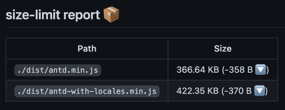
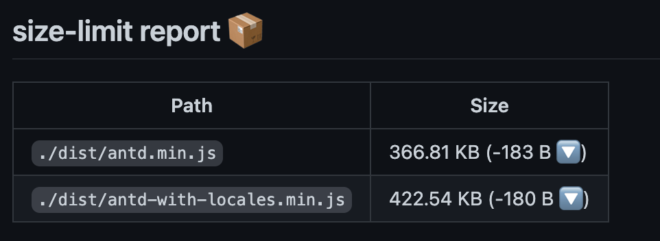
We did it in #38720 before, and continue it recently.

Here is the current bundle size: #39898 (comment)

Path Size
./dist/antd.min.js 367.29 KB
./dist/antd-with-locales.min.js 422.41 KB

report.html.zip

Since we drop legacy browsers support, there are still something we can optimize.

@github-actions
Copy link
Contributor

github-actions bot commented Dec 29, 2022

You may look for issues:

  1. 70% Bundle size optimization #22698

🤖 By issues-similarity-analysis

@afc163 afc163 added 📦 Bundlesize help wanted The suggestion or request has been accepted, we need you to help us by sending a pull request. labels Dec 29, 2022
@ant-design ant-design deleted a comment from github-actions bot Dec 29, 2022
@yoyo837
Copy link
Contributor

yoyo837 commented Dec 30, 2022

shallowequal 的移除, rc-* 还有一些没有发版, 所以 bundle size 还没体现.

@kiner-tang
Copy link
Member

kiner-tang commented Jan 2, 2023

Use ES classes, remove these babel plugins: https://github.com/ant-design/antd-tools/blob/3b3447eb106a80ebc64e634ca60ce1cd55e8a351/lib/getBabelCommonConfig.js#L20-L22
这个意味着我们在新版本的antdesign里面,已经不需要再去兼容不支持class的情况了吗

@kiner-tang
Copy link
Member

@ant-design/icons unnecessary internal component, we could reduce it.
这些非必要的内部组件,指的是Icon的别名组件么?

image

类似这些?那如果把这些别名组件去掉,使用的时候就只能通过``的方式使用了吗?

image

@li-jia-nan
Copy link
Member

li-jia-nan commented Jan 3, 2023

image

image

image

重构完 Transfer 组件的三个文件,一共少了大约 800 b

@li-jia-nan
Copy link
Member

重构工作就剩下 Affix 组件了,这个组件只有一个文件,但是逻辑比较复杂

@afc163
Copy link
Member Author

afc163 commented Jan 4, 2023

这个意味着我们在新版本的antdesign里面,已经不需要再去兼容不支持class的情况了吗

按官方支持范围,是的:https://caniuse.com/es6-class

@afc163
Copy link
Member Author

afc163 commented Jan 4, 2023

这些非必要的内部组件,指的是Icon的别名组件么?

antd 里同一个 icon,套了几层娃,好几个文件。相比 mui,一个图标只有一个文件:https://www.npmjs.com/package/@material-ui/icons?activeTab=explore

@Wxh16144
Copy link
Member

Wxh16144 commented Mar 5, 2023

计划把 rc-pagination 也重构成 Function Component. 已经开始做了。

@li-jia-nan
Copy link
Member

除了 Affixrc-pagination 之外还有 class component 吗?我来全部重构掉

@afc163
Copy link
Member Author

afc163 commented May 27, 2023

哦,原来已经提取过了,那改造一下上面的代码即可:https://github.com/react-component/upload/blob/0d0ca2f65acca13f64199ffbb05054fb13c210ea/src/AjaxUploader.tsx#L303

antd 里也有:

图片

@monolithed
Copy link

monolithed commented Jun 18, 2023

Practice shows that in a real project, no more than 30-50% of the components are actually used, and even those are heavily customized.
I suggest keeping only a minimal set of components in the standard build and including all exotic packages separately.

Mentions,
ColorPicker,
Cascader,
Rate,
Transfer,
TreeSelect,
Descriptions,
List,
QRCode,
Segmented,
Statistic,
Popconfirm,
Result,
App,
Watermark,
Menu,
Layout
Slider,
Carousel,
Collapse,
Empty,
Timeline,
Tour,
Tabs
Tree,
FloatButton,
For various reasons, I rarely have to include even one of these packages (26 never used). Collapse, Tabs and List are difficult to customize, while the rest are very specific in their use cases.

@imballinst
Copy link

imballinst commented Jul 6, 2023

Probably this would be better for v6 instead, but IMO, if we want the most optimized bundle size, we should mostly "offload" to consumers. For example, this button loading icon:

<LoadingIcon existIcon={!!icon} prefixCls={prefixCls} loading={!!innerLoading} />

What I think is, if consumers want to add loading spinners to the button (to indicate loading/submitting/something), then they would add it themselves. If they are using Button in the code but never use the loading prop, then it's a bit wasteful on their end.

Maybe we can have something like PlainButton or something, that only contains the CSS styling of the button? Then this PlainButton will be used by the main Button, so consumers that want to include all setup and logic can use Button, whereas those who want to have "minimal" setup can use PlainButton.

<PlainButton>
  {isLoading ? <AntdLoadingIcon /> : null}
  Submit
</PlainButton>

<Button loading={isLoading}>Submit</Button>

@monolithed
Copy link

monolithed commented Jul 6, 2023

@imballinst

This is a micro-optimization, although it's a valid point that relates to how the styling of Ant's projects is tightly coupled with the Ant Design design system. For example, if they need an icon to be on the left, such a property will be available in the design system, but if they don't, it won't be there. For example, do you know how to add an icon to Button on the right or align an arrow in the center of Accordion, find an H6 heading, or explain the purpose of exotic components that you would never be able to use in your own projects?

Currently, Ant Design is one of the heaviest libraries, and it still has significant issues with optimization, mobile device adaptation, and accessibility. Therefore, first and foremost, they need to understand how they want to position their system in order to avoid closing tickets they disagree with, not releasing backward-incompatible releases in minor versions, not passing beta versions off as major releases (currently, tokens don't work well) and start testing.

I tend to believe that a few years ago Ant Design were monopolists in the design system market, with no one else having as many visually pleasing components. However, now there are numerous libraries and standards with high competition, and performance is one of the crucial tasks.

Here's how I see the steps that could help solve this problem:

  1. Identify which components users need most frequently.
  2. Create a configurator that allows users to assemble a set of components and styles based on what they actually need.
  3. Make the components as flexible as possible (currently, tokens don't work well and are limited in customization).
  4. Full support accessibility and responsibility.
  5. Define metrics for rendering speed, build time, and loading time.
  6. Remove dependencies on personal preferences, such as a black background in Layout.

@afc163
Copy link
Member Author

afc163 commented Aug 5, 2023

图片

@monolithed
Copy link

Screenshot 2023-08-29 at 20 57 36

@monolithed
Copy link

Screenshot 2023-08-29 at 22 28 56 Screenshot 2023-08-29 at 22 30 16 Screenshot 2023-08-29 at 22 50 54


@ant-design/icons 67.62kb
    tinycolors 49.3kb
    lodash.camelcase 18.32kb

I don't even use it in my code. Perhaps the tinycolors package can be replaced with CSS variables?

rc-size-observer (resize-observer-polyfill) 41.93kb

Why not include this polyfill separately?

copy-to-clipboard 3.29kb

It looks like an optional feature

typography 45.6kb

A significant portion of the code is used for editing and other things that could also be moved into a separate option?

It seems easy to reduce around 170-240KB.

@afc163
Copy link
Member Author

afc163 commented Oct 9, 2023

@afc163
Copy link
Member Author

afc163 commented Mar 21, 2024

比起 https://unpkg.com/browse/lucide-react@0.360.0/dist/esm/icons/zap.js

Ant Design Icons 的冗余代码要多好多。

Sign up for free to join this conversation on GitHub. Already have an account? Sign in to comment
Labels
📦 Bundlesize help wanted The suggestion or request has been accepted, we need you to help us by sending a pull request. Inactive
Projects
None yet
Development

No branches or pull requests

7 participants