Card Landscape Analysis
Visual reference of usage across some government sites
Summary: A “card” is a UI design pattern that groups related information in a flexible-size container visually resembling a playing card.
Conclusion: Cards are a useful UI component for grouping several related pieces of information together for providing a linked entry point to further details on that content. Cards work especially well in contexts where they provide summaries of many different kinds of content, rather than when simply used as a modern-looking replacement for a list of content.

Cards have 4 key properties:
-
Cards are used for grouping information. A card chunks several different (but related) pieces of information into one digestible unit — be it an article on a news website, a product on an ecommerce site, or a post on a social app. A single card will typically include a few different types of media, such as an image, a title, a synopsis, sharing icons, or a call-to-action button — all associated with the same concept.
-
Cards present a summary and link to additional details. A card is usually short and offers a linked entry point to further details, rather than the full details themselves. It is intended as a high–information-scent outline used to entice users to click through to further details contained on a separate page.
-
Cards resemble physical cards. Cards use a border around the grouped content, and the background color within the card that differs from background color of the underlying canvas. These visual-design elements create a strong sense that the different bits of information contained within the border are grouped together.
Quite often, cards use a slight drop shadow to show depth, which is a clickability signifier. For most implementations, clicking or tapping anywhere on the card link to a details page (though some cards, like the one in our previous example, also include some secondary call-to-action buttons or links in addition to the main link available). This larger touch zone substantially improves usability on both touchscreen devices and mouse-based devices (due to Fitts’ Law).
-
Cards allow for flexible layouts. When multiple cards are used together in a layout, they often do not all have the same type of information — some cards might include a text summary, hashtags, or an image whereas other cards on the same page may include totally different details. Cards allow for varying height to accommodate differing amounts or types of content, but typically the width is fixed from one card to the next.
Cards contain content and actions about a single subject.

- Cards are surfaces that display content and actions on a single topic.
- They should be easy to scan for relevant and actionable information. Elements, like text and images, should be placed on them in a way that clearly indicates hierarchy.
- Contained: A card is identifiable as a single, contained unit.
- Independent: A card can stand alone, without relying on surrounding elements for context.
- Individual: A card cannot merge with another card, or divide into multiple cards.
A card is a flexible and extensible content container. It includes options for headers and footers, a wide variety of content, contextual background colors, and powerful display options.

Cards are used to apply a container around a related grouping of information.
Cards should use an underlying <article> element to maintain usability for some screen reader users.
Cards are used to group similar concepts and tasks together to make Shopify easier for merchants to scan, read, and get things done.

- Use headings that set clear expectations about the card’s purpose
- Prioritize information so the content merchants most need to know comes first
- Stick to single user flows or break more complicated flows into multiple sections
- Avoid too many call-to-action buttons or links and only one primary call to action per card
- Use calls to action on the bottom of the card for next steps and use the space in the upper right corner of the card for persistent, optional actions (such as an Edit link)
- They include content guidance, but there is not much about it specific to cards.
Cards can be used in a variety of ways. To start, they can be used to represent a variety of content types, such as documents and individual cases.
Because cards may vary greatly, it is recommended to use utility and layout classes to structure content within them.


- Expandable: Some cards may require some content to be initially hidden from view if that information is not pertinent to the user’s ability to scan the page for the right card to follow through or open.
- Document: Document card provides a pattern for displaying a list of documents with a way to view expanded information
A card is a flexible container that groups related blocks of content and information into a single unit.
Cards display a snapshot of information intended to encourage users to interact with or click to view more details or actions. According to the Nielsen Norman group, cards have four key properties:
- Cards are used for grouping information and content.
- Cards present a summary and link to additional details.
- Cards resemble physical cards.
- Cards allow for a flexible layout.

Editable cards group information that represents an object, object groupings, or a specific aspect of an object that the user can manage. Their primary purpose is for viewing and modifying content that is contained entirely in the card.
Content cards are intended for grouping and organizing related static content. Their primary purpose is for displaying a summary of information and do not contain an editable state.
- Intentionally organize cards within the page layout by grouping related cards in sections
- Consider adding page filters if you have a large collection of cards (e.g. Catalog page)
- Use structured lists instead of tables
- Use editable cards to show areas of the page the user can edit
- Nest a card within another element such as a table
- Do not use editable cards for complex multi-step flows. Consider using a side panel instead.
- Do not use cards in modals
- Avoid using tables. Use a structured list instead.
- Avoid scrolling
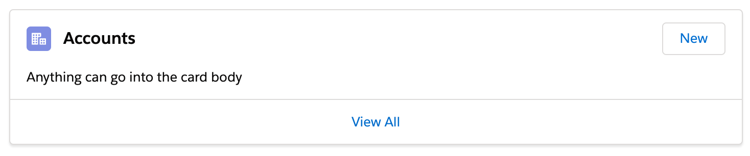
The cards above use divs rather than <article> or <section>. If they're truly standalone they could benefit from markup like:
article.card
  header.card__header
  div.card__body
  footer.card__footer
In this article, I'll be looking into a few permutations of a simple card component, emphasizing a balance between sound HTML structure and ergonomic interaction.
- Use list markup to group your cards
- Make sure your cards don't break when lines of content wrap or images don't meet specific aspect ratio requirements
- Avoid too much functionality and reduce tab stops. Cards shouldn't be miniature web pages.
- Remember that headings should begin sections. Most everything that belongs to the section should follow the heading in the source.