Skip to content
New issue

Have a question about this project? Sign up for a free GitHub account to open an issue and contact its maintainers and the community.

By clicking “Sign up for GitHub”, you agree to our terms of service and privacy statement. We’ll occasionally send you account related emails.

Already on GitHub? Sign in to your account

[Header]: Change direction of dropdown arrow when opened #2616

Closed
maya opened this issue Jul 23, 2018 · 6 comments
Closed

[Header]: Change direction of dropdown arrow when opened #2616

maya opened this issue Jul 23, 2018 · 6 comments
Assignees
Labels
Context: JavaScript Issue is in JavaScript Type: Enhancement An improvement to existing code

Comments

@maya
Copy link
Contributor

maya commented Jul 23, 2018

via @mariamarrero in #1905

Have you considered changing the direction of the arrow on the menu to pointing 'up' or replacing it with an 'X' once the menu is opened? It would stand out against other arrows pointing down and will give a visual cue that you need to click on the menu to close it.

PS: We have gotten direct comments from users on these 2 issues.

dropdown up or down

@maya maya added Type: Enhancement An improvement to existing code [Skill] UX labels Jul 23, 2018
@maya
Copy link
Contributor Author

maya commented Jul 23, 2018

Here's some feedback I got from Nielson Norman Group's support email around this question:

I am not aware of any specific research on drop-down caret orientation. However any particular study might not generalize to all situations, because there are several factors that affect the value of this design detail.

In general, it's best to provide explicit signals to differentiate each navigation state. So technically it is better to have the caret position change when the menu is expanded; especially if the menus are click activated (rather than hover activated), to suggest that once the menu is expanded, it can also be collapsed by clicking the 'up' caret.

However if the menu is hover activated and has a background color that has high contrast against the page (such as dark blue over a white page), then the benefit of re-orienting the caret to indicate an open or closed state will likely be negligible, because it's already obvious that the menu is expanded and users don't need to click it again to close it.

Note that the previous comments apply to horizontal menus such as the image you sent. Vertical menus have a different set of challenges and typically they do benefit from having distinct 'open' and 'close' icons.

@bpdesigns
Copy link

my vote on this would be to point the caret up ^ to indicate open

@mariamarrero
Copy link

@bpdesigns, that is exactly what we did in USA.gov. :)

@thisisdano thisisdano added the Context: JavaScript Issue is in JavaScript label Oct 9, 2018
@thisisdano
Copy link
Member

This is what we do in the banner, so let's go ahead and do it here, too. Down caret indicates openable, up caret indicates closable

@greensteph
Copy link

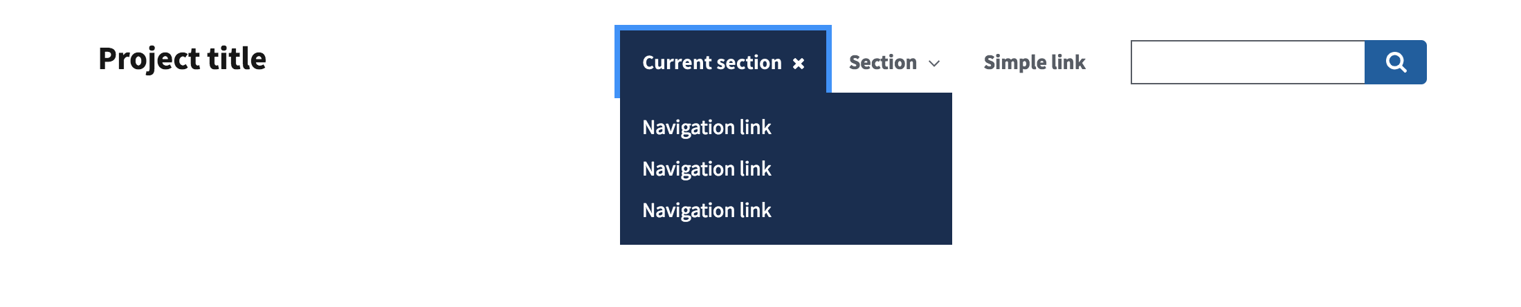
There isn't currently a white Carat Up UI element. I'm adding 2 options below using existing elements. Do we use one of these or create the Carat Up in white? @thisisdano @saracope

Blue Up Carat:
screenshot 2019-02-22 13 23 12


White Close X:

screenshot 2019-02-22 14 05 15

@maya
Copy link
Contributor Author

maya commented Mar 6, 2019

Closed in #2923.

Nice work 🎉

@maya maya closed this as completed Mar 6, 2019
Sign up for free to join this conversation on GitHub. Already have an account? Sign in to comment
Labels
Context: JavaScript Issue is in JavaScript Type: Enhancement An improvement to existing code
Projects
None yet
Development

No branches or pull requests

5 participants