When you install Storybook Docs, DocsPage is the zero-config default documentation that all stories get out of the box. It aggregates your stories, text descriptions, docgen comments, props tables, and code examples into a single page for each component.
- Motivation
- Component parameter
- Subcomponents parameter
- Replacing DocsPage
- Story file names
- Inline stories vs. Iframe stories
- More resources
DocsPage is the successor to addon-info, which was one of the most popular Storybook addons despite many limitations.
Like addon-info, DocsPage provides sensible defaults, meaning it adds documentation to your existing Storybook without requiring any additional work on your part.
However, DocsPage brings the following improvements:
- It supports all frameworks that Storybook supports, including React, Vue, Angular and many others.
- It generates better documentation that can be used as a standalone docs site, independently of Storybook.
- It supports better configuration, so you can capture project specific information with ease.
- It's built to work with
MDXwhen you need more control of your documentation.
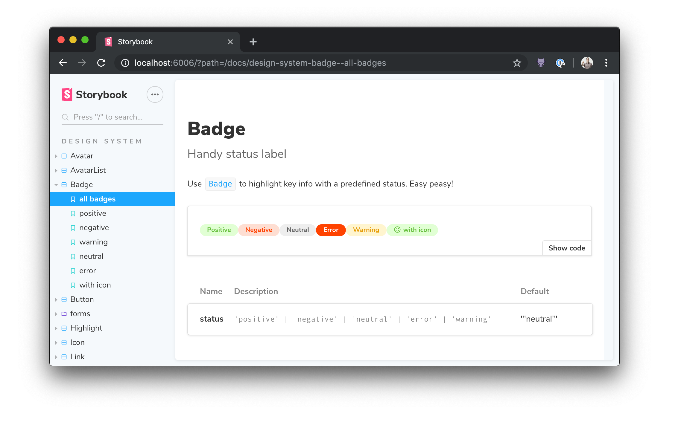
DocsPage pulls info from many sources, but one of the main ones is the component parameter, which is a new addition to Storybook in 5.2. It's based on the best practice that each component should have an associated set of documentation and stories (versus organizing it in some other way).
Storybook uses component to extract the component's description and props, and will rely on it further in future releases. We encourage you to add it to existing stories and use it in all new stories.
Here's how to set the component in Component Story Format (CSF):
import { Badge } from './Badge';

export default {
  title: 'Path/to/Badge',
  component: Badge,
};
And here's how to do the same thing the underlying storiesOf API:
import { storiesOf } from '@storybook/react';
import { Badge } from './Badge';

storiesOf('Path/to/Badge', module).addParameters({ component: Badge });
If you're coming from the storiesOf format, there's a codemod that adds it for you.
Sometimes it's useful to document multiple components on the same page. For example, suppose your component library contains List and ListItem components that don't make sense without one another. DocsPage has the concept of a "primary" component with the component parameter, and can also accept one or more "subcomponents":
import { List, ListHeading, ListItem } from './List';

export default {
  title: 'Path/to/List',
  component: List,
  subcomponents: { ListHeading, ListItem },
};
Subcomponent prop tables will show up in a tabbed interface along with the primary component, and the tab titles will correspond to the keys of the subcomponents object.

If you want organize your documentation differently for groups of components, we recommend trying MDX which is completely flexible to support any configuration.
What if you don't want a DocsPage for your storybook, for a specific component, or even for a specific story?
You can replace DocsPage at any level by overriding the docs.page parameter:
- With
nullto remove docs - With MDX docs
- With a custom React component
Globally (preview.js)
import { addParameters } from '@storybook/react';
addParameters({ docs: { page: null } });
Component-level (Button.stories.js)
import { Button } from './Button';
export default {
  title: 'Demo/Button',
  component: Button,
  parameters: { docs: { page: null } },
};
Story-level (Button.stories.js)
import { Button } from './Button';
// export default { ... }
export const basic => () => <Button>Basic</Button>
basic.parameters = {
  docs: { page: null }
}Here's an example of rebuilding DocsPage out of doc blocks:
import React from 'react';
import {
  Title,
  Subtitle,
  Description,
  Primary,
  ArgsTable,
  Stories,
} from '@storybook/addon-docs/blocks';
import { DocgenButton } from '../../components/DocgenButton';

export default {
  title: 'Addons/Docs/stories docs blocks',
  component: DocgenButton,
  parameters: {
    docs: {
      page: () => (
        <>
          <Title />
          <Subtitle />
          <Description />
          <Primary />
          <ArgsTable />
          <Stories />
        </>
      ),
    },
  },
};
You can interleave your own components to customize the auto-generated contents of the page, or pass in different options to the blocks to customize their appearance. For more info see the examples in official-storybook.
Unless you use a custom webpack configuration, all of your story files should have the suffix *.stories.@(j|t)sx?, e.g. "Badge.stories.js", "Badge.stories.tsx", etc.
The docs preset assumes this naming convention for its source-loader setup. If you want to use a different naming convention, you'll need a manual configuration.
Due to the complex nature of writing a cross-framework utility like Storybook, the story blocks for most frameworks exist within an <iframe> element. This creates a clean separation of the context the code for each framework lives inside, but it isn't a perfect tradeoff. It does create a set of disadvantages--namely, you have to explicitly set the height of a story. It also causes some headaches for certain dev tools (Vue dev tools, for example, don't pick up components that exist in an iframe, without substantial jerry-rigging).
That being said, there is a system in place to remove the necessity of this tradeoff. The docs configuration contains two options, inlineStories and prepareForInline that can work together to integrate non-react stories seamlessly (or should I say "scroll-bar-less-ly") into DocsPage. Setting inlineStories to true tells storybook to stop putting your stories into an iframe. The hard(er) part is providing the prepareForInline parameter. This parameter accepts a function that transforms story content in your given framework into something react can render. Any given framework will need to approach this in a different way. Angular, for example, might convert its story content into a custom element (you can read about that here). We've actually taken the initiative and implemented Vue inline stories for you in the default docs config for Vue, because we're such nice people. The following docs config block allows Vue components to be rendered inline through an effect hook provided by @egoist/vue-to-react:
import React from 'react';
import { render } from 'react-dom';
import toReact from '@egoist/vue-to-react';
import { addParameters } from '@storybook/vue';

addParameters({
  docs: {
    prepareForInline: (storyFn, { args }) => {
      const Story = toReact(storyFn());
      return <Story {...args} />;
    },
  },
});
With that function, anyone using the docs addon for @storybook/vue can make their stories render inline, either globally with the inlineStories docs parameter, or on a per-story-basis using the inline prop on the <Story> doc block. If you come up with an elegant and flexible implementation for the prepareForInline function for your own framework, let us know! We'd love to make it the default configuration, to make inline stories more accessible for a larger variety of frameworks!