Create A Story
🚀 So, now that you have created your amazing component, you need to explain how to use it and expose all the information related to this component.
Our OKP4 design system uses a tool called Storybook which allows us to expose all our components through a catalog. 📖
You can have a look here to see what it looks like.
This catalog has the advantage of offering the developer the possibility to take in hand and play with each component through its properties.
As the name suggests, each component is accompanied by a story file where you can import your component and present it through several variations and contexts.
It is important to keep this in mind in order to build the most complete stories for developers.
Well, you need to create a folder with the name of your component: e.g. myComponent in the stories folder.
myComponent will contain at least its story MyComponent.stories.mdx, and may also contain a stylesheet, an i18n folder for translations...
Each component must be assigned a badge:
You can get more details on the use here.
Each story must follow a certain formalism in order to have all our stories standardized. In order of reading, you will find:
- Imports
- Meta tag with its title, affiliated component, parameters, decorators ...
- Component Name
- A very short description of this component
- A stable/unstable badge
- A complete description
- Overview of the component with an affiliated story
- Properties table of the overview story
- Detailed presentation of each story with a description, default value if any, dedicated story in canvas
- Responsiveness (optional)
- Internationalization (optional - if the component comes with translations files )
- Prerequisites (optional)
- Notes (optional: e.g. evolutions to come...)
It is essential for the developer to have access to the code related to the use of the component in order to help him in his understanding.
This will allow it to have access to the context related to the use of the component
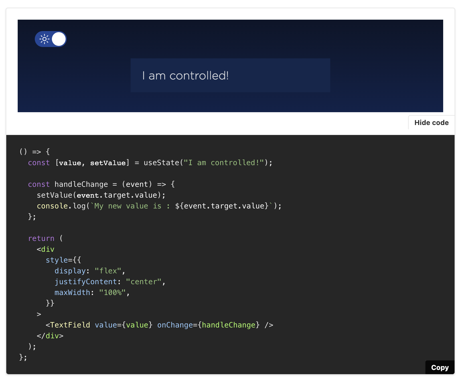
That's why you need to use the <Canvas> element exposed by Storybook which allows to display a "Show Code" button .
It must be used for every Story except for the Overview one.
Example of use:
<Canvas isColumn>
  <Story name="Controlled">
    {() => {
      const [value, setValue] = useState('I am controlled!')
      const handleChange = event => {
        setValue(event.target.value)
        console.log(`My new value is : ${event.target.value}`)
      }
      return (
        <div style={{ display: 'flex', justifyContent: 'center', maxWidth: '100%' }}>
          <TextField value={value} onChange={handleChange} />
        </div>
      )
    }}
  </Story>
</Canvas>
This is what the developer will see:
The theme switcher must be used for any themed component. It should be positioned above each story in order not to confuse it as a part of the component (it is only present to simulate the change of theme for the component).
<ThemeProvider>
  <div className="story-theme-switcher">
    <ThemeSwitcher />
  </div>
  <Story />
</ThemeProvider>
Examples:


If the component you have created is internationalized and comes with its translation files, then it is important to expose the file name and its translation keys in order to facilitate the developer's work.
For example:
##### **`myComponent_en.json`**

{
  "greetings": "Hello fellow data space invader! "
}
We should also remember to add a link to the internationalization guide:
See <a href="?path=/docs/guidelines-internationalization--page">internationalization</a>
for information on how to load translations.The component you want to expose contains properties.
It is important that the developer can modify and play with these properties in order to see the component evolve according to the values passed to these props.
Basically, controls are allowed for each property, but you can also disable them if they don't make sense.
We often disable them when it is a property that can receive a JSX element for example, or for a function.
The developer will find it easier to modify isOpened which is a Boolean property or select a size rather than creating a JSX element and passing it to the property only to test the component.
Here is how to disable a control:
<Story
  name="Usage"
  argTypes={{
    onChange: {
      control: false
    },
    inputRef: {
      control: false
    },
    rightIcon: {
      control: false
    },
    value: {
      control: { type: 'select' },
      options: ['string', ['array', 'of', 'string']]
    }
  }}
  args={{
    placeholder: "I'm a placeholder!",
    defaultValue: "I'm set with a default value",
    value: undefined
  }}
>
  {args => (
    <div style={{ display: 'flex', justifyContent: 'center', maxWidth: '100%' }}>
      <TextField {...args} />
    </div>
  )}
</Story>
Make sure as well that you pass properties with their default value in args for those who have them. This makes the argsTable display the default value correctly.
We want our stories to be easily read! That's why we have some few guidelines when it comes to the styling and structuring of the story content:
- Stories should as much as possible be ordered in the same way as they appear in the property table.
- Stories should be light and easy to understand. Stick to the essentials and try not to be too technical, it's a story after all.
-
Propertiesshould be highlighted using back tics and values in bold. - Get inspired by other stories! This will also help uniforming stories by using the same format and vocabulary.
import { ArgsTable, Meta, Story, Canvas } from '@storybook/addon-docs'
import { LanguageSwitcher } from 'ui/atoms/languageSwitcher/LanguageSwitcher'
import { ThemeProvider } from 'ui/atoms/theme/ThemeProvider'
import { ThemeSwitcher } from 'ui/atoms/theme/ThemeSwitcher'
<Meta
title="Atoms/LanguageSwitcher"
component={LanguageSwitcher}
decorators={[
Story => (
<ThemeProvider>
<div className="component-story-main language-switcher">
<ThemeSwitcher />
<Story />
</div>
</ThemeProvider>
)
]}
/>
# Language Switcher
> Allows the user to change the application language.
[](https://github.com/emersion/stability-badges#unstable)
## Description
`LanguageSwitcher` is used to offer multi-language support to users in order to improve their experience on the application.
Its background color is transparent in order to offer an easy implementation.
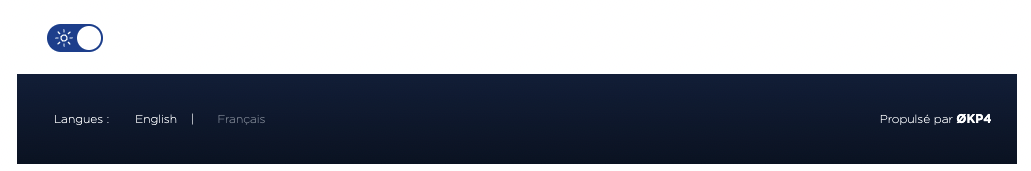
## Overview
<Story
name="Overview"
args={{
languages: [
{ name: 'English', lng: 'en' },
{ name: 'Français', lng: 'fr' }
]
}}
>
{args => (
<div style={{ display: 'flex', justifyContent: 'center' }}>
<LanguageSwitcher {...args} />
</div>
)}
</Story>
## Properties
<ArgsTable story="Overview" />
## Languages
The `LanguageSwitcher` comes with a `languages` mandatory property.
This property must respect the `Languages` format which is an array of `Language`:
type Language = {
readonly name: string
readonly lng: string
}
##### **`example.tsx`**
import { Languages } from '@okp4/ui'
export const MyExampleComponent: React.FC = () => {
const allLanguages: Languages = [
{
"name": "English",
"lng": "en"
},
{
"name": "Français",
"lng": "fr"
},
{
"name": "Italiano",
"lng": "it"
}
]
return <LanguageSwitcher languages={allLanguages} />
## Responsiveness
The component was built according to the principles of Responsive Web Design (see <a href="?path=/docs/guidelines-responsive-web-design--page">dedicated guideline</a>) in particular thanks to the use of media queries and a responsive grid.
This allows the component to adapt to any screen size, from the smallest phone to a large desktop screen or television.
## Internationalization
`LanguageSwitcher` is provided with its defaults translation files (`languageSwitcher_en.json` and `languageSwitcher_fr.json`).
It is possible to overwrite the translations or to add new translation keys if needed.
Here are the keys and their english translations:
##### **`languageSwitcher_en.json`**
{
"languages": "Languages:"
}
Example of translation replacement or insertion:
- the file name must be the same, so here it has to be `languageSwitcher_en.json`
- the file format must be identical (same key names, curly brackets...)
- translation can be replaced by your own (overwrite)
- new key with associated translation can be added (extension)
##### **`languageSwitcher_en.json`**
{
"languages": "Update with your own translation here", // Translation overwrite
"modify-language": "Write your own translation here" // Translation extension
}
Tsx usage:
<p>{t('languageSwitcher:languages')}</p>
<p>{t('languageSwitcher:languages.modify-language')}</p>
The component was built according to the internationalization implementation: see <a href="?path=/docs/guidelines-internationalization--page">dedicated guideline</a>.
## Prerequisites
`LanguageSwitcher` is designed to be used on dark backgrounds because of its white text color.