


A simple and customisable React Native component that implements an animated bottom tab bar for React Navigation v5.
- 60FPS
- Support for iPhoneX
- Lots of customisation
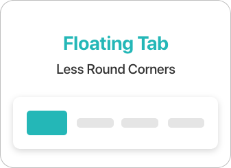
- Bottom Tab Bar Floating style
- April 19 2020
- In order to run the examples, don't forget to
pod installafternpm install - Glitch when using navigation.navigate() has been fixed!
- In order to run the examples, don't forget to
- March 11 2020
- June 25 2020
- Upgrade to v3.0
- Add more customisations including, floating style, icon configs, label configs, and more.
- Fixed issues with changing screen orientation
- Fixed animation when provided initial screen
- Improved code quality, refactoring
- Implement a new custom navigation builder


❗️In order to use the component, you need to have React Navigation v5 installed.
If using yarn
yarn add react-native-animated-nav-tab-bar
If using npm
npm install react-native-animated-nav-tab-bar
import { AnimatedTabBarNavigator } from "react-native-animated-nav-tab-bar";Then create a navigator using the navigation builder that you imported, and create your navigation! Look at the example below.
...

const Tabs = AnimatedTabBarNavigator();

export default () => (
  <Tabs.Navigator
    // default configuration from React Navigation
    tabBarOptions={{
      activeTintColor: "#2F7C6E",
      inactiveTintColor: "#222222"
    }}
  >

    // Home Screen
    <Tabs.Screen name="Home" component={Home} />

    // Other screens go here.
    ...

  </Tabs.Navigator>
)If you'd like to add icons to your Bottom Navigation you can use react-native-vector-icons. Look at an example of how to add icons to your tab bar.
Example
import Icon from 'react-native-vector-icons/Feather';

...

export default () =>
  <Tabs.Navigator
    tabBarOptions={{
      activeTintColor: "#2F7C6E",
      inactiveTintColor: "#222222"
    }}
  >
    <Tabs.Screen
      name="Home"
      component={Home}
      options={{
        tabBarIcon: ({ focused, color, size }) => (
            <Icon
                name="Home"
                size={size ? size : 24}
                color={focused ? color : "#222222"}
                focused={focused}
                color={color}
            />
        )
      }}
    />
    </Tabs.Navigator>

...The navigation component takes two main props which help you customise your navigation. tabBarOptions is the default prop from React Navigation which you can use to specify different tint colors and more (see available options below). for all the details. The second prop is appearence. Here you'll be able to adjust several properties of the tab bar as you wish. See the available properties above.
-
tabBarOptions
- ✅
activeTintColor- Label and icon color of the active tab item. - ✅
inactiveTintColor- Label and icon color of the inactive tab item. - ✅
activeBackgroundColor- Background color of the active tab item. - ✅
tabStyle- Style object for the tab wrapper (Note! it overrides the properties inappearenceprop (see below). - ✅
labelStyle- Style object for the tab label text.
- ✅
-
appearence
-
topPadding(default: 20) - Space between the tab button and the wrapper (top) -
✅
horizontalPadding(default: 20) - Vertical space between for the tab buttons -
✅
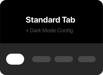
tabBarBackground(default: "white") - Backgorund color for the wrapper that contains the navigation tabs -
✅
shadow(default: true) - If set to true, the wrapper has a light shadow -
✅
activeTabBackgrounds- Array of hex colours for the background of each tab when active. (if not specified, falls back to theactiveBackgroundColorfromtabBarOptions) -
✅
activeColors- Array of hex colours for the tint of each tab when active. (if not specified, falls back to theactiveTintColorfromtabBarOptions) -
✅
floating(default: false) - If set to true, the nav bar will float on top of the current screen. Look at examples above. -
✅
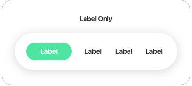
whenActiveShow(default: "both") Configure the appearence of the active tab. Available valuesboth,label-only,icon-only. -
✅
whenInactiveShow(default: "icon-only") Configure the appearence of the inactive tabs. Available valuesboth,label-only,icon-only. -
✅
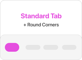
dotCornerRadius(default: 100) Corner radius for the active background / dot. -
✅
dotSize(default: "medium") Size of dot for the active tab. Available valuessmall,medium,large.
Note! Make sure you reload your view after changing the props. The animation might be stuck while changing them dinamically.
-
- My tab doesn't reflect the
tabStyleobject when I setpaddingTop. Solution: You must provide the same value forpaddingTopin bothtabStyleobject andtopPaddingproperty fromappearence. This is due to the fact that the dot / active background uses position absolute, and the parent's padding top does not affect it.
Pull requests are always welcome! Feel free to open a new GitHub issue for any changes that can be made.
Working on your first Pull Request? You can learn how from this free series How to Contribute to an Open Source Project on GitHub
Catalin Torge @torgeadelin