A very simple react datepicker component which includes range picker. Now supports server side rendering.
The package can be installed via NPM:
npm install react-xflex-datepicker --save
Or yarn:
yarn add react-xflex-datepicker
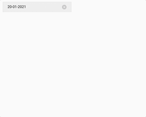
- Datepicker component for choosing only one date:
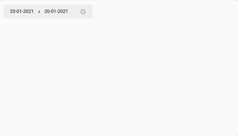
import { XFlexDatepicker } from 'react-xflex-datepicker';- Daterange picker component:
import { XFlexDatepickerRange } from 'react-xflex-datepicker';Then you can use it in your code:
<XFlexDatepicker />or
<XFlexDatepickerRange />import 'react-xflex-datepicker/dist/xflex-datepicker.css';moment is required for some of the options
| Option | Type | Values | Default | Description |
|---|---|---|---|---|
| initialDate | Moment | moment dates, null | moment() (Current date) | This is the initial date set on the calendar on mount. |
| position | String | top, bottom | bottom | It tells where the calendar will be positioned regarding the input control. This property has no effect when inputControl is set to false. |
| inputControl | Boolean | true, false | true | When is set to false, the calendar will be visible all the time, otherwise it will be opened by a button. |
| placeholder | String | any | Choose date... | This is the placeholder on the input control when no date is selected. It has no effect when inputControl is set to false. |
| String | moment formats (see momentjs webpage for available formats) | YYYY, MMMM DD | The format in which the dates will be shown on the input control. Has no effect when inputControl is set to false. | |
| locale | String | moment locale | en | The locale of the calendar. This does not affect the placeholder |
| buttonControlClassName | String | any className | '' | This is optional className for the button control for custom styling. |
Range datepicker has the same above options as the datepicker and a few more:
| Option | Type | Values | Default | Description |
|---|---|---|---|---|
| hasTooltip | Boolean | true, false | true | Whether or not to have an info tooltip on day mouseover |
| tooltipLabel | Function | functions | (numberOfNights) => {return numberOfNights} |
Provided this function, you can set a custom label for the day tooltip. It receives number of nights between the days selected. |
| Event | Arguments | Description |
|---|---|---|
| onChooseDate | date: Moment object | Fired when clicked on a date. On datepicker it fires with {date: Moment} and on range picker with {start: Moment, end: Moment | null. The end date is null if the event is fired when selecting the start date. |
| onClearDate | date: Moment object | Fired when cleared a date from the input control. On datepicker it fires with {date: Moment} and on range picker with {start: Moment, end: Moment | null. The object tells which dates have been cleared. The end date is null if the event is fired when only the start date is selected. |
| onCalendarShow | none | Fired when the calendar is shown. Only when inputControl is false |
| onCalendarHide | none | Fired when the calendar is hidden. Only when inputControl is false |
| onMonthDayOver | date: Moment object | Fired when mouseover on a date. The argument is a Moment object which represents the date that has been hovered. |
ISC