Some examples of creating custom layouts for MAUI. These are intended to demonstrate the sorts of things which are possible, and the basics of creating a custom layout. These are not intended as production-ready layouts.
Layouts in MAUI are pretty simple. Most of the work is done by an ILayoutManager implementation, which only requires two methods:
Size Measure(double widthConstraint, double heightConstraint)Size ArrangeChildren(Rectangle bounds)
A Measure implementation should call measure on each IView in the layout, and should return the total size of the layout given the constraints.
An ArrangeChildren implementation should determine where each IView should be placed within the given bounds, and should call Arrange on each IView with its appropriate bounds. The return value should be the actual size of the layout.
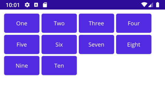
HorizontalWrapLayout works like a horizontal stack layout, except that instead of extending out as far as it needs to the right, it will wrap to a new row when it encounters the right edge of its container.
So given this XAML:
<local:HorizontalWrapLayout Margin="10" Spacing="5">
    <Button Text="One"></Button>
    <Button Text="Two"></Button>
    <Button Text="Three"></Button>
    <Button Text="Four"></Button>
    <Button Text="Five"></Button>
    <Button Text="Six"></Button>
    <Button Text="Seven"></Button>
    <Button Text="Eight"></Button>
    <Button Text="Nine"></Button>
    <Button Text="Ten"></Button>
</local:HorizontalWrapLayout>
You'll see something like this:
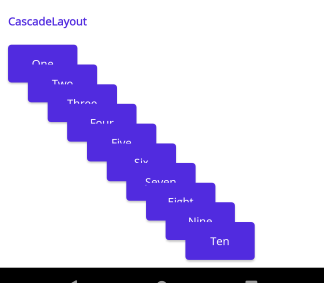
Cascades the items from top left to bottom right, similar to using the "cascade windows" arrangement in an MDI application.
<local:CascadeLayout Margin="10" Spacing="25">
	<Button Text="One"></Button>
	<Button Text="Two"></Button>
	<Button Text="Three"></Button>
	<Button Text="Four"></Button>
	<Button Text="Five"></Button>
	<Button Text="Six"></Button>
	<Button Text="Seven"></Button>
	<Button Text="Eight"></Button>
	<Button Text="Nine"></Button>
	<Button Text="Ten"></Button>
</local:CascadeLayout>
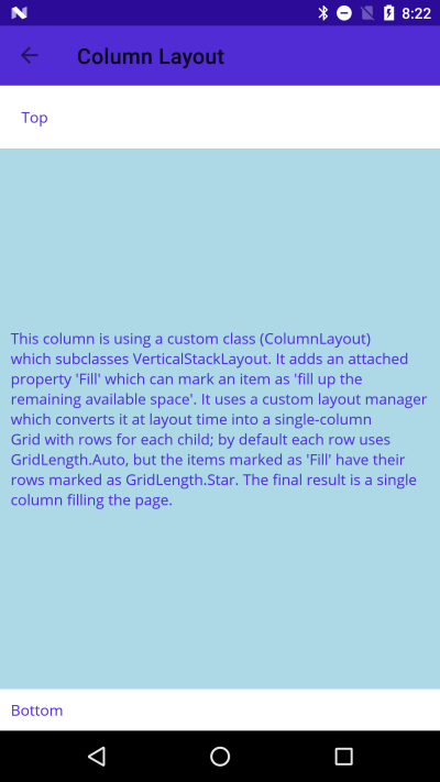
This is an example of a custom layout which can accomplish the same things as the old Forms AndExpand properties. It's a subclass of VerticalStackLayout which adds an attached property Fill that can be applied to one or more children of the layout. It uses a custom layout manager which converts the VSL at runtime into a single-column Grid. Each child of the VSL gets its own row in the Grid. Normally the rows are set to a height of Auto, but children marked as Fill get a row height of * instead.
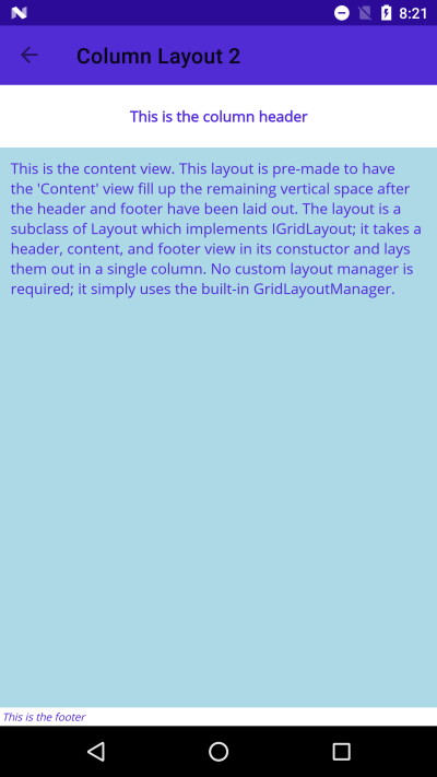
For folks who constantly find themselves building the same layouts out of grids/stacks/etc, this is an example of creating a custom purpose-built layout class for your own use. It simply subclasses Layout and implements some extra properties/methods from the IGridLayout interface. This allows it to be fed into a GridLayoutManager to handle the actual layout at runtime.
The class takes 3 views in its constructor - a header, content, and a footer. All the row/column setup is baked into the custom class, so using it becomes a single line of code wherever we need this fairly standard layout.
Variation of StackLayout which arranges its children atop one another in order.
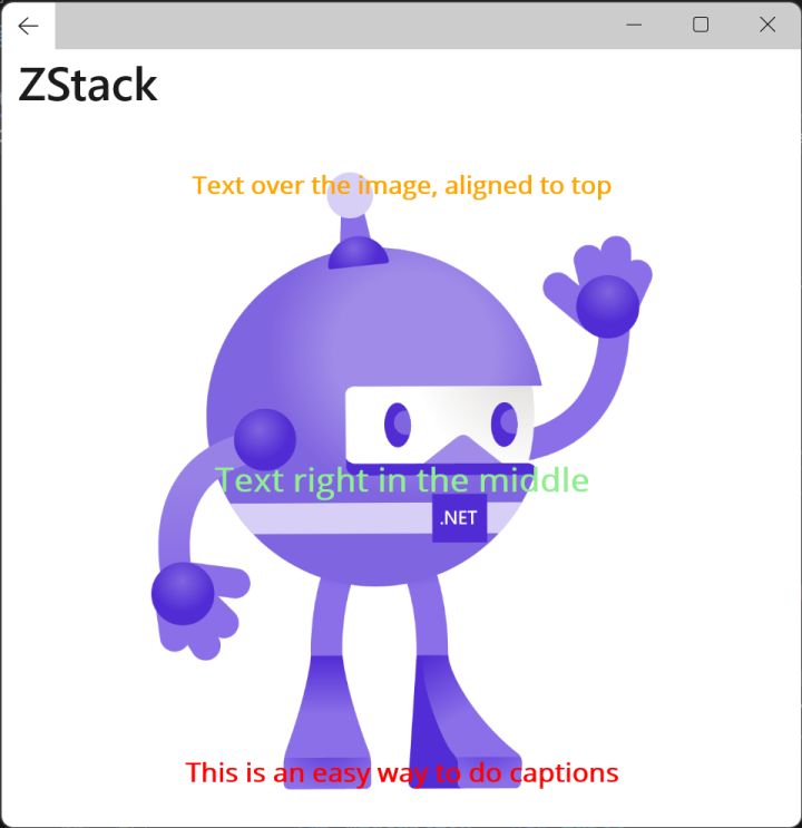
Works just like a VerticalStackLayout or HorizontalStackLayout, except along the Z-axis. All children are laid out at the origin; the arrangement area's width is determined by the widest child and the height is determined by the tallest child.
Provides a lower-complexity alternative to using a GridLayout to stack Views along the z-axis (e.g., in order to use an Image as a background for another View).
Example usage:
<ZStackLayout HorizontalOptions="Center" VerticalOptions="Center">
	<Image Source="dotnet_bot.png" WidthRequest="300" HeightRequest="372" HorizontalOptions="Center" />

	<Label Text="Text over the image, aligned to top" FontAttributes="Bold" FontSize="15" TextColor="Orange" HorizontalOptions="Center" VerticalOptions="Start"/>
	<Label Text="Text right in the middle" FontAttributes="Bold" FontSize="20" TextColor="LightGreen" HorizontalOptions="Center" VerticalOptions="Center"/>
	<Label Text="This is an easy way to do captions" FontAttributes="Bold" FontSize="16" TextColor="Red" HorizontalOptions="Center" VerticalOptions="End"/>
</ZStackLayout>
For most customization scenarios, your own custom layout control is the way to go. However, in some extreme situations you may find that you really, really want to change the behavior of an existing layout type without having to actually create a custom layout and use it everywhere.
For those rare scenarios, you can create an ILayoutManagerFactory and use it to replace the default layout manager type with your own. The customized Grid example here demonstrates how to achieve that:
- Write your own LayoutManager (e.g., CustomGridLayoutManager.cs)
- Create an ILayoutManagerFactory (e.g., CustomLayoutManagerFactory.cs)
- Register your factory with the application (e.g., MauiProgram.cs)
Now when the app is rendering a plain-old out-of-the-box Grid (like the one in CustomizedGridPage.xaml), it will use your custom manager.
In this example, the custom manager makes sure that the RowDefinitions for the Grid include enough rows to account for each Grid.Row property set in a child view (a thing you normally have to do at design time).
