Releases: catppuccin/catppuccin
Ctp v0.2.0
😸 Ctp v0.2.0
A really a big, chunky and juicy update. A full overhaul!

What changed?
well.. everything!
- Catppuccin is no longer a single palette, now there are 4 different flavours! These are: Latte, Frappe, Macchiato and Mocha. Fun fact: the names were picked based off of the lightness of the coffee, AKA the amount of milk that usually goes into each one of them.
- Renewed naming convention for the monochromatic subpalette:
text,subtext1,subtext0,overlay2,overlay1,overlay0,surface2,surface1,surface0,base,mantle, andcrust - We now have 3 communities online: Github (here), Npm and Discord
- New docs: with info on how to create ports, upstream them, integrate the palettes into personal projects, ...
- Tooling: to ease out the process of maintaining Catppuccin we have created a toolbox.
- Better assets: hopefully they will help everything looks more stylish, aesthetic and minimalistic.
- WCAG standards: the palettes now comply with level AA.
- Integrations: now it's easy to integrate the palettes in any type of project!

Ctp v0.1.3
A rather big update, I'd say.
Things are popping a tad more now, aren't they? this is because the contrast ratio between the main colors (e.g. rosewater, maroon, lavender, teal, etc...) and the main background was increased to ensuse that the palette was compliant with WCAG 2.1 standards for enhanced contrast. Furthermore, the transition between every color in the black-gray palette is smoother now.
📚 Changes
- WCAG 2.1 level AAA enhanced contrast compliance: this means that the palette is accessible at level AAA, which means that the visual presentation of text has a contrast ratio of at least 7:1. You can find more information about this on W3.org's documentation: https://www.w3.org/WAI/WCAG21/quickref/?showtechniques=143%2C146#contrast-enhanced
These are the results of the tests we ran to assert this conformance claim:
• rosewater: ✅
• flamingo: ✅
• mauve: ✅
• pink: ✅
• red: ✅
• maroon: ✅
• peach: ✅
• yellow: ✅
• green: ✅
• blue: ✅
• sky: ✅
• teal: ✅
• lavender: ✅
• white: ✅
• gray2: ✅
• gray1: ❌
• gray0: ❌
• black4: ❌
• black3: ❌
• black2: ❌
• black1: ❌
• black0: ❌
The test was conducted with a size
14font between every color against black2 (#1E1D2F), which is the main background of the palette. As evedenced on the data above, the colors from the main palette passed the test successfully; however, as expected, the colors from the black-gray palette (which fall into theexceptionscategory according to WCAG 2.1 standards) didn't.
- The transition between every color in the black-gray palatte is smoother: this is because the darkest ones of them now have a slight tint of a really deep dark purple which makes colors pop more, so to speak. Purple was chosen since most of the colors that were going to be on top of it (like yellow, green, orange, and red) were opposed to it in the color wheel.
🎨 Palette
These were the colors that changed:
| Name | Hex | RGB | |
|---|---|---|---|
| Mauve | #DDB6F2 |
221, 182, 242 |
|
| Pink | #F5C2E7 |
245, 194, 231 |
|
| Maroon | #E8A2AF |
232, 162, 175 |
|
| Red | #F28FAD |
242, 143, 173 |
|
| Peach | #F8BD96 |
248, 189, 150 |
|
| Yellow | #FAE3B0 |
250, 227, 176 |
|
| Green | #ABE9B3 |
171, 233, 179 |
|
| Teal | #B5E8E0 |
181, 232, 224 |
|
| Blue | #96CDFB |
150, 205, 251 |
|
| Sky | #89DCEB |
137, 220, 235 |
|
| Black 0 | #131020 |
19, 16, 32 |
|
| Black 1 | #1A1823 |
26, 24, 35 |
|
| Black 2 | #1E1E2D |
30, 29, 47 |
|
| Black 3 | #302D41 |
48, 45, 65 |
|
| White | #D9E0EE |
217, 224, 238 |
Catppuccin v0.1.2
This release targeted the morning palette and improved several things on it.
Palette Changes
- Saturation: Some colors were pulled down a little, some stayed the same and some were pulled up. Overall everything is more balanced now that luminance (from v0.1.1) and suturation were fixed.
- New Colors!: The most notable improvement in this release is the addition of 4 new colors! Here are they in the color table:
| Name | Hex | RGB | HSL | CMYK | |
|---|---|---|---|---|---|
| Rosewater | #F5E0DC |
245, 224, 220 |
10, 56%, 91% |
0%, 9%, 10%, 4% |
|
| Maroon | #E49CB3 |
228, 156, 179 |
341, 57%, 75% |
0%, 32%, 21%, 11% |
|
| Sky | #92D2E8 |
146, 210, 232 |
195, 65%, 74% |
37%, 9%, 0%, 9% |
|
| Lavender | #C9CBFF |
201, 203, 255 |
238, 100%, 89% |
21%, 20%, 0%, 0% |
Note: you can view the whole palette in the README
- Updated some colors:
As mentioned above, some colors had mild changes; here they are:
| Color | v0.1.1 | v0.1.2 |
|---|---|---|
| Flamingo | #F2CECF |
#F2CDCD |
| Peach | #F9C096 |
#F7BE95 |
| Yellow | #EBDDAA |
#ECDDAA |
| Green | #B1E3AD |
#B1E1A6 |
| Teal | #BEE4ED |
#B7E5E6 |
| White | #DADAE8 |
#DFDEF1 |
Org-wise Changes
- We have a new logo 🥳⛅!

 Catppuccin Theme
- New slogan: most of the time we found people describing the color palette as "soothing"; so that's why the new slogan is: Soothing pastel theme for the high-spirited!
Repo Changes
- We now have a proper issue template for making port requests.
Catppuccin v0.1.1
This release ends as the result of the work carried out by many of the members of the Discord server, myself included.
Initially, since it was only me at the start of the project most of the decisions were taken by only one person. But now that a bunch of people have hopped into the boat we have managed to shape the project together. Although this release points out to the final version of the palette (which now has 18 colors), it's not the only new thing that came with it.
Several Other Improvements (project wise)
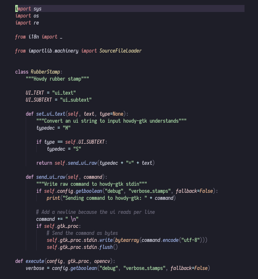
- Syntax Highlighting: it has been standardized and is now more polished. Languages like JavaScript, Python, Lua, C and Java were taken into account while assigning the color each syntactic element was going to have.
- Luminance: The palette not only brought new colors like teal and white bone, but it also balanced out more the overall luminance for consistency purposes.
- Styling UIs: The addition of 2 colors was because we were lacking colors for developing/styling graphical elements.
Syntax Highlighting
Examples using code samples found here:
Python
Rust

JavaScript

Lua

Luminance Improvements
Morning Palette

Night Palette
