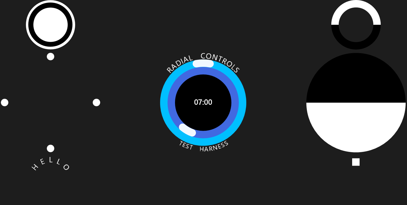
A circular controls library for Windows 8 Apps.
- Chains - for circular text
- Sliders - for time pickers
- Arcs - for doughnut charts
- Slices - for pie charts
- Discs - for circular fills
- Rings - for jewelry
The library also contains some ready-made examples.
RadialControls is available as a NuGet package.
In Visual Studio, create a blank Windows 8.1 or Windows Universal app.
- Right click on the project and click 'Manage NuGet Packages...'
- When the package manager appears, search for RadialControls.
- Click 'Install' and follow the prompts
That's it! You now have the tools you need to make something...
In MainPage.xaml, add the following namespace declarations for the Page.
xmlns:control="using:Thorner.RadialControls.Controls"
xmlns:example="using:Thorner.RadialControls.Examples"
Now go ahead and make some controls inside the Grid panel e.g.
<Grid>
  <example:TimePicker/>
</Grid>
You may get a 'XAML parsing failed' warning (doesn't seem to matter!).
There are 3 main types of control (hardest first).
-
Halo - A halo is a panel which can be used to manage nested rings or bands of controls, such as the hour and minute sliders on a time picker or clock
-
HaloRing / HaloChain - A ring can be used to position items around a circle; a chain is a specialised ring used to display circular text
-
HaloArc / HaloSlice - An arc is a circular path, like a slice of doughnut; a slice is a filled arc, like a slice of pie
The Slider control can also be used inside a Halo.
Draw three concentric bands (white, black and white). The Halo will occupy all the space given to it.
 <control:Halo Grid.Row="0" Grid.Column="0" Margin="10">
     <control:HaloDisc Fill="White" control:Halo.Thickness="10" control:Halo.Band="2"/>
     <control:HaloDisc Fill="Black" control:Halo.Thickness="20" control:Halo.Band="1"/>
     <control:HaloDisc Fill="White" control:Halo.Thickness="10"/>
 </control:Halo>
Any children which are not in a band will be placed in the centre of the halo. Controls can share a band.
Draw four dots in a circle (0, 90, 180, 270 degrees). The dots will be rotated around the centre of the ring.
<control:HaloRing>
    <Ellipse Width="30" Height="30" Fill="White"/>
    <Ellipse Width="30" Height="30" Fill="White" control:HaloRing.Angle="90"/>
    <Ellipse Width="30" Height="30" Fill="White" control:HaloRing.Angle="180"/>
    <Ellipse Width="30" Height="30" Fill="White" control:HaloRing.Angle="270"/>
</control:HaloRing>
Alternatively, you can use the Offset property, which will place the child at a point on the circle, without rotating it.
Draw a circular label, centred at 0 degrees. Take a look at Examples/RingLabel for an out-of-the-box label control.
<control:HaloChain Tension="0.5" Spacing="10">
    <TextBlock Text="H" FontSize="30"/>
    <TextBlock Text="E" FontSize="30"/>
    <TextBlock Text="L" FontSize="30"/>
    <TextBlock Text="L" FontSize="30"/>
    <TextBlock Text="O" FontSize="30"/>
</control:HaloChain>
The HaloChain also has Angle and Offset properties, which behave the same as for HaloRing, but apply to the chain as a whole.
Draw two half-rings (white and black), centred at 0 and 180 degrees. I've assumed the arcs are inside a Grid or Halo panel.
<control:HaloArc Spread="180" Tension="0.5" Stroke="White" StrokeThickness="30"/>
<control:HaloArc Angle="180" Spread="180" Tension="0.5" Stroke="Black" StrokeThickness="30"/>
The HaloArc also has an Offset property, which is added to the Angle to determine where to start drawing.
Draw two semi-circles (white and black), where the line of symmetry is horizontal. Again, I assume an appropriate parent panel.
<control:HaloSlice Offset="90" Spread="180" Fill="White"/>
<control:HaloSlice Offset="90" Angle="180" Spread="180" Fill="Black"/>
In general, offset means origin - where to start drawing, and angle means a rotation about the centre, starting from the offset.
Draw a slider with a rectangular thumb. Take a look at Examples/ArcSlider for a slicker version of this control.
<control:Slider Angle="{Binding SomeProperty}">
   <control:Slider.Thumb>
      <ControlTemplate>
         <Rectangle Width="30" Height="30" Fill="White"/>
      </ControlTemplate>
   </control:Slider.Thumb>
</control:Slider>
The Slider control also has an Offset property to set where the zero Angle should be (vertical up by default).
The library includes several examples of extending the basic controls.
Restyles the basic Slider control using a HaloArc.
<example:ArcSlider Offset="90" Angle="0"/>
This example also adds click animation to make the slider feel like a button.
Wraps a HaloChain to provide a simple control for displaying circular text.
<example:RingLabel Text="HELLO" FontSize="30"/>
<example:RingLabel Text="WORLD" Flip="True" FontSize="30"/>
The text is displayed either at the top or the bottom of a circle using the Flip property.
Combines several basic controls to form a time picker.
<example:TimePicker Time="{Binding SomeTimeSpan}"/>
Converters are used to adjust the hour/period when the hands wrap, and to display the time.