The list-ui object creates blocky, list items with lines between them.
$ npm install --save-dev aleut.objects.list-ui
Basic usage of the Block object uses the required classes:
<ul class="o-list-ui">
	<li class="o-list-ui__item">Foo</li>
	<li class="o-list-ui__item">Bar</li>
	<li class="o-list-ui__item">Baz</li>
</ul>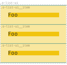
The only valid children of the .o-list-ui node are .o-list-ui__item.
Other, optional classes can supplement the required base classes:
.o-list-ui--[tiny|small|large|huge]: alter the spacing between list-items
For example:
<ul class="o-list-ui o-list-ui--small">
	<li class="o-list-ui__item">Foo</li>
	<li class="o-list-ui__item">Bar</li>
	<li class="o-list-ui__item">Baz</li>
</ul>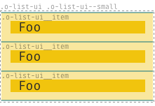
To modify the base styling you can change these variables and set them to your preferred options before you import the _objects.list-ui.scss-file.
$o-list-ui-border-width:    1px !default;
$o-list-ui-border-style:    solid !default;
$o-list-ui-border-color:    #ccc !default;