A set of custom UWP controls and utilities that I have built for my apps. I will continue to add to this repo from my personal collection of doo-dads and bobbles and as a I build new ones 🚀
| Branch | Build Status |
|---|---|
master |
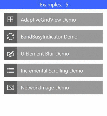
| Component (w/ jumplink) | Namespace | Description |
|---|---|---|
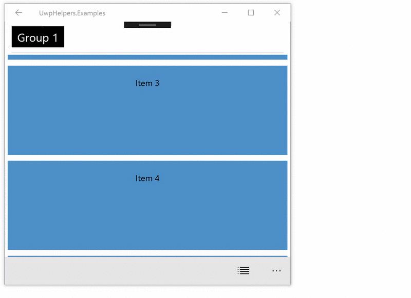
| AdaptiveGridView | UwpHelpers.Controls.ListControls |
Maintains aspect ratio of items as column width changes |
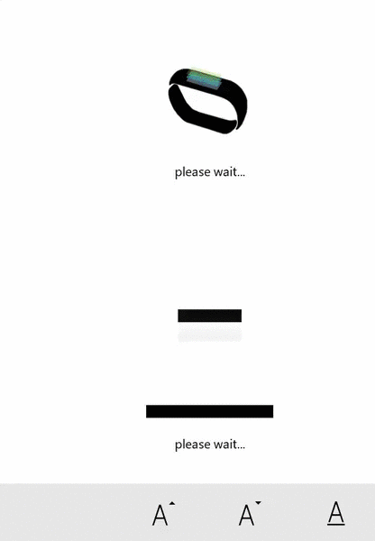
| BusyIndicators | UwpHelpers.Controls.BusyIndicators |
Custom busy indicators |
| BlurElementAsync | UwpHelpers.Examples.Helpers |
Converts any UIElement into a blurred bitmap |
| IncrementalLoadingCollection | UwpHelpers.Controls.Common |
Use this for lazy-loading scenarios, demo in Examples |
| NetworkImage | UwpHelpers.Controls.ImageControls |
An Image control that shows download progress |
| DownloadStreamWithProgressAsync | UwpHelpers.Controls.Extensions |
HttpClient Extension methods that reports download progress |
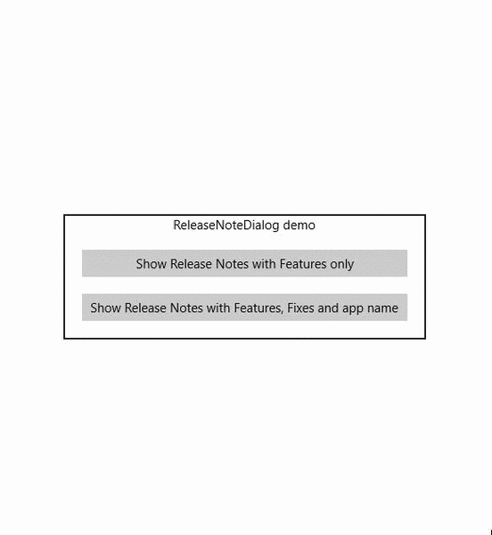
| ReleaseNotesDialog | UwpHelpers.Controls.Dialogs |
Shows a list of Features and Fixes using the familiar ContentDialog approach |

- MinItemWidth -
double: Sets minimum width of GridView items. - MinItemHeight -
double: Sets the minimum height of GridView items.
<listControls:AdaptiveGridView ItemsSource="{Binding ListItems}"
       MinItemHeight="105"
MinItemWidth="315">- BandBusyIndicator
- DownloadUploadIndicator
- IsActive -
boolean: Shows or hides the indicator. - Direction -
AnimationDirection: The direction of the animation. - DisplayMessage -
string: Message shown when active. - DisplayMessageSize -
double: Message font size.
<busyIndicators:BandBusyIndicator IsActive="{Binding IsBusy}"
      DisplayMessage="busy..."
      Direction="Uploading"  />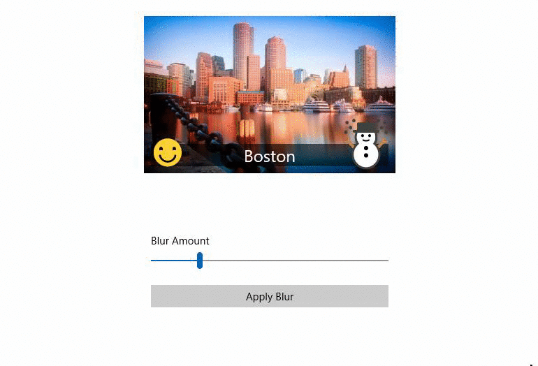
//You can pass any UIElement to the method and it will render all of the children into a bitmap with a Blur applied
var blurredElement = await ContentToBlur.BlurElementAsync();

//example: you can then set Background brush of a Grid
ContentRootGrid.Background = new ImageBrush
{
  ImageSource = blurredBitmapImage,
  Stretch = Stretch.UniformToFill
};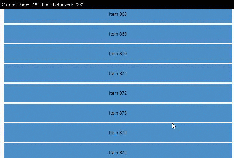
<ListView ItemsSource="{Binding InfiniteItems}" />ViewModel or Code-Behind
InfiniteItems = new IncrementalLoadingCollection<T>((cancellationToken, count) => Task.Run(GetMoreData, cancellationToken));

//and GetMoreData is
private async Task<ObservableCollection<T>> GetMoreData()
{
   return more items of type ObservableCollection<T>
}
- ImageUrl -
string: String URL of the photo. - IsActive -
bool: The control manages this automatically, but you can manually enable/disable if needed . - DownloadPercentageVisibility -
Visibility: If you want to hide the progress percentage. - ProgressRingVisibility -
Visibility: If you want to hide the ProgressRing animation. - ImageStretch -
Stretch: Stretch property passed to the underlying Image control.
<imageControls:NetworkImage ImageUrl="http://bigimages.com/MyHugeImage.jpg" />
- Url -
string: Url of the thing you want to download. - Reporter -
Progress<DownloadProgressArgs>- reports the progress via event args.
Note: There are a couple more methods in the helper class (i.e. DownloadStringwithProgressAsync)
void SetupReporter()
{
    var reporter = new Progress<DownloadProgressArgs>();
    reporter.ProgressChanged += Reporter_ProgressChanged;

    var imageStream = await new HttpClient(myFavoriteHandler).DownloadStreamWithProgressAsync(bigImageUrl, reporter)
}

private void Reporter_ProgressChanged(object sender, DownloadProgressArgs e)
{
    SomeProgressBar.Value = e.PercentComplete;
}
- AppName -
string: Sets the dialog title (default value is "Release Notes"). - Features -
ObservableCollection<string>: List of new features. - Fixes -
ObservableCollection<string>: List of fixes. - UseFullVersionNumber -
bool: Determines whether to show the manifest build number (e.g. 1.0.0).
var rnd = new ReleaseNotesDialog();

rnd.AppName = "My App Name";
rnd.Message = "Thank you for checking out ReleaseNotesDialog! Here's a list of what's new and what's fixed:";

rnd.Features = new ObservableCollection<string>
{
    "Amazing feature!",
    "Added theming",
    "Backup and restore added!"
};

rnd.Fixes = new ObservableCollection<string>
{
    "Fixed crash when opening",
    "Added text wrapping to fix text being cut off"
};

await rnd.ShowAsync();
Lancelot Software © 2010-2021