Internal storybook plugin to convert stories into widgets

See the video "Walkthrough creating a widget using storybook"
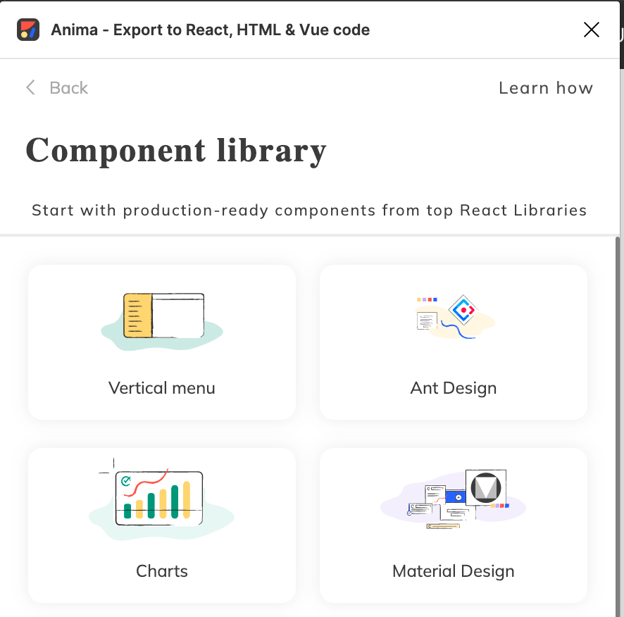
A widget library is a colection of widgets. For example, Vertical Menu and Ant Design are widget libraries.
- Clone this repository
git clone git@github.com:AnimaApp/storybook-addon-internal.git- Install the dependencies (requires NPM version >= 8.3.0)
npm install- Start the storybook server
npm start- All widget libraries are a project present in the folder
./widget-libraries. Let's create a new one:
mkdir widget-libraries/sampleecho "{
\"name\": \"@animaapp/widgets-sample\",
\"version\": \"1.0.0\",
\"private\": true,
\"scripts\": {},
\"dependencies\": {},
\"devDependencies\": {}
}" > widget-libraries/sample/package.jsonecho "module.exports = {
name: \"Sample\",
description: \"My sample widget library\",
short_description: \"Sample widget library\",
thumbnail_url: \"https://animaapp.s3.amazonaws.com/widgets/vertical-menu.svg\",
empty_thumb_url: \"https://animaapp.s3.amazonaws.com/widgets/vertical-menu.svg\",
sample_file_figma_url: \"\",
styles_import: [],
excluded_packages: [],
theme: {},
};" > widget-libraries/sample/metadata.jsYou can later add dependencies on package.json. For instance, if your story requires antd, you should add it on ./widget-libraries/sample/package.json, not on ./package.json.
The file metadata.js is used to configure how the widget library will be displayed and handled by Figma Plugin.
- The storybook stories are the widgets component itself available on Figma Plugin. All stories should be present in the folder
./widget-libraries/{library-name}/stories. Let's create our first story:
mkdir widget-libraries/sample/storiesecho "import React from \"react\";
export default {
title: \"Sample/Hello\",
component: \"p\",
};
const Template = () => (
<p>Hello</p>
);
export const Simple = Template.bind({});" > widget-libraries/sample/stories/Hello.stories.jsxNote that all stories should have the title following the pattern {widget-library-name}/{widget-name}. On this example, it's Sample/Hello.
A widget can be configurable at Figma Plugin. For example, to add the following configuration:
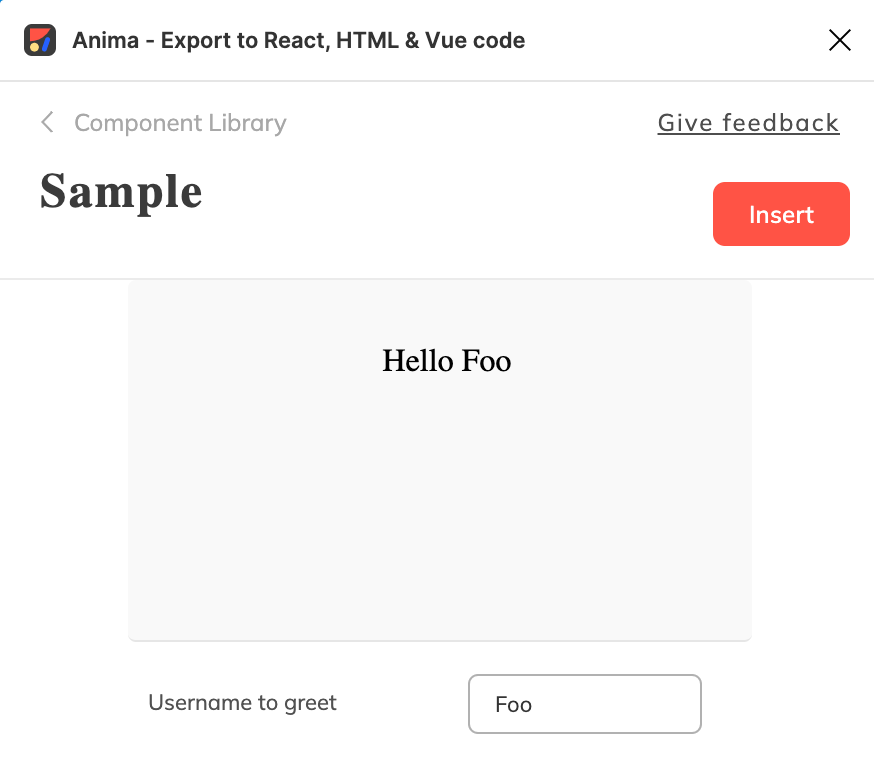
You should do the following changes:
 export default {
   title: "Sample/Hello",
   component: "p",
+  argTypes: {
+    username: { description: "Username to greet" },
+  },
 };

-const Template = () => (
-  <p>Hello</p>
+const Template = ({ username }) => (
+  <p>Hello {username}</p>
 );

 export const Simple = Template.bind({});
+Simple.args = {
+  username: "Foo",
+};A compound widget is a story consists of sub-stories inside it.
For example, MenuItemGroup.stories is a compound widget, it uses SimpleMenuItem.stories as a sub-story.
In order to create a compound widget, we should pay attention to the following areas:
In our following example, we have 2 different sub-stories: SimpleTestSubMenu and SimpleTestMenuItem.
We should go to those stories and add a storyInfo property. The storyInfo will give the Anima add-on plugin the ability to understand which are the connected sub-stories and retrieve their data.
The storyInfo property is a dictionary which includes name and kind keys. The name should be the same as the sub-story name and the kind should be taken from the sub-story title.
An example of the SimpleTestMenuItem sub-story:
// TestMenuItem.stories
const Template = (args) => (
 <TestMenuItem label={args.label}/>
);

export const SimpleTestMenuItem = Template.bind({});
SimpleTestMenuItem.args = {
 label: "A Menu Item",
};
SimpleTestMenuItem.storyInfo = {
 name: "SimpleTestMenuItem",
 kind: "Vertical menu/TestMenuItem",
};Import the relevant sub-stories
// TestMenu.stories
import { SimpleTestSubMenu } from "./TestSubMenu.stories";
import { SimpleTestMenuItem } from "./TestMenuItem.stories";Each arg pointing to a sub-story should be defined as follows:
// TestMenu.stories
export default {
  title: "TestMenu",
  component: TestMenu,
  parameters: {
    docs: {
      description: {
        component: "",
      },
    },
  },
  argTypes: {
    submenu: {
      type: "story",
      description: "Simple Test Sub-Menu",
      storyInfo: SimpleTestSubMenu.storyInfo,
    },
    menuitem: {
      type: "story",
      description: "Simple Test Menu-Item",
      storyInfo: SimpleTestMenuItem.storyInfo,
    },
  },
};An example of the TestMenu parent story, which includes the SimpleTestMenuItem and SimpleTestSubMenu sub stories:
// TestMenu.stories
const Template = (args) => (
  <TestMenu {...args}>
    <SimpleTestMenuItem {...args.menuitem} />
    <SimpleTestSubMenu {...args.submenu} />
  </TestMenu>
);

export const SimpleTestMenu = Template.bind({});
SimpleTestMenu.args = {
  title: "A Menu",
  submenu: { ...SimpleTestSubMenu.args },
  menuitem: { ...SimpleTestMenuItem.args },
};Moving to sub-stories representation in Storybook, may bring issues when rendering child components as independent stories, since some of those components rely on their parent in order to be rendered properly.
In order to overcome this problem, we are using the custom decorator withStoryContainer.
We may define the parent container in the child story and the decorator will take care of wrapping the “orphan” story.
In the following example, we are writing a story for a MenuItem, which must live inside a Menu. We will define a container key inside the parameters dictionary with the parent component.
// MenuItem.stories.jsx
export default {
  title: "MenuItem",
  component: Antd.Menu.Item,
  parameters: {
    docs: {
      description: {
        component: "",
      },
    },
    container: Antd.Menu
  },
};There are cases where the arg exposed to the user is different than its corresponding value inside the story. Let’s take the AntD menu icon as an example. We would like the user to select an icon by its name, but the real value will be an AntD icon component:
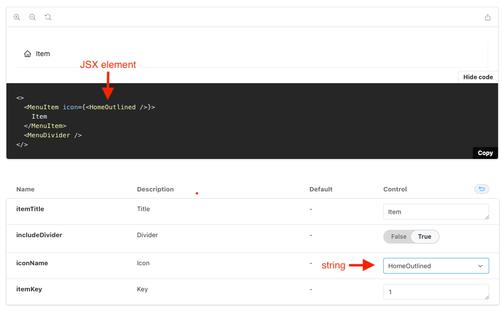
In this case we would use the withArgsMapping decorator to instruct Storybook that the arg should be transformed into a different type prior the rendering process.
// widget-libraries/vertical-menu/decorators/withIconMapped.tsx
import React from 'react';
import * as AntDesignIcons from "@ant-design/icons/lib/icons";
import { withArgsMapping } from "../../../src/decorators";

const nameToIcon = (name: string) => {
  const Icon = AntDesignIcons[name];
  return Icon ? <Icon /> : <></>;
};

const argsMapping = { iconName: nameToIcon };
const withIconMapped = withArgsMapping(argsMapping);

export default withIconMapped;
// widget-libraries/vertical-menu/stories/MenuItem.stories.jsx
import withIconMapped from "../decorators/withIconMapped";
export default {
decorators: [withIconMapped],
};In addition to withArgsMapping which covers the rendering aspect in the Storybook UI, we need to provide a transformation function that will be used by the Story code compiler.
A transformation function is a simple EJS template which relies on a single input param:
// widget-libraries/vertical-menu/stories/MenuItem.stories.jsx
const iconTransform = "<% if (param !== 'None') { %><AntDesignIcons.<%= param %> /><% } else { %> '' <% } %>";

export default {
  argTypes: {
    iconName: {
      type: "options",
      options: options,
      description: "Icon",
      transform: iconTransform
    },
  },
};
In the above example, assuming the iconName param is "HomeOutlined", the following code:
<Antd.Menu.Item key={args.itemKey} icon={args.iconName}>will be converted to:
<Antd.Menu.Item key={args.itemKey} icon={<AntDesignIcons.HomeOutlined/>}>Another example of generating a random id to the key attribute of menu items:
const keyTransform = "<%- `\"${(Math.floor(Math.random() * 1000) + 1).toString()}\"` %>";

export default {
  argTypes: {
    itemKey: {
      description: "Key",
      hidden: true,
      transform: keyTransform
    },
  }
};

const Template = (args) => {
  return (
    <>
      <Antd.Menu.Item key={args.itemKey} icon={args.iconName}>
        {args.itemTitle}
      </Antd.Menu.Item>
      {args.includeDivider && <Antd.Menu.Divider />}
    </>
  );
};