This document specifies the visual design of Shields badges.
- legible: it should be as easy to read the metadata provided by a badge as it is to read body copy inside of a README file regardless of display resolution
- semantic: the purpose of the information provided by a badge should be self-evident
- non-promotional: badges should refrain from advertising a service but instead provide value through the badge's information instead
- concise: one descriptive word on the left (the key), one piece of data on the right (the value)
- hyperlinked: badges can link to a third-party website providing more information, either related to the metadata provided by the badge or about the project the badge was used for (e.g. an open source library)
The key is shamelessly promoting the service provider instead of giving context to the value. If service providers want to promote themselves, they can simply encourage people to link back to them and let folks who are curious click on the button for more information.
The key clearly explains what the value stands for (the version of the software provided). The platform or service hosting the version of the software is only relevant to people who decide to click on an eventual link added to the badge itself but the value stands on its own with the metadata value it provides to viewers.
The design of our badges has been carefully considered to provide sufficient padding between the container badge and the text within. Badges should never have a fixed width. The letter spacing (or kerning) is deliberate and focused on clarity, so is the use of the Open Sans font face. Contrary to widely available web-safe alternative sans-serif fonts like Arial (a sloppy Helvetica ripoff) and Verdana (a sloppy Futura ripoff), Open Sans remains highly legible at very small sizes which is why it was chosen.
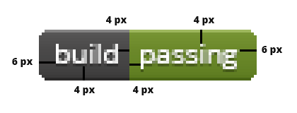
When it comes to color choices, the focus is on clear contrast between the text and the background color on both sides of the badge (key and value). The two sides are also contrasted with each other with the key side always retaining a dark grey color for consistency, and the value side taking on whichever background color better conveys the meaning of the data provided (e.g. green for a successful build, red for a failed build).