USWDS - Checkbox + Radio: create background color variable. #4199
Conversation
| @@ -1,3 +1,131 @@ | |||
| @mixin format-input { | |||
There was a problem hiding this comment.
Added these two mixins to improve the readability of the component code.
Before:
.usa-checkbox__input:disabled + .usa-checkbox__label::before,
.usa-radio__input:disabled + .usa-radio__label::before {
  background: color("disabled-light");
  box-shadow: 0 0 0 units($theme-input-select-border-width) color("disabled");
  cursor: not-allowed;
}
After:
.usa-checkbox__input,
.usa-radio__input {
  &:disabled {
    @include format-input {
        background: color("disabled-light");
        box-shadow: 0 0 0 units($theme-input-select-border-width) color("disabled");
        cursor: not-allowed;
    }
  }
}
| } | ||
| } | ||
|
|
||
| @mixin checkbox-and-radio-colors( |
There was a problem hiding this comment.
This long mixin allows users to write scoped colors.
It takes two color token inputs, $bg-color and checked-color. Neither are required and will assume the values in settings if omitted. It returns all the code necessary to set checkbox and radio inputs for the desired scope.
For instance, if you wanted to change the color of all checkbox and radio elements within a .checkbox-tests container, you could do something like the following
.checkbox-tests {
  @include set-text-and-bg("green-80");
  @include checkbox-and-radio-colors("green-80", "green-warm-10v");
  padding: units(2);
  border-radius: radius("md");
}
| } | ||
|
|
||
| @mixin checkbox-and-radio-colors( | ||
| $bg-color: $theme-input-background-color, |
There was a problem hiding this comment.
The bg-color default the component bg color from settings...
|
|
||
| @mixin checkbox-and-radio-colors( | ||
| $bg-color: $theme-input-background-color, | ||
| $checked-color: "default" |
There was a problem hiding this comment.
...and the default checked color is either the dark or light link color set in settings.
| @@ -11,18 +139,65 @@ | |||
| } | |||
| } | |||
|
|
|||
| @include checkbox-and-radio-colors; | |||
There was a problem hiding this comment.
Here, I'm using the mixin to set the component's default colors.
| .usa-checkbox__label-description, | ||
| .usa-radio__label-description { | ||
| display: block; | ||
| font-size: size("ui", "2xs"); | ||
| margin-top: units(1); | ||
| text-indent: 0; | ||
| } | ||
|
|
||
| // Test code for scoped custom colors |
There was a problem hiding this comment.
This test code is used to power the example here: https://federalist-3b6ba08e-0df4-44c9-ac73-6fc193b0e19c.app.cloud.gov/preview/uswds/uswds/jm-tile-add-bg/components/preview/checkbox--test.html
We should comment it out before going into production
| @@ -80,16 +80,14 @@ $theme-footer-max-width: "desktop" !default; | |||
| // Form and input | |||
| $theme-checkbox-border-radius: "sm" !default; | |||
| $theme-form-font-family: "ui" !default; | |||
| $theme-input-background-color: default !default; | |||
There was a problem hiding this comment.
I changed this from a tile-specific background color to an input background color since this will now apply to original checkbox and radios as well
| $theme-input-line-height: 3 !default; | ||
| $theme-input-max-width: "mobile-lg" !default; | ||
| $theme-input-select-border-width: 2px !default; | ||
| $theme-input-select-size: 2.5 !default; | ||
| $theme-input-state-border-width: 0.5 !default; | ||
| $theme-input-tile-background-color-selected: "primary-lighter" !default; |
There was a problem hiding this comment.
The system now sets this automatically based on the background color. The tile background color is a more transparent version of the calculated text/border color
| $theme-input-tile-border-radius: "md" !default; | ||
| $theme-input-tile-border-width: 2px !default; | ||
| $theme-input-tile-border-color: "base-lighter" !default; |
There was a problem hiding this comment.
The system now sets this automatically as a transparent version of the calculated text color
| $theme-input-tile-border-radius: "md" !default; | ||
| $theme-input-tile-border-width: 2px !default; | ||
| $theme-input-tile-border-color: "base-lighter" !default; | ||
| $theme-input-tile-border-color-selected: "primary-light" !default; |
There was a problem hiding this comment.
The system now uses the standard or reverse link color as the selected color instead of a special new color.
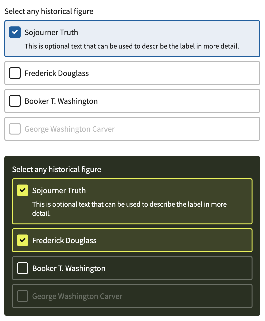
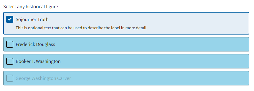
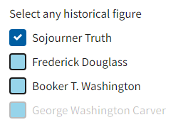
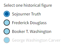
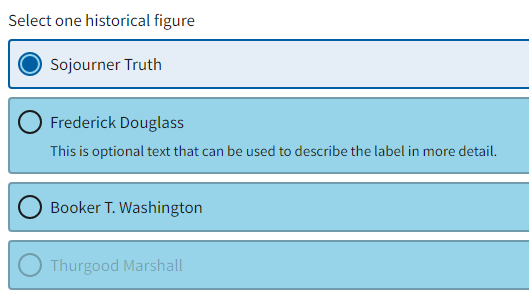
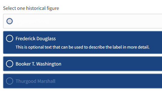
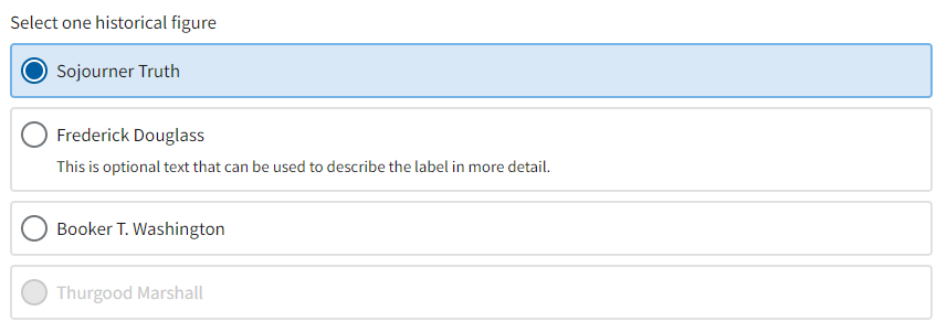
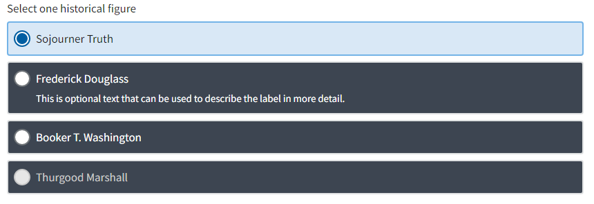
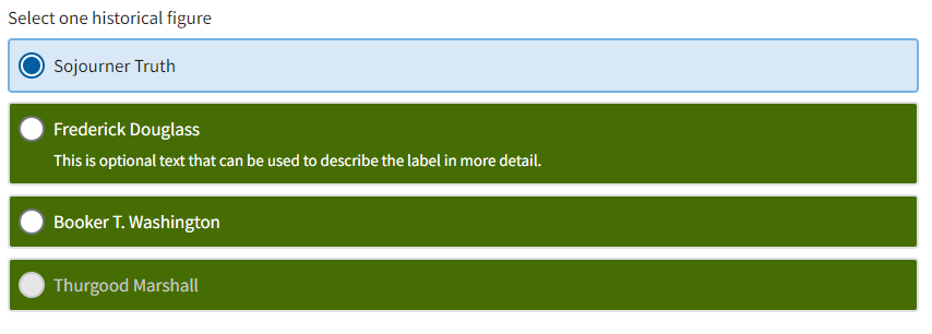
What I didThis new work allows users to change the output colors of default and tile checkboxes and radio buttons. The system will calculate the proper colors for all elements based on the set background and the values of standard and reverse text and link colors. It also includes a new mixin, This allows something like what we see below, where the top section uses colors derived solely from settings, and the bottom section includes new scoped color rules generated by the mixin:
Further notes in the code comments. What to check:
|
|
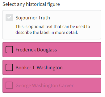
That is the expected result for using that setting (as built). If you change the value of I updated the code to give the selected background color to Note: This code is not meant to let designers give their tiles a separate background color independent from the form's background, like to give the tiles a yellow tile background on a white form background. We don't want the tiles to have a dramatically different look from the their surroundings. |
|
I see, thanks for the clarification. |
**Why:** Avoid future maintenance overhead incurred by version drift, incorporate latest features and updates, including upstream contributions previously implemented as overrides.

Changelog:
- https://github.com/uswds/uswds/releases/tag/v2.12.1
- https://github.com/uswds/uswds/releases/tag/v2.12.0

Incorporated revisions:
- uswds/uswds#4199
- uswds/uswds#4286
Description
Builds on the great work from @aduth on #4178.
Additional information
_settings-components.scssand_uswds-theme-components.scssset-text-and-bg()in checkbox and radio tiles to set accessible color on backgroundExamples
Default (white)
Base darker
Green 60v
Before you hit Submit, make sure you’ve done whichever of these applies to you:
npm testand make sure the tests for the files you have changed have passed.