Skip to content
New issue

Have a question about this project? Sign up for a free GitHub account to open an issue and contact its maintainers and the community.

By clicking “Sign up for GitHub”, you agree to our terms of service and privacy statement. We’ll occasionally send you account related emails.

Already on GitHub? Sign in to your account

Search field alignment issue on screen < 1220px #1068

Closed
ghost opened this issue Apr 11, 2019 · 6 comments
Closed

Search field alignment issue on screen < 1220px #1068

ghost opened this issue Apr 11, 2019 · 6 comments
Labels
bug Issue reports a bug resolved Issue is resolved, yet unreleased if open

Comments

@ghost
Copy link

ghost commented Apr 11, 2019

Description:

For screen sizes < 1220px the alignment of content inner and search is not working. The end of the content should align with the end of the search widget, like it does in >= 1220px. This is caused by erroneous margins of the source widget. I have a fix at https://github.com/matjaeck/mkdocs-material/commit/ce37adbde6b273f98a287b841adcc70a3a3cabe6 that is working for me, can PR if you want.

@squidfunk
Copy link
Owner

Could you please provide a screenshot which shows what you mean exactly? Furthermore, the changes on your branch look a little hacky to me. Happy to find the root cause and fix it, but first we need a thorough description of the issue including some visual clues.

@squidfunk squidfunk added the needs input Issue needs further input by the reporter label Apr 11, 2019
@ghost
Copy link
Author

ghost commented Apr 11, 2019

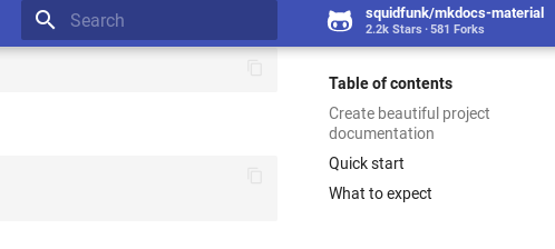
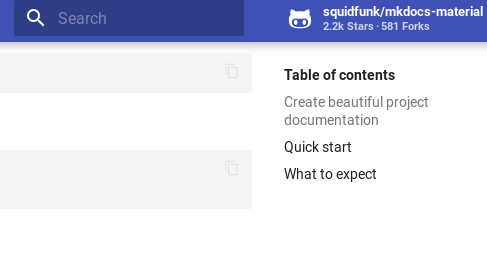
See missing screenshots below:

>= 1220px

material-align-2

< 1220px (Alignment issue of search field and content container)

material-align

This is how I calculated the .md-header-nav__source margins:

  • tablet +: 230px width + 8px margin-right (.md-header-nav__source) + 4px margin-right (.md-header-nav) gives us the sidebar width, add 16px additional margin-left to account for md-content-inner's margin-right of 16px.

  • screen +: like above but add 24px margin-left to account for md-content-inner's margin-right of 24px.

Removed the padding-right from md-source since it appeared not needed to me, but maybe I'm missing something here.

The margin-right: px2rem(-4px) that I added in my branch to md-search is indeed a hacky workaround for an issue that I caused when allowing disabling the primary sidebar, so not relevant for upstream.

Example of above (including other) changes is available at my WIP docs at https://matjaeck.github.io/OpenRADocs/traits/development/#

@squidfunk squidfunk added bug Issue reports a bug and removed needs input Issue needs further input by the reporter labels Apr 11, 2019
@squidfunk
Copy link
Owner

Thanks for the detailed explanation! Will look into it when I find the time.

@ghost
Copy link
Author

ghost commented Apr 11, 2019

FYI, I think the margin-right: px2rem(-4px) thing is actually fixing alignment issues resulting from different padding of md-header-nav__button and md-search, that only appear on tablet landscape + (when the search field is visible).

@squidfunk
Copy link
Owner

squidfunk commented Apr 28, 2019

Fixed in 50ea834. Moved spacing from .md-nav-header__source to .md-search__inner and added another breakpoint

@squidfunk squidfunk added the resolved Issue is resolved, yet unreleased if open label Apr 28, 2019
@squidfunk
Copy link
Owner

Released as part of 4.2.0.

Sign up for free to join this conversation on GitHub. Already have an account? Sign in to comment
Labels
bug Issue reports a bug resolved Issue is resolved, yet unreleased if open
Projects
None yet
Development

No branches or pull requests

1 participant