


Changelog for the official Nord website and documentation


This version mainly focused on the transition of the „Nord highlight.js“ port project. The implementation includes the port specific landing and docs pages as well as the installation & usage guides.
„Nord highlight.js“ Transition — #188 ⇄ #189 (⊶ c83114c5) ↠ Transferred all documentations, assets and visualizations from „Nord highlight.js“ to Nord Docs which will now serve as the single-source-of-truth™. Please see the corresponding issue in the Nord highlight.js repository to get an overview of what has changed for Nord highlight.js and what has been done to migrate to Nord Docs.
Landing Page

Docs Page

Installation & Usage Guide


This version mainly focused on the transition of the „Nord Xcode“ port project. The implementation includes the port specific landing and docs pages as well as the installation & activation and asset catalog guides.
„Nord Xcode“ Transition — #182 ⇄ #186 (⊶ 0732fd4c) ↠ Transferred all documentations, assets and visualizations from „Nord Xcode“ to Nord Docs which will now serve as the single-source-of-truth™. Please see the corresponding issue in the Nord Xcode repository to get an overview of what has changed for Nord Xcode and what has been done to migrate to Nord Docs.
Landing Page

Docs Page

Installation & Activation Guide

Asset Catalog Guide

Non-matching remark-lint ignore pattern — #180 ⇄ #181 (⊶ 8ae06b3b) ↠ Previously the defined pattern for directories were not matching due to the "asterisk" wildcard character at the end of the paths. These have been removed in order to make them work correctly.
Dependency Update April-October 2019 — #183 ⇄ #184 (⊶ b37ec8d6) ↠ Completed the regular batch update for outdated production and development dependencies.
The following packages have been deprecated in favour of new (scoped) packages:
eslint-config-arcticicestudio➔@arcticicestudio/eslint-configgatsby-mdx➔gatsby-plugin-mdxjest-dom➔@testing-library/jest-domreact-hooks-testing-library➔@testing-library/react-hooksreact-testing-library➔@testing-library/react
The react-pose and react-spring package were intentionally not updated in order to prevent incompatibilities. Due to the transitive dependency of react-pose to the stylefire package, some SVG animations would break because the latest version of stylefire changed the way how x & y CSS transform and translate property values are handled. This would result in SVG elements not being scaled from their original position but from the top of the viewBox.
Using the latest version of react-spring would cause a value not defined error for the animation of the floating port project logos.
Both problems will be solved later on by finding the root cause of the undefined value as well as migrating away from the deprecated react-pose package to the new framer-motion package and API.
The ESLint configuration has been adapted to the new @arcticicestudio/eslint-config package. This simplifies the configuration at all by removing custom overrides that were missing in the preset. It also removes the import of the import/no-extraneous-dependencies rule object from the @arcticicestudio/eslint-config-base package since the rule will be disabled for all files matching the **/.gatsby/**/*.js pattern.
The new preset also comes with the new development dependency package eslint-config-prettier. In order to resolve alias imports the eslint-import-resolver-alias package has also been added and configured.
After updating all configurations the whole code base has been linted and found errors and warnings have been fixed.
The awesome react-testing libraries moved to the @testing-library package scope which required some changes to be done to migrate the test setup:
- Updated all package import paths, e.g.
react-testing-libraryto@testing-library/react. - Removed the deprecated import of the
cleanup-after-eachfunction that yields the following warningThe module
@testing-library/react/cleanup-after-eachhas been deprecated and no longer does anything (it is not needed). You no longer need to import this module and can safely remove any import or configuration which imports this module. - Updated failing snapshots were only the class name of styled components changed. This is because the generated class names are now starting with a counter of
0instead of1causing only changes like this:-.c1 +.c0
- @mdx-js/react
1.0.6➔1.5.1 - axios
0.18.0➔0.19.0 - body-scroll-lock
2.6.1➔2.6.4 - date-fns
2.0.0-alpha.27➔2.4.1 - gatsby
2.3.29➔2.15.36 - gatsby-image
2.0.40➔2.2.27 gatsby-mdx➔ gatsby-plugin-mdx0.6.21.0.51- gatsby-plugin-canonical-urls
2.0.12➔2.1.11 - gatsby-plugin-catch-links
2.0.13➔2.1.13 - gatsby-plugin-google-gtag
1.0.16➔1.1.12 - gatsby-plugin-lodash
3.0.5➔3.1.11 - gatsby-plugin-manifest
2.0.29➔2.2.21 - gatsby-plugin-netlify
2.0.15➔ 2.1.19`` - gatsby-plugin-no-sourcemaps
2.0.2➔2.1.1 - gatsby-plugin-offline
2.0.25➔3.0.14 - gatsby-plugin-react-helmet
3.0.12➔3.1.11 - gatsby-plugin-remove-trailing-slashes
2.0.11➔2.1.10 - gatsby-plugin-robots-txt
1.4.0➔1.5.0 - gatsby-plugin-sharp
2.0.35➔2.2.29 - gatsby-plugin-sitemap
2.0.12➔2.2.17 - gatsby-plugin-styled-components
3.0.7➔3.1.9 - gatsby-plugin-webpack-size
0.0.3➔1.0.0 - gatsby-source-filesystem
2.0.32➔2.1.31 - gatsby-source-graphql
2.0.18➔2.1.18 - gatsby-transformer-sharp
2.1.18➔2.2.21 - gatsby-transformer-yaml
2.1.12➔2.2.13 - inter-ui
3.5.0➔3.10.0 - lodash
4.17.11➔4.17.15 - polished
3.2.0➔3.4.1 - react
16.8.6➔16.10.2 - react-dom
16.8.6➔16.10.2 - react-helmet
5.2.0➔5.2.1 - react-spring
8.0.7➔8.0.27 - semver
6.0.0➔6.3.0 - styled-components
4.2.0➔4.4.0
- @babel/core
7.4.3➔7.6.4 - @babel/plugin-proposal-class-properties
7.4.0➔7.5.5 - @babel/plugin-proposal-export-default-from
7.2.0➔7.5.2 - @babel/plugin-proposal-nullish-coalescing-operator
7.4.3➔7.4.4 - @babel/plugin-proposal-optional-chaining
7.2.0➔7.6.0 - @mdx-js/mdx
1.0.14➔1.5.1 - @svgr/webpack
4.2.0➔4.3.3 - babel-eslint
10.0.1➔10.0.3 - babel-jest
24.7.1➔24.9.0 - babel-plugin-styled-components
1.10.0➔1.10.6 - babel-preset-gatsby
0.1.11➔0.2.18 - del-cli
1.1.0➔3.0.0 - eslint
5.16.0➔6.5.1 eslint-config-arcticicestudio➔ @arcticicestudio/eslint-config>=0.4.0 <1.0.0>=0.8.0 <1.0.0- eslint-config-prettier 🆕
6.4.0 - eslint-import-resolver-jest
2.1.1➔3.0.0 - eslint-import-resolver-alias 🆕
1.1.2 - eslint-plugin-import
2.17.2➔2.18.2 - eslint-plugin-jsx-a11y
6.2.1➔6.2.3 - eslint-plugin-prettier
3.0.1➔3.1.1 - eslint-plugin-react
7.12.4➔7.16.0 - eslint-plugin-react-hooks
1.6.0➔2.1.2 - git-revision-webpack-plugin
3.0.3➔3.0.4 - glob
7.1.3➔7.1.4 - husky
2.1.0➔3.0.9 - jest
24.7.1➔24.9.0 jest-dom➔ @testing-library/jest-dom3.1.34.1.2- jest-junit
6.3.0➔8.0.0 - jest-styled-components
6.3.1➔6.3.3 - lint-staged
8.1.5➔9.4.2 - prettier
1.17.0➔1.18.2 - rehype-slug
2.0.2➔2.0.3 react-hooks-testing-library➔ @testing-library/react0.5.09.3.0react-testing-library➔ @testing-library/react-hooks6.1.22.0.3- remark-breaks
1.0.2➔1.0.3 - remark-cli
6.0.1➔7.0.0 - remark-github
7.0.6➔8.0.0 - remark-preset-lint-arcticicestudio
>=0.2.0 <1.0.0➔>=0.3.0 <1.0.0 - webpack-bundle-analyzer
3.3.2➔3.5.2


This version mainly focused on the transition of the „Nord Slack“ port project. The implementation includes the port specific landing and docs pages and the installation & activation guide.
„Nord Slack“ Transition — #175 ⇄ #176 (⊶ 28916bb5) ↠ Transferred all documentations, assets and visualizations from „Nord Slack“ to Nord Docs which will now serve as the single-source-of-truth™. Please see the corresponding issue in the Nord Slack repository to get an overview of what has changed for Nord Slack and what has been done to migrate to Nord Docs.
Landing Page

Docs Page

Installation & Activation Guide


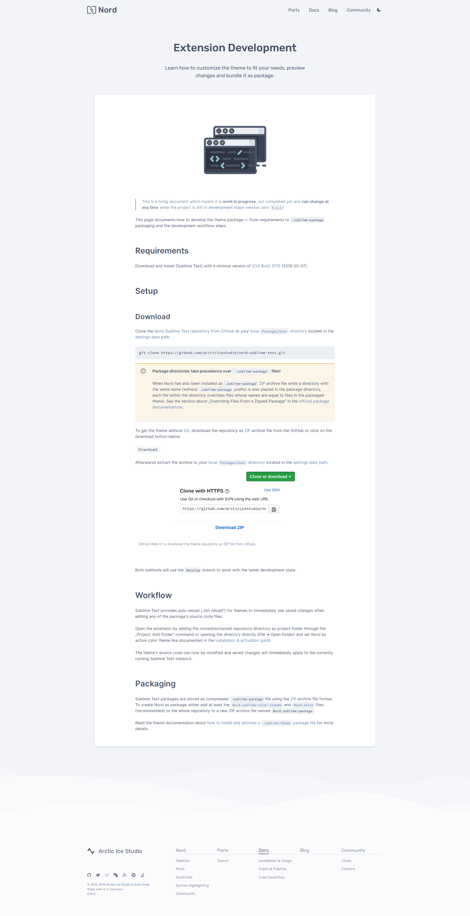
This version mainly focused on the transition of the „Nord Sublime Text“ port project. The implementation includes the port specific landing and docs pages, the installation & activation guide and package development page.
„Nord Sublime Text“ Transition — #171 ⇄ #174 (⊶ 06251893) ↠ Transferred all documentations, assets and visualizations from „Nord Sublime Text“ to Nord Docs which will now serve as the single-source-of-truth™. Please see the corresponding issue in the Nord Sublime Text repository to get an overview of what has changed for Nord Sublime Text and what has been done to migrate to Nord Docs.
Landing Page

Docs Page

Installation & Activation Guide

Package Development
Typo on Vim Port Project Landing Page — #172 (⊶ fd3f895b) by @impulse
↠ Removed an orphan gr token before link to the vim-go package in the plugin support section of the Vim port project landing page.


This version mainly focused on the transition of the „Nord Atom Syntax“ and Nord Atom UI. The implementation includes port specific landing (syntax/UI) and „docs“ (syntax/UI) page, the „installation & activation guide“ (syntax/UI) and how to develop the theme (syntax/UI).
„Nord Atom Syntax“ Transition — #168 ⇄ #170 (⊶ 82dcda81) ↠ Transferred all documentations, assets and visualizations from „Nord Atom Syntax“ to Nord Docs which will now serve as the single-source-of-truth™. Please see the corresponding issue in the Nord Atom Syntax repository to get an overview of what has changed for Nord Atom Syntax and what has been done to migrate to Nord Docs.
Landing Page

Docs Page

Installation & Activation Guide

Package Development

„Nord Atom UI“ Transition — #166 ⇄ #167 (⊶ 53b712c0) ↠ Transferred all documentations, assets and visualizations from „Nord Atom UI“ to Nord Docs which will now serve as the single-source-of-truth™. Please see the corresponding issue in the Nord Atom UI repository to get an overview of what has changed for Nord Atom UI and what has been done to migrate to Nord Docs.
Landing Page

Docs Page

Installation & Activation Guide

Configurations

Package Development

Duplicate path separator in URL mappings — #169 (⊶ 12e52c01)
↠ Some URL mapping constants for specific port projects defined duplicate path separators. The value of the ROUTE_ROOT constant is set to / and the port constants contained the partial path ${ROUTE_ROOT}/ resulting in duplicate path separators //. This has been fixed by removing the extra / character leaving only the correct ROUTE_ROOT constant that resolves into a single path separator.
Reversed download button targets for Adobe swatches — #162 (⊶ d799131a) by @mrymtsk
↠ Fixed the download buttons for Adobe swatches where the .ase file was linked to the .aco file while the button for the .aco file was in section for the Adobe Swatch Exchange file.
Typo on Vim landing page for lightline — #164 ⇄ #165 (⊶ 177f2906) by @jmurinello
↠ Fixed the missing letter t in the link for lightline located in the hero section of the Vim port project landing page.
Missing whitespace in changelog — #161 (⊶ 453601e9) by @mosn ↠ Fixed a missing whitespace in the changelog after a closing link square bracket.


This version mainly focused on the transition of the „Nord dircolors“ port project. The implementation includes port specific landing and docs page, the installation & activation guide and supported data and node types page.
„Nord dircolors“ Transition — #159 ⇄ #160 (⊶ 1e2a61f6) ↠ Transferred all documentations, assets and visualizations from „Nord dircolors“ to Nord Docs which will now serve as the single-source-of-truth™. Please see the corresponding issue in the Nord dircolors repository to get an overview of what has changed for Nord dircolors and what has been done to migrate to Nord Docs.
Landing Page

Docs Page

Installation & Activation Guide

Type Support


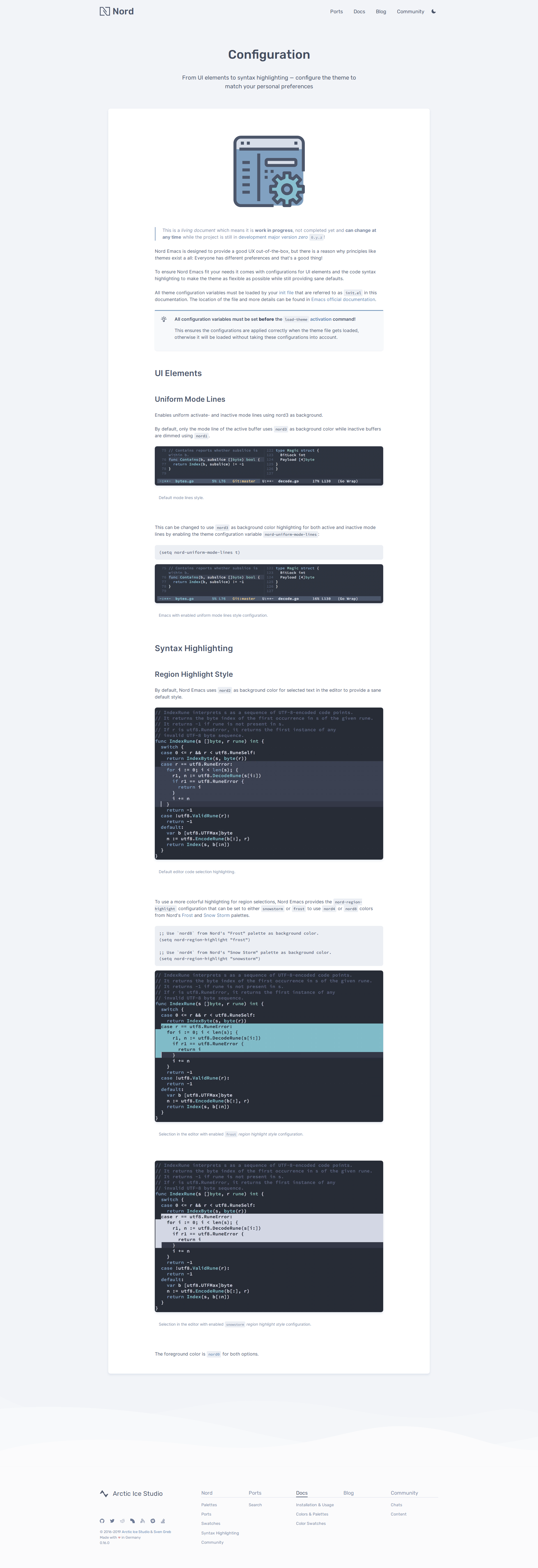
This version mainly focused on the transition of the „Nord Emacs“ port project. The implementation includes port specific landing and docs page, the installation & activation guide and configuration page.
„Nord Emacs“ Transition — #155 ⇄ #158 (⊶ 9569306d) ↠ Transferred all documentations, assets and visualizations from „Nord Emacs“ to Nord Docs which will now serve as the single-source-of-truth™. Please see the corresponding issue in the Nord Emacs repository to get an overview of what has changed for Nord Emacs and what has been done to migrate to Nord Docs.
Landing Page

Docs Page

Installation & Activation Guide

Configuration Guide
Missing Video Metadata In Docs Page Template — #157 (⊶ ce1f5768)
↠ The Video component maps the video file metadata received from props.sources (array of objects) to the <source> HTML tag, but for docs pages the MDX DocsPage component only passed down the publicUrl metadata field resulting in a array of strings. This caused the Video component failing to load the video file(s) for MDX docs pages.
To fix the invalid mapping the DocsPage component now passes down the whole video file metadata object instead of only the publicUrl (string) field.
This version mainly focused on the transition of the „Nord tmux“ port project. The implementation include port specific landing and docs page, the installation & activation guide, configuration guide and plugin support pages.
„Nord tmux“ Transition — #152 ⇄ #153 (⊶ a138cc24) ↠ Transferred all documentations, assets and visualizations from „Nord tmux“ to Nord Docs which will now serve as the single-source-of-truth™. Please see the corresponding issue in the Nord tmux repository to get an overview of what has changed for Nord tmux and what has been done to migrate to Nord Docs.


Screenshot showing Go syntax highlighting — #151 (⊶ 42b2b609) ↠ Added a new screenshot asset for the „Nord Visual Studio Code“ port project showing the Go syntax in order to fix the bug described in nordtheme/visual-studio-code#140 regarding the usage of duplicate assets.
This version mainly focused on the transition of the „Nord Visual Studio Code“ port project. The implementation include port specific landing and docs page, the installation & activation guide, customization and development guide.
„Nord Visual Studio Code“ Transition — #149 ⇄ #150 (⊶ c3fd6058) ↠ Transferred all documentations, assets and visualizations from „Nord Visual Studio Code“ to Nord Docs which will now serve as the single-source-of-truth™. Please see the corresponding issue in the Nord Visual Studio Code repository to get an overview of what has changed for Nord Visual Studio Code and what has been done to migrate to Nord Docs.


Nord Vim „bold font rendering“ configuration — #147 ⇄ #148 (⊶ ef0cb597)
↠ Added documentations for Nord Vim's new nord_bold configuration implemented in nordtheme/vim#161.
This version mainly focused on the transition of the „Nord Vim“ port project. The implementation include port specific landing and docs page, the installation & activation guide, configuration and customization guide.
„Nord Vim“ Transition — #143 ⇄ #146 (⊶ 6c804f42) ↠ Transferred all documentations, assets and visualizations from „Nord Vim“ to Nord Docs which will now serve as the single-source-of-truth™. Please see the corresponding issue in the Nord Vim repository to get an overview of what has changed for Nord Vim and what has been done to migrate to Nord Docs.


MDX v1 remark/rehype plugin loading after migration — #144 ⇄ #145 (⊶ 182f57f4)
↠ Fixed the loading of MDX remark/rehype plugins after the migration to MDX 1.0.0 in #137. The now deprecated mdPlugins and hastPlugins options were not replaced with their (new named) respective
equivalents remarkPlugins and rehypePlugins. Even if the documentation states that the options will be removed in v2 and are still supported (only showing a warning in the console when still used), the defined plugins were not loaded anymore causing e.g. no more automatic generation of id attributes for headers in MDX content.
Therefore, to finish 100% of the migration, both options have been renamed.
This version mainly focused on the transition of the „Nord JetBrains“ port project. The implementation include port specific landing and docs page, the installation & activation guide and development/contribution guide.
„Nord JetBrains“ Transition — #140 ⇄ #142 (⊶ 31a8666a) ↠ Transferred all documentations, assets and visualizations from „Nord JetBrains“ to Nord Docs which will now serve as the single-source-of-truth™. Please see the corresponding issue in the Nord JetBrains repository to get an overview of what has changed for Nord JetBrains and what has been done to migrate to Nord Docs.


Invalid image paths after asset restructuring — #136 (⊶ 819d3258) ↠ Fixed invalid image path for the repository hero caused by PR #135.
Invalid download URL for Apple macOS color swatch file — #141 (⊶ 2505faf5) reported by @jblanton on Twitter
↠ Fixed the invalid download URL for the Apple macOS color swatch file in the docs that used a lowercase n instead of an uppercase N for the file name.
„Nord JetBains“ project renaming — #138 (⊶ b435e0ef)
↠ Adapted the port docs, pages and components to the renaming of the „Nord JetBain“ project (nord-jetbrains-editor to nord-jetbrains) like documented in nordtheme/jetbrains#44.
Dependency Update February-April 2019 — #137 ⇄ #139 (⊶ 9de7e7b3) ↠ Completed the regular batch update for outdated production and development dependencies.
The largest change is the migration to MDX 1.0.0 using the official migration v0 to v1 guide.
React has been been updated to the latest patch version 16.8.6 and the prop-types package now comes with a handy new elementType prop type that can be used for React components.
Polished has been updated to the large 3.0.0 version milestone that comes with many features in form of new modules, improvements like a new error system as well as a a roadmap for v4.
The readableColor helper now offers the option to set the color(s) it returns for light or dark colors instead of only returning white or black based on the passed colors luminosity. stripUnit now offers the option to return the value and unit as an array, replacing the functionality of getValueAndUnit that'll is now deprecated and will be removed in v4.
All color modules will now also safely handle the transparent keyword instead of erroring out.
See the release notes for all details and changes.
React Waypoint has been updated to major version 9 that comes with improvements in library size and minifications in form of named exports for the Waypoint module as well as for all defined constants.
As of Babel 7.4.0, the @babel/polyfill package has been deprecated in favor of directly including core-js/stable and regenerator-runtime/runtime. Therefore the package has been replaced with the core-js package.
Prettier 1.17.0 now allows to use shared configurations making it much easier to setup new projects and keep the config code base at one single-point-of-truth™. Also Markdown tables are now kept compact when reformatting would exceed the print width making largely improving the readability.
The renderHook helper has been extracted from react-testing-library into the react-hooks-testing-library standalone package for better modularization. Therefore the package has been added as development dependency in order to test Hook based implementations.
Gatsby and all official plugins have been updated to the latest versions. This comes with new features that allow environment variables to be replaced per environment.
gatsby-plugin-manifest fixes the incorrect favicons size bug that often appeared as warning in the console.
gatsby-plugin-sharp now comes with a defaultQuality option to define the default quality for processed images instead of only allowing to set the quality through the GraphQL query.
gatsby-image now comes with a durationFadeIn option that accepts a number instead of boolean to customize animation duration.
@babel/polyfilldeprecated and removed in favor of includingcore-js/stabledirectly- @mdx-js/tag
0.18.0➜0.20.3 - 🆕 core-js
2.6.5 - gatsby
2.0.75➔2.0.117 - gatsby
2.1.4➜2.3.29 - gatsby-image
2.0.30➜2.0.40 - gatsby-mdx
0.4.0➜0.6.2 - gatsby-plugin-canonical-urls
2.0.10➜2.0.12 - gatsby-plugin-catch-links
2.0.10➜2.0.13 - gatsby-plugin-google-gtag
1.0.13➜1.0.16 - gatsby-plugin-lodash
3.0.4➜3.0.5 - gatsby-plugin-manifest
2.0.17➜2.0.29 - gatsby-plugin-netlify
2.0.9➜2.0.15 - gatsby-plugin-offline
2.0.23➜2.0.25 - gatsby-plugin-react-helmet
3.0.6➜3.0.12 - gatsby-plugin-remove-trailing-slashes
2.0.7➜2.0.11 - gatsby-plugin-sharp
2.0.23➜2.0.35 - gatsby-plugin-sitemap
2.0.5➜2.0.12 - gatsby-plugin-styled-components
3.0.5➜3.0.7 - gatsby-plugin-svgr
2.0.1➜2.0.2 - gatsby-source-filesystem
2.0.20➜2.0.32 - gatsby-source-graphql
2.0.10➜2.0.18 - gatsby-transformer-sharp
2.1.15➜2.1.18 - gatsby-transformer-yaml
2.1.8➜2.1.12 - inter-ui
3.3.2➜3.5.0 - polished
2.3.3➜3.2.0 - prop-types
15.6.2➜15.7.2 - react
16.8.3➜16.8.6 - react-dom
16.8.3➜16.8.6 - react-pose
4.0.6➜4.0.8 - react-spring
8.0.7➜8.0.19 - react-waypoint
8.1.0➜9.0.2 - semver
5.6.0➜6.0.0 - styled-components
4.1.3➜4.2.0 - typeface-rubik
0.0.54➜0.0.72
- @babel/core
7.2.2➔7.4.3 - @babel/plugin-proposal-class-properties
7.3.0➔7.4.0 - @babel/plugin-proposal-nullish-coalescing-operator
7.2.0➔7.4.3 - @mdx-js/mdx
0.20.1➔1.0.14 - @mdx-js/tag ␡ Migrated to MDX v1 that replaced it with the new
@mdx-js/reactpragma package! - @mdx-js/react 🆕
1.0.6 - @svgr/webpack
4.1.0➔4.2.0 - babel-jest
24.1.0➔24.7.1 - babel-plugin-react-remove-properties
0.2.5➔0.3.0 - babel-preset-gatsby
0.1.7➜0.1.11 - eslint
5.14.0➜5.16.0 - eslint-plugin-import
2.16.0➜2.17.2 - eslint-plugin-react-hooks
1.0.2➜1.6.0 - husky
1.3.1➜2.1.0 - jest
24.1.0➜24.7.1 - jest-dom
3.0.2➜3.1.3 - jest-junit
6.2.1➜6.3.0 - lint-staged
8.1.3➜8.1.5 - prettier
1.16.4➜1.17.0 - react-hooks-testing-library 🆕
0.5.0 - react-testing-library
5.5.3➜6.1.2 - webpack-bundle-analyzer
3.0.3➜3.3.2

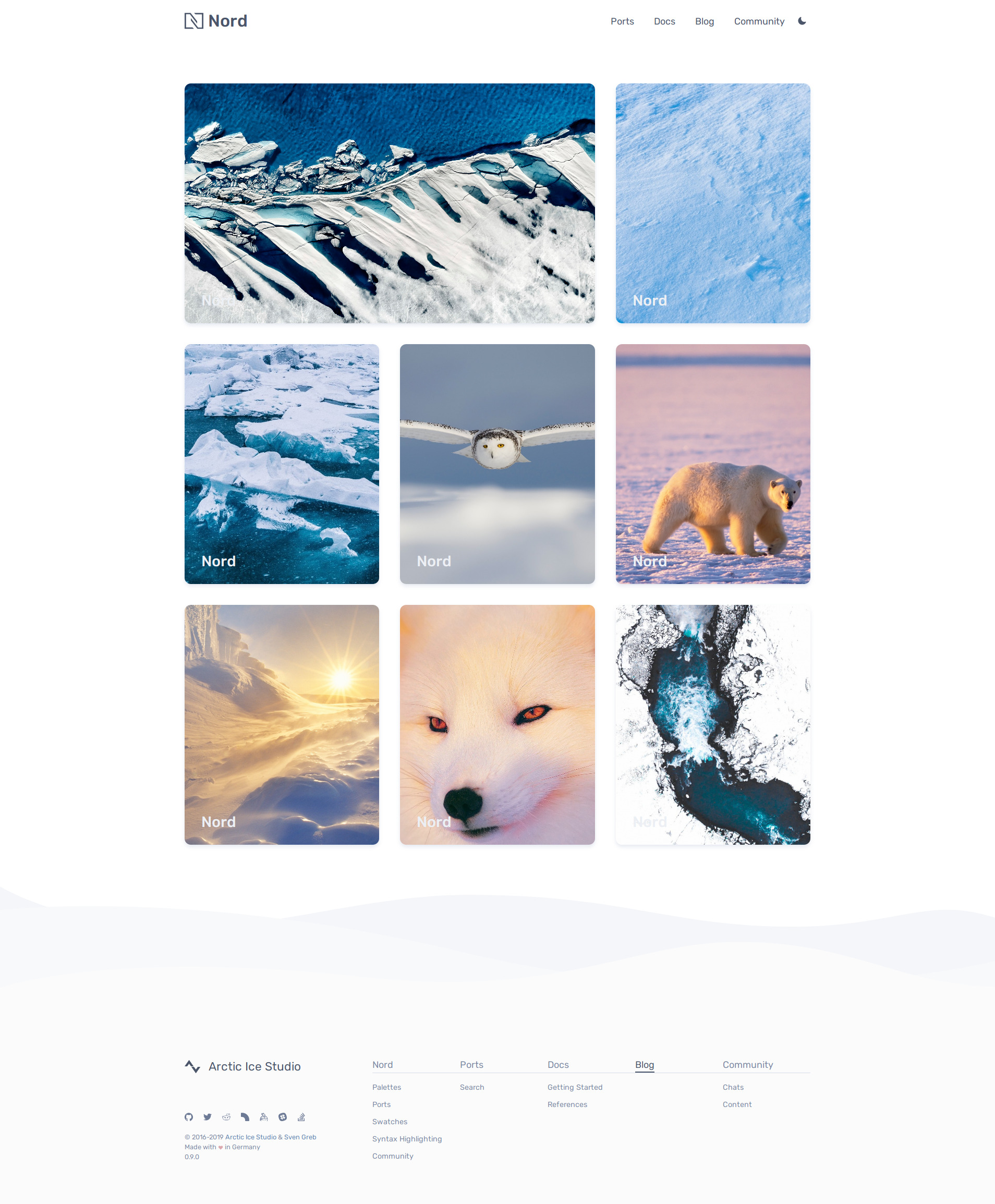
Finally emerged from the snowstorm: Nord Docs initially launched!
Nord Docs's initial version is finally available on the production domain!
The long awaited initial website launch is completed. It focused on the transition of the Nord documentation and assets to make them available through the /docs landing page.
I'm absolutely happy to announce this great milestone. It's been a long time, but finally all essential parts are done and it is ready to be tested by the community in the production environment.
Please feel free to give it a try and give any feedback if you'd like! Nord is an open source project and we love to receive contributions from the community!
Also keep an eye on the blog, there will be a detailed write-up about Nord Doc's way from the initial commit to the initial launch.
Nord Docs Transition — #132 ⇄ #135 (⊶ 0e5eb3d4) ↠ Transferred all documentations, assets and visualizations from Nord to Nord Docs which will now serve as the single-source-of-truth™. Please see the corresponding issue in the Nord repository to get an overview of what has changed for Nord and what has been done to migrate to Nord Docs.


Initial website launch ahead!
This version finally marks the last release before the long awaited initial website launch. It mainly focused on the MDX integration for blog posts and docs pages to finish the last remaining base routes in order to start the migration of Nord's documentation and poject asset content.
I'm really hyped and happy to announce this great milestone. It's been a long time, but finally all essential parts are done and it is ready to see the light of the production environment.
More details and information can also be found in the tweet thread of the initial website announcement.

The following issues are related to the “Components” and “Responsive Web” design concepts to adjust the rendered content based on the available width and provide an optimal UX on smaller viewports.
MDX Integration for docs and blog pages — #129 ⇄ #130 (⊶ 05d32115)
↠ Integrated MDX with gh-gatsby-mdx including the implementation of the logic, layout and style for blog posts and docs pages (/docs and /blog routes).
MDX is used to handle the actual content of the documentation and blog posts. Gatsby allows to use Markdown for content that comes with the nice side effect that the already existing documentations can simply be adapted and reused, but unfortunately it is limited to its reduced and simplified syntax.
To also use the great power of React for content and not only layout and design this project makes use of the MDX specification, a new language and abstract syntax tree definition.
In order to ensure a vibrant ecosystem and community, tooling needs to exist for formatting, linting, and plugins. This tooling requires a foundational specification and abstract syntax tree so that parsing is properly handled before transforming to JSX/Hyperscript/React/etc and potentially leveraging existing plugin ecosystems.
We're using the official implementation, the fully-featured MDX parser, loader and JSX renderer together with the great Gatsby plugin gh-gatsby-mdx to allow to seamlessly use JSX in Markdown documents by importing components and export metadata or any other ECMAScript compliant data structures like frontmatter.
- 💻 Everything is a component: Use existing components inside your MDX and import other MDX files as plain components.
- 🔧 Customizable: Decide which component is rendered for each Markdown element ({ h1: MyHeading }).
- 📚 Markdown-based: The simplicity and elegance of Markdown remains, you interleave JSX only when you want to.
- 🔥 Blazingly blazing fast: MDX has no runtime, all compilation occurs during the build stage.
To integrate MDX Gatsby's onCreateNode and createPages APIs are implemented to handle the generation of the GraphQL MDX nodes and the subsequent automated creation of the docs pages and blog posts.
More details are provided by the official MDX and gh-gatsby-mdx websites that include documentations to get started, usage examples and advanced configuration and customization information.
To get the best performance and quality for images Gatsby's awesome support for the high performance Node.js image processing library “Sharp“ is used through gatsby-plugin-sharp, gatsby-transformer-sharp and gatsby-image.
To automatically process all images the transformer provides GraphQL query fragments like GatsbyImageSharpFluid. They are used within custom fragments that have been implemented to fit the project structure.
In order to create great documentations and blog posts with interactive elements a new mdx-elements atom core package was created that initially includes some custom React components that can be imported and placed in MDX based content:
Image— An Gatsby image that extendsGatsbyImageand is wrapped in a<figure>element with an optional caption.Video— An<video>element that uses theImagecomponent to render aposterwith Gatsby's image rendering mechanism while the media file is being loaded to prevent layout shifting. It is also wrapped in a<figure>element with an optional caption.ShinkedWidth— An container component that shrinks the maxiumum width for a better visual style and more readable text.

To reduce the requirement of imports and "logical Markdown" almost all HTML elements supported by the official Markdown as well as the GitHub Flavored Markdown Specification the MDXProvider component is used to map the project's base components to their specific HTML elements.
The design of docs pages imitate a paper sheet where the overall styles using a darker background so that the white paper stands out for a clear and sharp content visualization.
The last remaining main page is /blog which presents an overview of Nord's blog posts in a three-column grid of card components sorted descending by their publish date.

Each card consists of an cover image together with the title of the post. The latest post spans over two columns at the top for a nice visual structure and better recognizability. While a one-column card uses a cover image the latest post uses a banner that will either be the same image with a larger width, a variant of it or a completly different one.

A blog post itself makes use of the MDX features and the custom MDX components mentioned in the paragraph above.
To simplify the usage of the cover and banner image they are be processed with Gatsby's onCreateNode API in combination with Gatsby's mapping configuration feature. This allows to map the paths of images to a File node that is then handled by the Gatsby image processing plugin workflow also documented in the Image Processing section above.
Another required node is the heroImage field that queries for a hero.(png|jpg|jpeg) image that is used as the hero of a blog post.
To also allow the usage of videos in blog posts or even as header a custom Video the custom MDX component has been implemented including the optional heroVideo and heroVideoPoster GraphQL node fields.
All together that results in the following required and optional images/videos mapped to specific node fields with reserved file names per blog post directory for simple usage via GraphQL queries:
bannerImage↹banner.(png|jpg|jpeg)— The required banner image of a blog post card (used when currently the latest two-column wide post placed on top of the grid).coverImage↹cover.(png|jpg|jpeg)— The required cover image of a one-column blog post.heroImage↹hero.(png|jpg|jpeg)— The required hero image of a blog post.heroVideo↹hero.(mp4|webm)— The optional hero video of a blog post.heroVideoPoster↹heroposter.(png|jpg|jpeg)— The optional poster image of a blog postheroVideo.
To prevent the unknwon field GraphQL error during build time (e.g. when there are no blog posts yet) a dummy/placeholder blog post and docs page has been created.
Anyway, they will be removed as soon as there is finally the first blog post and docs page. Later on the project will migrate to the shiny new schema customization API.
New official Nord Spectrum community — #131 (⊶ d71e4f98) ↠ Updated all URLs and references to the new official Nord Spectrum community that is available as of 2019-03-03. Previously the official Arctic Ice Studio community was used with its channels for Nord projects.


This version mainly focused on the sections of the ports page to represent Nord's port projects. The implementation was limited to the landing page components and currently doesn't include any prot specific pages, but will be implemented later on when the actual documentations are being migrated.
The following issues are related to the “Components” design concept and the “Responsive Web” design concept to adjust the rendered content based on the available width and provide an optimal UX on smaller viewports.

Ports Page Sections — #119 ⇄ #126 (⊶ 606f805a) ↠ Implemented all port page sections including required changes to involved components and new dependencies.


The first section contains a feature duo container with the pages heading and a summary about Nord's ports.
Underneath the static vector graphic that was placed in the port section of the landing (/) page has been implemented as interactive animated component. It uses a 3D depth effect for the port project's logos by moving against the direction of the current mouse position where the larger logos will move more to give the impression that they are closer.

The second section consists of a input field that allows to filter available port projects by predefined search terms. Underneath a animated grid of card components reacts to the input field by filtering non-matching ports projects. Each card represents one port project and consists of the logo, the name (with the Nord prefix) as well as a card footer that contains the version of the latest release of the respective project and the number of stars of the GitHub repository.
To prevent UI freezes/frame drops when typing in the input field, while the grid reacts to the change immediately, it was considered to use debounce that waits some milliseconds before actually filtering the grid by the given search term. This hasn't been implemented yet but might be added later on when there are performance problems. To get the best performance Lodash can be used through gatsby-plugin-lodash which sets up babel-plugin-lodash and lodash-webpack-plugin.

To view the metadata about the port project repositories Gatsby's fantastic GraphQL integration is used through the awesome gatsby-source-graphql plugin. It allows to fire queries that'll get executed and stitches remote schemas together by adding a type that wraps the remote schema Query type and putting it under field of Gatsby GraphQL Query.
To implement components with an interactive animation the awesome react-spring project is used which allows, like the already used fantastic react-pose library, to use spring-physics based animations. The advantage of react-spring is that it bails out of the React renderer to avoid unnecessary renders and instead uses native methods to get the best performance even for complex animations. It comes with first-class support for Hooks, a great and extensive documentation and a lot of examples for inspirations.
React Hooks Support — #121 ⇄ #122 (⊶ c1bf2dbe)
↠ Since the latest stable React version finally comes with the long-awaited Hooks the project now added support for the new features.
To simplify the usage and import of custom Hooks a new hooks import alias has been added that allows to import custom hooks from the new src/hooks Hooks base directory.

The ESLint plugin eslint-plugin-react-hooks provided by the React core team has been added to enforce the rules of Hooks. This is a temporary integration until the eslint-config-arcticicestudio package has been updated to support and include the plugin.
The plugin is configured by following the official documentation about the rules of Hooks. Since React Hooks are making use of inline arrow functions the react/jsx-no-bind rule has been disabled to avoid noisy false-positive errors.

git-crypt — #123 ⇄ #124 (⊶ 475c6956) ↠ Integrated git-crypt into the repository to allow to encrypt specific files using GPG. git-crypt is a stable and production proven concept that works safely and allows to use a transparent encryption with Git.
Nord Docs uses it to encrypt Gatsby environment variables stored in .env* files that are handled by dotenv. Another way would be to use Circle CI's environment variables features to make sensitive data available during build time, but using git-crypt ensures that all required project data is stored in the repository and tracked by Git without the need to manually configure CI/CD providers and servers.
Unfortunately Netlify currently doesn't provide a way to customize the Docker container configuration so that it was not possible to set up GPG and git-crypt to import the CI/CD GPG secret key, decrypt the files and build the project. An attempted solution was to use Netlify's awesome “Functions” feature to run a function that executes shell commands using the deploy-building trigger to set up GPG and git-crypt, but there is no way to install git-crypt in the container so this doesn't work.
Therefore is was necessary to manually set required environment variables via Netlify's web app UI for build environment variables:
NORD_DOCS_GOOGLE_UNIVERSAL_ANALYTICS_TRACKING_ID— Stores the “Google Universal Analytics” tracking ID.
The following steps have been performed to integrate git-crypt for the current code base:
- Add files to
.gitattributesand configurefilteranddiffto usegit-cryptsetup - Initialize
git-cryptfor the repository:git-crypt init(default key) - Add the GPG keys of all core team members keys and Nord theme CI/CD virtual user:
git-crypt add-gpg-user --trusted --no-commit <ID>(--no-commitflag prevents automatic commit of generated files while--trustedassumes the GPG user IDs are trusted) - Commit the new generated
.git-cryptfolder - Unlock the repository:
git-crypt unlock - Ensure all target files are tracked to be encrypted:
git-crypt status - Commit all encrypted target files
- Validate the encryption works by locking the repository again:
git-crypt lock - Implement Circle CI build configuration jobs and commands to handle GPG key import, file decryption and clean up after successful build
- Document required manual steup steps for Netlify deployment configuration in
netlify.tomlfile
Interactive illustration for ports section of landing page — #127 (⊶ f79f4ac3) ↠ #126 improved the already existing “Nordify” SVG illustration by making it an interactive components that animates the floating logos in the opposite direction of the current mouse cursor's position.
The new component is now also used for the port section of the landing page replacing the static SVG illustration/image.

Dependency Update January 2018 — #120 (⊶ cb09058a) ↠ Performed the regular batch update for outdated dependencies. It includes the long awaited React version 16.8.0 finally brings the stable Hooks API as well as great performance improvements and bug fixes!
Updated Jest's configuration since version >=24.0.0 deprecated setupTestFrameworkScriptFile in favor of the new setupFilesAfterEnv option.
The ESLint plugin eslint-plugin-react includes a lot of improvements and bug fixes regarding the parsing of code structures for better prop validation and display name detection. This resulted in the requirement to implement currently missing prop types and display names in various SFC and class components in the project.
Gatsby and all plugins have been updated to the latest versions to include the latest improvements and bug fixes. The gatsby-plugin-manifest plugin now sets the legacy option to true by default to include Apple touch icons since the assumption was wrong that iOS supports the icons from the web manifest.
As of version 3.3 the “Inter UI” font typeface has been renamed and is now “Inter”, without the “UI” part. This change has been ported to the used inter-ui package. The import has been adjusted to match the renamed inter.css main file and all references to the “Inter UI” name have been adjusted by removing “UI”.
Prettier version 1.16.0 comes with support for React Hooks and features for TypeScript and HTML as well as many other improvements and bug fixes.
React Pose includes an important fix that also animates all other children when items are moving when using the PoseGroup component.
Gatsby 2.1.0 with React Hooks Support — #125 (⊶ cf578797)
↠ Updated to Gatsby v2.1.0 which introduces useStaticQuery, a new Gatsby feature that provides the ability to use a React Hook to query with GraphQL at build time. It provides the same functionality like the StaticQuery component, but as a Hook rather than a component that takes a render prop.
Update to React 16.8.3 — #128 (⊶ f4c9b45d)
↠ The latest React version 16.8.3 has been released including important bug fixes for incorrect state behaviors with the useState hook as well as a fix for <input> elements that discarded state updates during the render phase and reduced the performance.
The update is strongly recommended for any 16.8 release by the core team.
This bug fix release version might fix some problems that were encountered during development of the search filter <input> for #119.
This version mainly focused on the sections of the docs page to represent Nord's documentation categories and their topics. The implementation was limited to the landing page components and style and currently doesn't include any documentation, the actual docs will be implemented and imported later on using the GraphQL API and MDX.
The following issues are related to the “Components” design concept.
Community Page Sections — #117 ⇄ #118 (⊶ a0b9f5bc) ↠ Implemented all docs page sections including required changes to other components. All sections follow the “Responsive Web” design concept to adjust the rendered content based on the available width and provide an optimal UX on smaller viewports.

The first section is the “hero” of the docs page that renders a description about the page's purpose.
The 2nd section is about Nord's documentation contents where each category is represented as card rendered in a two-column grid layout. Each card contains a topic icon, colorized with a accent color from Nord's palettes and a short summary about the topic's links.
As of now there are two cards for the categories “Getting Started” and “References” that provide links to the various topics.
This version mainly focused on the sections of the community page to represent Nord's community chat channels as well as the content & knowledge bases.
The following issues are related to the “Components” design concept and the “Responsive Web” design concept to adjust the rendered content based on the available width and provide an optimal UX on smaller viewports.
Community Page Sections — #115 ⇄ #116 (⊶ 5fb775c7) ↠ Implemented all community page sections including required dependencies, components and illustrations.

The first section is the “hero” of the community page that renders a description about the page's purpose and an animated SVG component.


The 2nd section is about Nord's community chats where each platform is represented as card rendered in a two-column grid layout. Each card contains the platforms official logo, colorized with colors of the respective brand guidelines, a short summary about the platform/service and a link component that'll forward to the community within the platform. Next to the official main channel each platform also provides sub-channels for all port projects
As of now the following community chats of Nord are represented:
- Arctic Ice Studio's official community on Spectrum
- Nord's official Keybase team chat
- Nord's official Slack workspace
- Nord's official Discord space


The 3th and also currently last section presents platforms where the community can create content and ask questions for and about Nord. Next to the official documentation these content & knowledge bases are also powered by community.
Like the chat platforms in the previous section each platform/service is represented as card including the same information, rendered by the same components, and also structured in a two-column grid layout. Next to this, each card includes the latest three items (questions, posts etc.) of the platform's community rendered as link component with the item's title and metadata like tags, the name of the author and the relative creation date/time.
As of now the following community platforms of Nord are represented:
- Latest questions from Stack Overflow tagged with
nordornordtheme - Nord's official /r/nordtheme subreddit
All data is fetched from the official REST APIs of the respective platform using axios. The processing of any date/time data is handled with date-fns, a modern and more lightweight ES6+ library with tree-shaking support that'll be used project-wide for Nord Docs to handle any other date/time data like e.g. blog posts metadata.


This version focused on the sections of the landing page including the new Button core atom component that represents the <button> HTML element.
The following issues are related to the “Components” design concept and the “Responsive Web” design concept to adjust the rendered content based on the available width and provide an optimal UX on smaller viewports.
Core HTML Element Atom: “Button” — #110 ⇄ #111 (⊶ 41ce16fa)
↠ Implemented the core atom Button that represents a <button> base HTML element. It can also render as core atom A with Button styles when the href or to props are passed with an internal and external URL.
It provides multiple variations:
primary— uses the primary colornord8for background/border/text colorization.secondary— uses the secondary colornord9for background/border/text colorization.simple— uses the Snow Storm and Polar Night palettes for background/border/text colorization.subtle— only colorizes the background on hover using the Snow Storm and Polar Night palettes for background/border/text colorization.
Next to variations there are additional props to toggle more styles:
dashed— uses thedashedproperty for the CSSborder-styleattribute.ghost— only uses a border instead of a background color.outlined— uses uses a border in addition to a background color.quiet— keeps the initial text colorization on hover.


Landing Page Sections — #112 ⇄ #113 (⊶ 339d3b8f) ↠ Implemented all landing page sections including required dependencies, components and illustrations. All sections follow the “Responsive Web” design concept to adjust the rendered content based on the available width and provide an optimal UX on smaller viewports.
The first sections is the “hero” of the landing page that renders a short project description and the animated Arctic Landscape SVG component. The animation will be triggered through the React Waypoint project.
The 2nd and 3rd sections are about Nord's color palettes and provide information about the modularity and contrast. All palettes are visualized through a new "color palette card" component that consists of the actual colors as small, rounded boxes and the associated color code as label using the hexadecimal format.
The 4th section presents Nord's port projects which can be used by users to “nordify” their favorite apps and platforms. It consists of the text content as well as a new illustration that might also be animated later on using a 3D parallax effect that reacts and moves based on the current mouse position in the section.
The 5th section is about Nord's “native” color swatches. It consists of the same elements like the 4th section, but renders a new non-animated illustration showing a application UI with Nord loaded as color palette.
The 6th section is all about Nord's features to highlight code. Next to the text content and summary it renders a new and animated illustration, too.
The 7th and also last section presents details about Nord's communities. It renders the animated Arctic Ocean Fractal SVG component and a short summary about how to join, contribute and develop Nord's community.
Landing page decoration container blocks mouse pointer events — #114 (⊶ 4ce828cb) ↠ Fixed the container for decoration components of the landing page (implemented in #112) blocking all mouse/pointer events since it covers the whole section size. Therefore all underlying elements like buttons and links couldn't be clicked/pressed because the pointer was focused on the decoration container.
This version focused on the essential footer as well as a styled link component. It also includes the integration of the Webpack size-plugin to print the gzipped sizes of assets and the changes since the last production build.
The following issues are related to the “Components” design concept and the “Responsive Web” design concept to adjust the rendered content based on the available width and provide an optimal UX on smaller viewports.
Core Atom: “Link” — #105 ⇄ #107 (⊶ cf1f1184)
↠ Implemented the core atom Link that wraps the base HTML element atom component the A and adds matching brand styles to it.
Core Organism Component: “Footer” — #106 ⇄ #108 (⊶ 9a6c0496)
↠ Implemented the core organism component Footer which represent the <footer> element and is an essential part of Nord Docs. It provides a sitemap, the Arctic Ice Studio organization branding logo and caption, networking & social media links as well as the copyright paragraph including version information.
The footer uses a CSS flexbox and grid layout consisting of two container components with the maximum of flexible space between both. The left-side container contains the branding and link components while the right-side container contains the sitemap like documented in the sections below.
For a nice and smooth transition between the last section/element of a page a new SVG vector graphic divider in form of multiple “overlapping waves” has been added. It must be rendered by the last component/element (in most cases a Section/<section>) to ensure the transparent background of the wave's container matches the last components background by rendering it in the bounds.
To allow users to simply navigate around the site, next to the main header, the component provides the quickly accessible sitemap. This container uses the flexbox layout where each base route of the site is added as one category represented as a column. Each of these consists of an heading, the name of the route, and the corresponding sub-routes.
As of now the following base routes are included:
- “Nord” — links to
/and includes all sections of the main landing page. - “Ports” — links to
/portsand includes all sections of the Nord port projects. - “Docs” — links to
/docsand includes all sections of Nord's documentation. - “Blog” — links to
/blogand includes all sections of Nord's blog. - “Community” — links to
/communityand includes all sections of the Nord community channels.
To represent Arctic Ice Studio's branding, the left-sided container contains the logo with the caption that'll link to the organization website. It is placed in one line with the category heading of the sitemap like documented in the section above.
The left-side container also contains the social media & networking links where each link is represented through the icon of the corresponding site/service. They are placed in one line with a flexible layout to adust based on the available width.
The last elements of the left-side container is a paragraph providing version information about the site like the currently running version (with commits ahead metadata when required) and the build & deployment date. It also has additional Git metadata added as data- attributes and a <time> HTML element.
Full Width

Reduced Width

Small Width

For reduced width views (responsive design) the footer adjusts several styles and composed components. For really small view ports the grid layout be switches to a flexbox layout.
Core Organism Component: “Footer” — #109 (⊶ 75435d07) ↠ Integrated the Webpack size-plugin that prints the gzipped sizes of assets and the changes since the last build added through gatsby-plugin-webpack-size.

This version focused on analytics & statistics as well as SEO & social media representation. This includes the integration of Google Analytics, requirements of a PWA (Progressive Web App) like a Web App Manifest, offline resistance and availability through a service worker and improved caching strategies and usage of advanced techniques like HTTP/2 server push.
Several implementation for SEO have been made with automated generation of web standard resources like the sitemap.xml and robots.txt files. A new SiteMetadata component has been added to allow to provide metadata for several specifications like the Open Graph Protocol, Twitter Cards and schema.org.


Google Analytics — #87 ⇄ #88 (⊶ 7aed8952) ↠ Integrated Google Analytics like documented in the “Analytics & Statistics” design concept through the Gatsby plugin gatsby-plugin-google-gtag.
It is a stable and proven service tool to collect and analyze data with a lot of useful configurable features and a reliable persistence.
Nord Docs uses the latest and recommended gtag.js library that optionally allows, next to Google Analytics itself, the integration of almost all Google Marketing services like e.g. Google Tag Manager.
To protect the privacy of users and to be compatible with various privacy and data legal guidelines all IP addresses are anonymized.

Gatsby Plugin "Netlify" — #89 ⇄ #90 (⊶ b4a91fd9)
↠ Added gatsby-plugin-netlify to automatically generate a _headers file and a _redirects file at the root of the public folder to configure HTTP headers and redirects on Netlify.
One of the main advantages is that it also enables HTTP/2 server push of critical Gatsby assets through the Link headers. By default, the plugin adds HTTP/2 assets to server push the critical Gatsby scripts (ones that have the preload attribute already) and additionally adds basic security and caching headers.
See the “Hosting & Continuous Deployment” design concept for more details.

Gatsby Plugin "Web App Manifest" — #91 ⇄ #93 (⊶ 6415ddc5)
↠ Integrated gatsby-plugin-manifest that adds support for generating and shipping a web app (PWA) manifest.webmanifest. It allows users to save Nord Docs as web application to their desktops / task bars and smartphone home screens so it behaves similar to native apps.
See the great Google Developer documentation about the web app manifest and the official W3 Web App Manifest specification.
Note that it is recommended to use this plugin together with gatsby-plugin-offline (#94), but ensure that this plugin is listed before the offline plugin so that it can cache the created manifest.webmanifest file!

Gatsby Plugin "Offline" Service Worker — #94 ⇄ #95 (⊶ e381f366) ↠ Integrated gatsby-plugin-offline that adds drop-in support for making a Gatsby site work offline and more resistant to bad network connections. It creates a service worker for the site using the great Workbox project and loads the service worker into the client.
Note that it is recommended to use this plugin together with gatsby-plugin-manifest (#91), but ensure that this plugin is listed after the offline plugin so that the created manifest.webmanifest file can be included in the service worker!
The plugin comes with optimal configurations out-of-the-box™. Note that the offline support can break when changing these options.

Gatsby Plugin "Sitemap" — #96 ⇄ #97 (⊶ 1cf69f42) ↠ Integrated gatsby-plugin-sitemap that automatically generates a sitemap.xml file including all of Nord Docs pages, except the ones excluded by default and custom configured routes.
Note that by default the plugin assumes that the default Gatsby config object field siteMetadata.siteUrl is set to the site's URL.

Gatsby Plugin "robots.txt" — #98 ⇄ #99 (⊶ ca4ed675) ↠ Integrated gatsby-plugin-robots-txt that automatically generates a robots.txt file.
Note that by default the plugin assumes that the default Gatsby config object field siteMetadata.siteUrl is used and set to the site's URL. It also uses the default path ${siteMetadata.siteUrl/sitemap.xml} for the sitemap file (#96).


Site Metadata Component — #101 ⇄ #102 (⊶ a8fb8edd)
↠ Implemented the core atom SiteMetadata that injects global metadata. Next to general data like the page title and canonical URL it will include data for the Open Graph Protocol, Twitter Cards and the schema.org structured data format JSON-LD.
The component doesn't render any UI, but injects the elements into the <head> using React Helmet.
For more details read the “SEO & Social Media Representation” design concept and the great documentation about SEO with Gatsby.
Dependency Update December 2018 — #103 ⇄ #104 (⊶ 1c4ba796)
↠ Performed the regular batch update for outdated dependencies which raises React to version 16.7.0 to include an important performance bug fix for React.lazy.
Babel has been updated to the latest minor version 7.2.0 (including official plugins) that comes with a lot of improvements and bug fixes for TypeScript and Flow as well as support for private instance methods and “smart” pipeline operator parsing.
The babel-plugin-styled-components plugin now also supports the new css prop of the also updated styled-components package.
Gatsby and all plugins have been updated to the latest versions to include the latest improvements and bug fixes.
Note that packages marked with an ❗ have been affected by the security incident!
- gatsby
2.0.55➔2.0.75 - gatsby-plugin-canonical-urls
2.0.7➔2.0.8 - gatsby-plugin-catch-links
2.0.8➔2.0.9 - gatsby-plugin-react-helmet
3.0.2➔3.0.5 - gatsby-plugin-remove-trailing-slashes
2.0.5➔2.0.6 - gatsby-source-filesystem
2.0.9➔2.0.12 - gatsby-transformer-yaml
2.1.5➔2.1.6 - inter-ui
3.0.0➔3.1.0 - react
16.6.3➔16.7.0 - react-dom
16.6.3➔16.7.0 - styled-components
4.1.2➔4.1.3
- @babel/core
7.1.6➔7.2.2 - @babel/plugin-proposal-class-properties
7.1.0➔7.2.3 - @babel/plugin-proposal-export-default-from
7.0.0➔7.2.0 - @babel/plugin-proposal-nullish-coalescing-operator
7.0.0➔7.2.0 - @babel/plugin-proposal-optional-chaining
7.0.0➔7.2.0 - babel-plugin-styled-components
1.9.2➔1.10.0 - babel-plugin-transform-react-remove-prop-types
0.4.20➔0.4.21 - babel-preset-gatsby
0.1.4➔0.1.6 - eslint
5.9.0➔5.11.0 - husky
1.2.0➔1.2.1 - jest-dom
2.1.1➔3.0.0 - prettier
1.15.2➔1.15.3 - react-testing-library
5.3.0➔5.4.2
This version focused on the responsive web design, core & base component as well as base HTML elements as components of Nord Docs. It includes the base layout which initially consists of the header that provides the global navigation links. Another focus was the handling of exceptional & special states like empty states and the 404 error state.

Base Media Query Setup — #61 ⇄ #62 (⊶ 6b78d691) ↠ The basic setup for components with responsive styles through media queries has been implemented based on the “Responsive Web Design” design concept.
To simplify the usage of media queries with styled-components, a utility function to generate media templates has been implemented. It uses the min-width parameter to fulfill the used mobile-first approach. The base size that is used has been implemented as theme property in #54.
Always adjust media queries to the content individually and not vice-versa. The design supports the content. Not the other way around.
Like documented in the #52, Nord Docs uses the mobile-first pattern and follows the great “Google Developer Responsive Web Design” guidelines. The recommended way is to create media queries not based on any device sizes but individually based on the content which is unique for each project. This is the best practice and, contrary to most popular CSS framework like Bootstrap, the correct way since each site is different and there are thousands of devices and in the future new sizes will appear. The following media query template functions have been implemented:
phonePortrait—max-width: 479pxphoneLandscape—max-width: 480pxtabletPortrait—max-width: 600pxtabletLandscape—max-width: 900pxdesktop—max-width: 1200pxdesktopPlus—max-width: 1800px
Core Layout Component: BaseLayout — #66 ⇄ #68 (⊶ 208c9ac0)
↠ Implemented the BaseLayout core layout component, the default layout of Nord Docs. It consists of the Root core container as root element and the core components representing the header, the main page container and in the future the footer.
Core Container Component: Page — #65 ⇄ #67 (⊶ 701ec43d)
↠ Implemented the core container component Page, the base wrapper for page content of Nord Docs. It renders the HTML <main> element to wrap page content and is used in layout components like BaseLayout.
Core Atom HTML Element: P — #79 ⇄ #80 (⊶ ad995b0a)
↠ Implemented the core atom P that represents the text content HTML element <p>. It uses adjusted styles instead of browser defaults to match Nord Docs brand style.
Core Atom HTML Element: Heading — #81 ⇄ #82 (⊶ c4e1aa84)
↠ Implemented the core atoms H1-H6 that represent the content sectioning HTML elements <h1>-<h6>. They use custom styles instead of browser defaults and allow to disable the bottom margin via the noMargin prop. The font style like size, modular scale and family adhere to the “Typography” design concept.
Core Atom HTML Element: A — #70 ⇄ #71 (⊶ 75d0e49c)
↠ Implemented the core atom A that represents the inline text semantic HTML element <a>. This is a special dynamic and failsafe component because it internally uses the Gatsby Link component to route within the site (internal links) while also being able to link to external data.
To handle the logic of conditionally rendering a Gatsby Link or a basic <a>, based on the passed target URL (internal & external), utility functions has been implemented to evaluate the passed target.
Core Organism Component: Header — #64 ⇄ #75 (⊶ d6f0fef2)
↠ Implemented the essential core organism component Header that provides the main site navigation and a user action component to toggle between the global theme modes.
The header uses the CSS flexbox layout consisting of two container components with the maximum of flexible space between both. The containers contain the branding and the navigation components like described in the sections below.
To allow users to simply navigate around the site, the component provides the quickly accessible navigation. It is placed in the right-sided container and currently contains the following items:
- “Ports” — links to
/ports, the landing page for all Nord port projects. - “Docs” — links to
/docs, the landing page for Nord's documentation. - “Blog” — links to
/blog, the landing page for Nord's blog. - “Community” — links to
/community, the landing page of the Nord community channels.
To represent Nord's branding, the left-sided container contains the Nord logo with the caption. It links the landing page to allow quick access to the root (/) page.
The user action component mentioned in the introduction paragraph above allows to toggle between the available global theme modes. Both modes are represented through icons where a sun is used for the “bright snow flurry” and a moon for the “dark night frost” mode. They are implemented using the awesome React Pose project to animate the switching. The icons “fly out and in” within the bounds of the component that takes the form of a button.
Like documented in the “Iconography” design concept, the awesome Eva Icons project is for icons.
For reduced width views (responsive design) the header adjusts several styles and composed components.
The main navigation link list will be hidden and replaced by a user action element (button) that toggles an animated slide down menu containing the navigation links. The drop down starts right below the header and takes up the available height and width to cover the full screen. As soon as the animation starts all scroll events will be removed from the underlying content (body) using the body-scroll-lock project. This prevents users from scrolling the content below the menu when the menu itself overflows the Y-axis and shows a scroll bar.

To allow quick access while also being inconspicuous, the component is sticky at the top of the site, but collapses as soon as the user scrolls down and only switches back into expanded mode when at top of the site. In expanded mode, the height of the header is larger and the caption of the logo is visible. As soon as switching into collapsed mode the height decreases and the logo caption fades out with a smooth transition animation.
To achieve the resizing animation based on the scroll position the subscribe-ui-event project is used to listen to scroll events. It provides throttling by default, only calls document.body.scrollTop and window.innerWidth once and uses requestAnimationFrame for a better performance.
Empty State Component — #78 ⇄ #83 (⊶ 2079c056)
↠ Implemented the EmptyState molecule component to represent an empty state. It consists an vector illustration, a headline and the corresponding subline.


There are initially 3 different illustrations available that can be selected through the illustrationVariant prop. The headline informs the user about the purpose of the illustration and the reason why it is currently shown while the subline can include additional information and helpful instructions.
The empty state component has been placed within a base HTML component that represents a <section> with multiple base style variants and is now initially used by the new base page components for the header navigation links.
404 Page Components — #84 ⇄ #85 (⊶ a39649fa) ↠ Implemented the 404 page and illustration components to handle requested but non-existing routes and resources.

It aligns with Nord Docs brand and can use a humorous image and tagline that conveys the purpose of the screen, without appearing actionable. Also see the great Gatsby documentation about 404 pages for more details.

SVGR Integration — #72 ⇄ #73 (⊶ 39c13041) ↠ Integrated SVGR, a transformer for SVG into ready to use React components. It is part of create-react-app and makes SVG integration into React projects easy.
All configurations are placed in the svgr.config.js file instead of passing them to the corresponding Gatsby plugin for the Webpack loader that is described in the section below.
To directly import SVG's as React component the @svgr/webpack package is used to simply integrate SVGR as Webpack plugin. It has been added through gatsby-plugin-svgr which adjusts the required Webpack configurations by adding the loader and removing the default .svg file loader/handler.


Jest utilities for Styled Components — #76 ⇄ #77 (⊶ 47010b8c) ↠ Integrated jest-styled-components, a set of utilities for testing Styled Components with Jest that improves the snapshot testing experience and provides a brand new matcher to make expectations on the style rules. Instead of storing the generated class names in snapshots it allows to track the actual CSS rules and attributes for better comparison what changed and if the change is even really related to the affected component.
This is the officially recommended library to use Jest with styled-components.
const Button = styled.button`
  color: red;
`;exports[`snapshot`] = `
<button
className="sc-bdVaJa rOCEJ"
/>
`;Before
- Snapshot
+ Received

 <button
-  className="sc-bdVaJa rOCEJ"
+  className="sc-bdVaJa hUzqNt"
 />
After
- Snapshot
+ Received

+.c0 {
+  color: green;
+}
+
 <button
-  className="sc-bdVaJa rOCEJ"
+  className="c0"
 />
The package has been added in the setup file defined in Jest's setupTestFrameworkScriptFile field (#39) to enable all included features.
The custom toHaveStyleRule matcher is useful to test if a given rule is applied to a component. It is added to the extended global except object when the main package file is being imported.
This version focused on the typography, the brand design & styling and theme modes of Nord Docs. It includes the globally used typefaces, a React context provider and consumer component for the available theme modes as well as some initial global base styles.

Typefaces — #54 ⇄ #55 (⊶ 81a5b238)
↠ Integrated globally available open source typefaces like documented in the “Typograhpy” design concept and implemented the typography module to define style properties and configurations. The font size and units are based on the used modular scale documented in #2.
Rubik — the main stylistic and visualization sans-serif font installed through through the typeface-rubik package.

Inter UI — the sans-serif font for documentations as well as technical and factual content. It is installed through the inter-ui package. Note that the font is currently not available through Google Fonts yet, but might be added in the future very soon due to its large popularity and perfect implementation.


Source Code Pro — the main monospace font for all code elements installed through the typeface-source-code-pro package.


Base Style & Theme Setup — #53 ⇄ #56 (⊶ 85498ca0) ↠ Implemented the basic style & theme setup like documented in the “Brand Design & Styling” design concept using the CSS-in-JS library styled-components for component representations. To use uniform global theme definitions and to simplify CSS styling, the styled-theming and polished libraries are also integrated next to some useful and required specific Babel & Gatsby plugins.
Integrated the great project modern-normalize that normalizes the default styles of browsers for a consistent appearance across different modern browsers. For the best usage with styled-components the styled-modern-normalize project is used. It exports the styles via the css API and has been added to the created global styles component mentioned below.
To simplify the CSS styling, the polished package is used that provides a lightweight toolset for writing styles in JavaScript (CSS-in-JS).
Global and normalization CSS styles have been implemented using styled-components css API. They extend modern-normalize and define, next to the browser normalization, styles of the available global themes like documented in the sections below.
In order to use fonts in Nord Docs style & themes (implemented in #54) the basic properties and values have been added and integrated into this CSS base styles.
To inject global styles, styled-components v4 createGlobalStyle API is used to create a <GlobalStyle> component to inject various styles globally.
To provide the global theme, the ThemeProvider component has been added to the Nord Docs Root core container component. The global theme is now passed to the provider.
To simplify the usage of styled-theming's theme() and theme.variants() API functions, two utility functions have been implemented:
themeMode(modeStyles : object)— Shorthand function for thethemeAPI to define styles based on the global theme mode(s).themedModeVariant(modeStyles : object, variantPropName : string)— Shorthand function for thetheme.variantsAPI to define variant styles based on the global theme mode(s).
Initially Nord Docs will be build with the “bright snow flurry” and “dark night frost” theme modes. The names have been implemented as constants with values BRIGHT_SNOW_FLURRY and DARK_NIGHT_FROST that are used with the utility functions mentioned above to define the styles of a component for each available global theme.
styled-components great Babel plugin adds support for server-side rendering, minification of styles, and a nicer debugging experience. It has been integrated via the corresponding Gatsby's plugin.
Since the main JavaScript implementation of Nord is currently not completed and released yet, the colors and palettes have been provided "manually" via the nord and palettes modules. As soon as the implementation has been done they will be replaced through imports from the official package.
Some basic configurations for motion related styles like animations have been implemented, inspired by Material Designs great documentation and guide about motion speed. This includes values for speed like transition durations for the global theme modes. It'll be used to set the CSS transition for the base background and font color within the globals CSS style module.

Theme Mode Context — #57 ⇄ #58 (⊶ 86edb920)
↠ Implemented a React.Context provider and consumer for the global theme modes. It provides the name of the currently active theme and a function to toggle through available themes.
Both the context consumer and provider components have been implemented in the Root core container component. The consumer is exported and can then be imported in any component to consume the provided values.
The Root component has beene changed from a SFC to a class component to store the currently active state and handle the theme mode toggle logic through a function. It migrated the currently used simple styled-component theme (provided through the <ThemeProvider component) to the styled-theming theme that provides the initially implemented theme (#53).
To persist the current active theme mode when changing the route (which unmounts the Root component and therefore resets the state), the value is written to the browser's session storage. The storage type has been preferred over the local storage since this would persist the active theme mode even when the user closes the tab, but the desired behavior is to optimize the site for the “bright snow flurry” aura theme mode that is set as default theme.
To simplify the read- and write handling as well as prevent possible errors due to wrong storage keys, two utility functions have also been implemented:
readSessionCache(key : string)— Reads the value of the given key from the session storage (if available).writeSessionCache(key : string, value : any)— Writes the given key-value pair to the session storage (if available).
Theme Global Base Styles — #59 ⇄ #60 (⊶ 2c545da1)
↠ Implemented some basic theme styles like font and background colors. They are initially used in the global theme styles implemented in #53. This includes a transition for both attributes (background-color and color) to ensure a smooth theme mode transition.
This is the initial release version of Nord Docs. It represents the basic project setup, structure and development workflow with an deployable state. There are many initial implementations and configurations for the documented design concepts. They are covered in the following sections of this version changelog to introduce used technologies and explain why several decisions have been made.
To get an overview of the general project plan, read the “Design Concept & Initial Launch Plan” documentation which describes the project's justification, its goals, the architecture, the tech stack and the “UI Design & Branding“ concept.
NPM configuration file — #4 (⊶ f4df27cb)
↠ Added the NPM .npmrc file to ensure specific configurations are set project-wide for all core team members and contributors. This includes the usage of the lockfile and exact (dev)dependency package versions.
Git mail mapping — #9 (⊶ e5629109) ↠ Added a Git mailmap file to link to in documentations and allow contributors to send mails regarding security issues. This prevents unnecessary overhead of updating all documents when new core team and members and contributors are added and additionally adds the main functionality of the file: Mapping commits when someone uses a different email address.
EditorConfig — #11 (⊶ 4fa30ce4) ↠ Added the EditorConfig file to define and maintain consistent coding styles between different editors and IDEs.

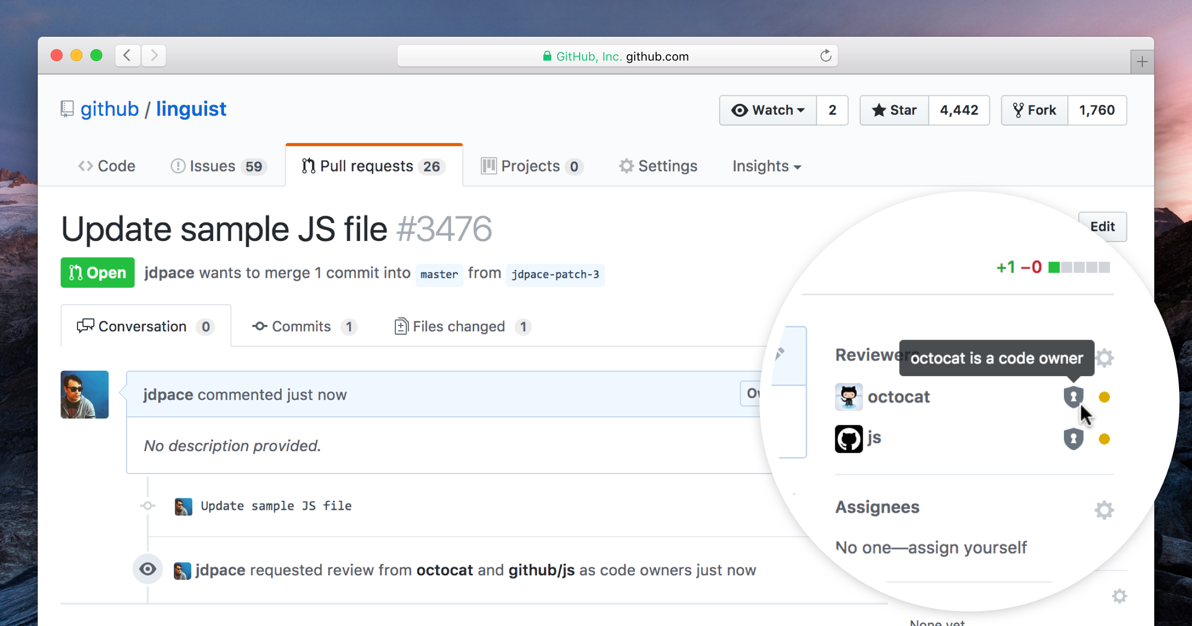
GitHub code owners — #7 (⊶ 05ded0c2) ↠ Adapted to GitHub's code owners feature to define matching pattern for project paths to automatically add all required reviewers of the core team and contributors to new PRs. Read the GitHub Help article for more details.


GitHub Open Source community standards — #8 ⇄ #12 (⊶ 262f731e) ↠ Inspired Nord Docs project philosophy using GitHub's features for recommended community standards. It adheres to the great Open Source Guides and adapted to the recommendations to complete the projects community profile.

To facilitate a healthy and constructive community behavior, Nord Docs also introduced and enforces a code of conduct. Read the GitHub Help article for more details about the provided integrations.
The added contribution guidelines help to build a community that encourages people to use, contribute to, and evangelize the project.

It includes sections about
- how to get started
- bug reports
- enhancement suggestions
- pull requests
- style guides
- credits
Read the GitHub introduction blog post and the GitHub Help article for more details about the provided integrations.
GitHub issue and pull request templates — #10 ⇄ #13 (⊶ c3c7b8af) ↠ Integrated GitHub's feature to define multiple issue templates while the initial template file is used as a fallback/generic template to link to the specific ones.
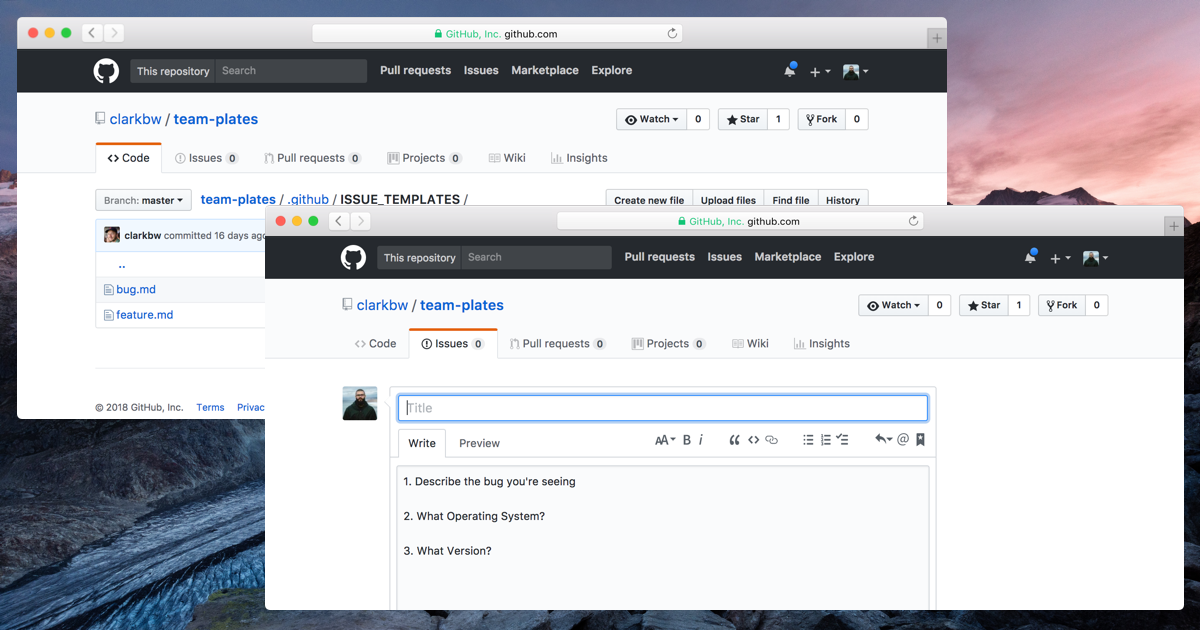

Read the GitHub Help article for more details about issue and pull request templates. Also check out how to manually create issue templates, a pull request template. and the guide on how to create the (deprecated) fallback/generic issue template.
Introducing remark-lint — #14 ⇄ #19 (⊶ 1d2959ca) ↠ Integrated remark-lint, a linter built on remark, the powerful Markdown processor powered by plugins such as remark-lint. It is used through remark-cli with remark-preset-lint-arcticicestudio, the custom preset that implements the Arctic ice Studio Markdown Style Guide.
To lint all Markdown sources within the project the lint:md NPM script has been added which will be picked up by the main lint script.
Introducing ESLint — #15 ⇄ #20 (⊶ d4bd7833) ↠ Integrated ESLint, the pluggable and de-facto standard linting utility for JavaScript using the configuration preset eslint-config-arcticicestudio which implements the Arctic Ice Studio JavaScript Style. Read #15 for more details about the configuration and setup as well as included plugins.
To lint all JavaScript sources within the project the lint:js NPM script has been added which will be picked up by the main lint script. The second script format:js allows to make use of ESLint's great auto-fixing feature.

Introducing Prettier — #16 ⇄ #21 (⊶ 39af1daf) ↠ Integrated Prettier, the opinionated code formatter with support for many languages and integrations with most editors. It ensures that all outputted code conforms to a consistent style and provides the best and recommended style configurations of-out-the-box™. Read #16 for more details about the configuration and setup as well as included plugins.
To format all compatible sources within the project the format:pretty NPM script has been added which will be picked up by the main format script.

Introducing lint-staged — #17 ⇄ #22 (⊶ 6ab10911) ↠ Integrated lint-staged to run linters against staged Git files and prevent adding code that violates any style guide into the code base.
Read #17 for more details about the configuration and setup.

Introducing Husky — #18 ⇄ #23 (⊶ 16e90c34) ↠ Integrated Husky, the tool that make Git hooks easy and can prevent bad Git commits, pushes and more woof!
Read #18 for more details about the configuration and setup.
Project repository README — #49 (⊶ f8561505) ↠ Wrote the project's repository README that initially contains the hero and various badges provided by the great shields.io project. Further documentations about the design concept, architecture and technologies as well as guides for contributions to develop, run and maintain the project will be documented within the docs itself. Minimal instructions might be added later on within a “Getting Started” / “Quick Start” section.

The following sections include details about implemented requirements for the three key criteria of the “JAMstack” design concept.

The “Gatsby” design concept defines process steps and aspects for the static site generator that is used to build Nord Docs like the Gatsby core configuration, Gatsby API implementations, required Gatsby plugins, custom configurations for Babel and Webpack and many more.
Gatsby initial configuration — #27 ⇄ #28 (⊶ 3cda2621)
↠ Initially implemented the core configuration of Gatsby through the gatsby-config.js file. It defines project-wide site metadata that can be used through the GraphQL API and configures all used plugins.
Read #27 for more details about the configuration and setup as well as included plugins. There have also been some tickets for bug fixe

Babel configuration — #29 ⇄ #30 (⊶ b288befb) ↠ Implemented the configuration for Babel even when Gatsby comes with an already optimized setup to create SSR “static” websites and apps, but there are also use cases that require to modify and extend this configuration to e.g. add a new Babel plugin for the latest syntax feature/proposal support.
Read #29 for more details about the configuration and setup as well as included plugins.

Webpack configuration — #31 ⇄ #32 (⊶ 7734d052) ↠ Implemented the configuration for Webpack to add useful production bundle plugins and development workflow optimizations by using Gatsby's Node API.
Read #31 for more details about the configuration and setup as well as included plugins.

Introduce React — #33 (⊶ 24aecae9) ↠ Initially added React's currently latest stable version 16.6.3. Since Gatsby v2, React and React DOM are a peer dependencies which allows users to freely choose the version they'd like to use.
Introduce React “prop-types” — #35 (⊶ 4fe54731) ↠ To support type validation and checking, Nord Docs initially uses React prop types through the prop-types package. This technique is sufficient for the beginning of the project and might be revised and refactored later on by migrating to TypeScript or integrating Flow.
The following sections include details about implemented requirements for the “Component & Project Structure” design concept.
Implemented the Root core container component (data provider) — #36 ⇄ #37 (⊶ 0465f375)
↠ The Root core container is the first and one of the important main data provider React components of this project. It represents the base element and entry point that wraps the all custom application components and serves as a data provider later on. Some of the tasks in the future will be to
- provide context props and functions for the global styled-components theme through the
ThemeProvidercomponent - inject global styles through styled-components
createglobalstylefunction including typography (#2) related data like application-wide used fonts - possibly data stores for state management libraries like MobX
This initial implementation only renders a React.Fragment.

The following sections include details about implemented requirements for the “Testing” design concept.
Set up the basic testing setup — #39 ⇄ #42 (⊶ 7a4d356c) ↠ To start writing tests the basic testing environment has been set up. This includes the Gatsby specific configurations, the base setup for Jest as well as the fantastic react-testing-library and just-dom's custom matchers.
Read #39 for more details about the configuration and setup as well as included plugins.

The following sections include details about implemented requirements of the workflow for the “Continuous Integration & Testing” design concept.
Basic continuous integration & testing setup — #44 ⇄ #45 (⊶ 2d0000e3) ↠ To ensure a great project quality, the stable and proven continuous integration & testing providers Circle CI and Codecov have been set up to automate the CI process pipelines and provide code coverage reports.
Read #44 for more details about the configuration and setup as well as available automated pipelines.
The following sections include details about implemented requirements of the workflow for the “Hosting & Continuous Deployment” design concept.
Basic Netlify configuration — #48 (⊶ f03dc824)
↠ Implemented Netlify's configuration file to define the command and publish path for production builds.
Read #48 and the design concept for more details about the configuration and setup as well as automated deployment pipelines.
Added missing “React Helmet” dependency — #34 (⊶ b63bab36) ↠ Implemented the configuration for Babel even when Gatsby comes with an already optimized setup to create SSR “static” websites and apps, but there are also use cases that require to modify and extend this configuration to e.g. add a new Babel plugin for the latest syntax feature/proposal support.
During the initial implementation of Gatsby (#27) the gatsby-plugin-react-helmet has been added, but the required react-helmet main package was accidentally forgotten to be added too.
Fix invalid Webpack resolve alias for pages — #40 (⊶ d2e72e39)
↠ Fixed the Webpack resolve alias pages for Gatsby pages that was configured to the invalid src/components/pages path instead of the correct src/pages path.
Fixed overridden ESLint import/no-extraneous-dependencies rule — #41 (⊶ 7eccff4b)
↠ The import/no-extraneous-dependencies rule allows to define a array of glob pattern that are allowed to define import devDependencies. In #15 the rule was overridden to include the project specific path **/.gatsby/** which whitelists all Gatsby specific scripts. Unfortunately this removed all glob pattern defined in the used eslint-config-arcticicestudio (rule is defined in the -base package) resulting in errors in other projects paths like tests.
It has been fixed by importing the paths defined in the preset from the eslint-config-arcticicestudio-base package and merge it with the additional **/.gatsby/** path.
NPM package initialization — #3 (⊶ ff99b861)
↠ Initialized the NPM package.json file that contains the project's metadata and dependency definitions.
Dependency update including security incident — #47 (⊶ 43204f06) ↠ Performed the first regular batch update for outdated dependencies that includes an important update since it for the hijacked package event-stream that includes malicious code which has been revealed yesterday. Nord Docs was affected passively because the package was a traverse dependency of the used package npm-run-all. The maintainer has reacted quickly and released the fix version 4.1.5.
Note that packages marked with an double exclamation mark ‼ have been affected by the security incident!
- gatsby
2.0.50➔2.0.55 - gatsby-source-filesystem
2.0.8➔2.0.9
- husky
1.1.4➔1.2.0 - lint-staged
8.0.5➔8.1.0 - ‼ npm-run-all
4.1.3➔4.1.50

MIT license — #5 (⊶ a6b4e4e1)
↠ Added the LICENSE.md file for the MIT license.
Git ignore and attribute pattern — #6 (⊶ 6b265454)
↠ Added the .gitattributes and .gitignore configuration files to define the pattern.
Using binary Git attribute for “Adobe Illustrator” artwork project files — #50 (⊶ f524be00)
↠ “Adobe Illustrator“ .ai artwork project files have been changed to be handled with the binary Git attribute instead of “normal” plain text to prevent encoding problems and noisy diff views.

Copyright © 2016-present Sven Greb

