Support Shadow DOM #17473
Comments
|
Hello @oliviertassinari, I found a workaround to fix this issue. Please let me know if you need code sandbox for a sample. |
|
Thanks for sharing. We have currently no incentive in improving the support of shadow DOM. We have yet to see strong completing use cases that outweigh the cost. The current use cases we have heard about:
If we could use this issue to document how Shadow DOM can be done, that would be perfect. I personally think that the current implementation of web components should have been abandoned and removed from the spec in 2015. |
|
Another workaroud. #16223 (comment) |
|
This is partly an upstream bug of React. Fix is already drafted. facebook/react#15894 |
|
@Jack-Works Thank you! |
|
@oliviertassinari I noticed one more issue: Unable to focus on input boxesSteps to reproduce:
|
|
Everyone have this issue please leave a comment for your usage on facebook/react#15894 you can see Facebook doesn't have any action on that pr. And does hack on #16223 (comment) solves your problem? |
|
@Jack-Works Yes, it works but focusing on inputs is not functioning inside the shadow dom. |
|
@sravannerella yes we found that problem in our production. Our team found out why and here is the solution |
This comment has been minimized.
This comment has been minimized.
|
Please consider adding support for shadow DOM |
|
Do you guys have more details on why shadow DOM? It will help better understand the need. What's the objective of it? For instance, if it's isolation, how is it solving more problems than creating? |
|
Our project is a browser extension, we need to inject UI into other web pages so we choose ShadowDOM. Currently, React, JSS and @material-ui don't support Shadow DOM well so we did a lot of hacks to make it work. |
|
@Jack-Works Have you considered to increase the CSS specificity of the styles (can be done with a JSS pluggin, say to 10) over using shadow DOM? What's that limitations of iframe? |
It's not the problem of css priority. We need to hide the Dom we added to the webpage so the webpage cannot see any text we added to the page. |
|
@Jack-Works Did you notice improvement opportunities from our side? I'm especially interested in the diff between the work that is required between having to React work in shadow DOM (this is outside of our scope) and the work required to make Material-UI work in shadow DOM. Basically, what can we do here to help the process? I have never looked at it in details, my distant perception on the matter is that React doesn't do any effort for the use case. |
|
Yes, IIRC in @material-ui there's some code assuming it is running in the main dom (maybe related to Modal) then it becomes buggy. Anyway, the most important part is I want to let JSS support ShadowDOM but I think it's not the duty of @material-ui. I also tried to contribute to React to improve the support for ShadowDOM but they don't accept it until now. |
|
We're using |
|
|
|
What about JSS? It would be nice to let JSS support inject style tags into ShadowRoot, even https://developers.google.com/web/updates/2019/02/constructable-stylesheets this modern feature! |
|
You can inject the styles where ever you want with JSS ( |
|
Our code are multiple root (all of those root are in the ShadowRoot) React application so I have no idea if |
|
cc @NMinhNguyen in case you have any insight on this one. I recall your team tried Shadow DOM at some point. |
You'd need an |
|
I'd also love to see support for shadow DOM. Our specific use case is the need to embed an app in a legacy project where we have no control over styling. This legacy project has global styles on stuff like It seems to me that a closed shadow DOM subtree is the solution that requires the least amount of work here, but I may be mistaken. We already have styles applied to the shadow tree using injection. If we could control where the portal appears that would basically solve all our remaining problems. For now we are stuck reimplementing dialogs and tooltips becaues they are not compatible. Another use case for this might be micro-frontends though I have no experience with that personally. Not sure how common this case is for others, but for me it has cropped up multiple times already. |
|
https://codesandbox.io/s/nostalgic-cloud-d2ny7?file=/src/Demo.tsx All UI in the code sandbox above is rendered in the ShadowRoot. You can verify that by the devtools.
const picker = usePortalShadowRoot((container) => (
     <DatePicker
         DialogProps={{ container }}
         PopperProps={{ container }}
         value={new Date()}
         onChange={() => {}}
         renderInput={(props) => <TextField {...props} />}
     />
))
Note: Our application is licensed in AGPLv3, you may not be able to reuse this code otherwise the license will spread into your project. This solution is quite hacky and might have a potential performance problem. |
|
I resolved this problem currently by using insertionPoint. constructor() {
super();
const shadow = this.attachShadow({ mode: "open" });
shadow.innerHTML = `
<noscript id="jss-insertion-point"></noscript>
<div id="app"></div>
`;
const appElement = shadow.querySelector("#app");
const jssInsertionPointElement = shadow.querySelector("#jss-insertion-point");
const createdJSS = jss.create({
...jssPreset(),
insertionPoint: jssInsertionPointElement,
});
ReactDOM.render(
<StylesProvider jss={createdJSS}>
<KanvasThemeProvider>
<CssBaseline />
<Button variant="contained" color="primary">
Primary
</Button>
</KanvasThemeProvider>
</StylesProvider>,
appElement
);
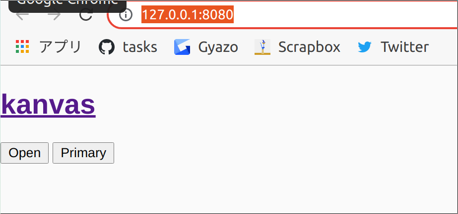
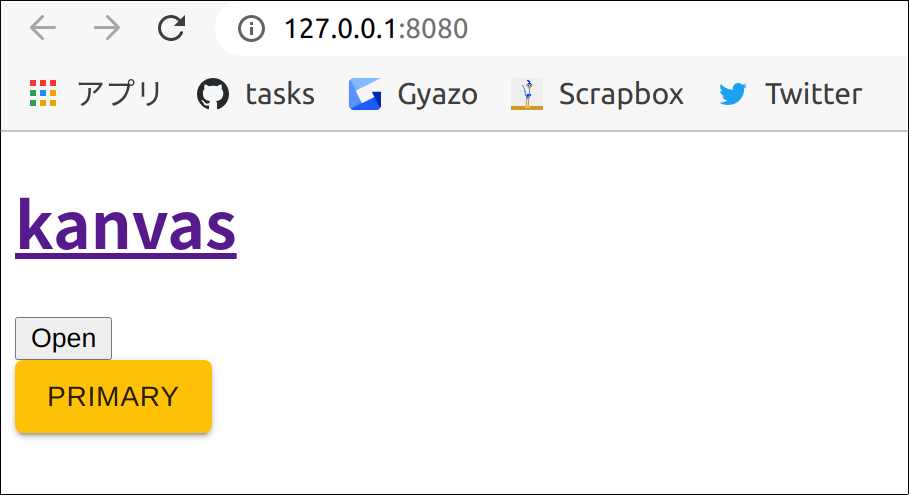
}Before After |
|
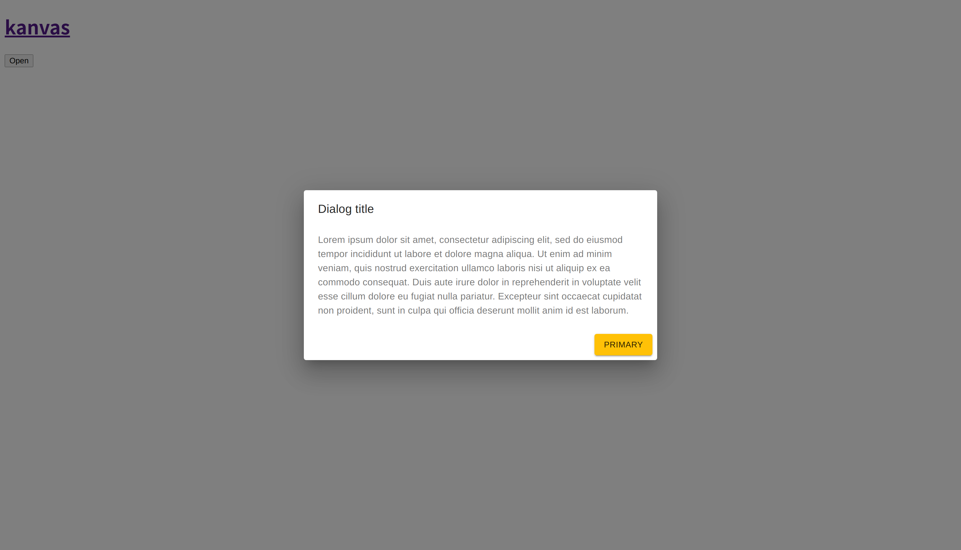
To use constructor() {
super();
const shadow = this.attachShadow({ mode: "open" });
shadow.innerHTML = `
<noscript id="jss-insertion-point"></noscript>
<div>
<div id="container">
<div id="app"></div>
</div>
</div>
`;
const appElement = shadow.querySelector("#app");
const containerElement = shadow.querySelector("#container");
const jssInsertionPointElement = shadow.querySelector(
"#jss-insertion-point"
);
if (!(jssInsertionPointElement instanceof HTMLElement)) {
throw new Error("Could not find JSS insertion point.");
}
const createdJSS = jss.create({
...jssPreset(),
insertionPoint: jssInsertionPointElement,
});
ReactDOM.render(
<StylesProvider jss={createdJSS}>
<KanvasThemeProvider>
<CssBaseline />
<Dialog container={containerElement} open={true}>
<DialogTitle>Dialog title</DialogTitle>
<DialogContent>
<DialogContentText>
Lorem ipsum dolor sit amet, consectetur adipiscing elit, sed do
eiusmod tempor incididunt ut labore et dolore magna aliqua. Ut
enim ad minim veniam, quis nostrud exercitation ullamco laboris
nisi ut aliquip ex ea commodo consequat. Duis aute irure dolor
in reprehenderit in voluptate velit esse cillum dolore eu fugiat
nulla pariatur. Excepteur sint occaecat cupidatat non proident,
sunt in culpa qui officia deserunt mollit anim id est laborum.
</DialogContentText>
</DialogContent>
<DialogActions>
<Button variant="contained" color="primary">
Primary
</Button>
</DialogActions>
</Dialog>
</KanvasThemeProvider>
</StylesProvider>,
appElement
);
} |
|
Does anyone know why the Select drop down breaks (loses styling-see screenshot, shows as bullet points- and some click abilities)? By the way, I have the exact same problem in v5 @mui/material Select also.
|

|
Got the answer through stackoverflow. Apparently, the fix is to just do this. <Select MenuProps={{ disablePortal: true }}> I don't have portal directly imported into my app so I'm scratching my head. https://mui.com/api/portal/#props |
|
@leopardy: Use |
|
@cherniavskii provided extremely helpful content here This works great: // fragment taken from @cherniavskii's code snippet
const theme = createTheme({
components: {
MuiMenu: {
defaultProps: {
container: shadowRootElement
}
},
MuiModal: {
defaultProps: {
container: shadowRootElement
}
}
}One inconvenience is that if several MUI components, which rely on portal functionality, are rendered within the Shadow DOM, then you'd have to hunt them all down and supply default containers for all of them explicitly - seems like a lot of error prone work. Perhaps there could be a way to supply the default container for any portal rendering, in this case it would be |
|
@cherniavskii, if I wanted to override the default container for |
|
I've found a better solution to address this - see mui/mui-x#5030 (comment) I think this can be addressed by the section in docs. I'm not 100% sure this is complete solution, but it looks like it addresses most of cases, and we can always update the docs if there's something to add here. |
|
One thing that it doesn't address is the |
|
@jacobweberbowery Right, I can reproduce it with this demo: https://codesandbox.io/s/shadow-dom-forked-t3d7cl?file=/demo.tsx I think we can use index d1993e039ec..afefc953844 100644
--- a/packages/mui-base/src/ModalUnstyled/ModalManager.ts
+++ b/packages/mui-base/src/ModalUnstyled/ModalManager.ts
@@ -122,14 +122,21 @@ function handleContainer(containerInfo: Container, props: ManagedModalProps) {
});
}
- // Improve Gatsby support
- // https://css-tricks.com/snippets/css/force-vertical-scrollbar/
- const parent = container.parentElement;
- const containerWindow = ownerWindow(container);
- const scrollContainer =
- parent?.nodeName === 'HTML' && containerWindow.getComputedStyle(parent).overflowY === 'scroll'
- ? parent
- : container;
+ let scrollContainer: HTMLElement;
+
+ if (container.parentNode instanceof DocumentFragment) {
+ scrollContainer = ownerDocument(container).body;
+ } else {
+ // Improve Gatsby support
+ // https://css-tricks.com/snippets/css/force-vertical-scrollbar/
+ const parent = container.parentElement;
+ const containerWindow = ownerWindow(container);
+ scrollContainer =
+ parent?.nodeName === 'HTML' &&
+ containerWindow.getComputedStyle(parent).overflowY === 'scroll'
+ ? parent
+ : container;
+ }
// Block the scroll even if no scrollbar is visible to account for mobile keyboard
// screensize shrink.@jacobweberbowery Would you like to submit a pull request? |
|
@cherniavskii Thanks for the quick response! Here's a PR based on your solution. It seems to work in my local testing. |
Issue:
When integrating modal or date picker or popover inside Shadow DOM, the click away listener is not working.
Expected Behavior:
On clicking outside, should close the modal, popover or the date picker
Current Behavior:
On clicking outside, the modal, popover or the date picker stays the same without closing.
A sample code:
Code sandbox
I need this to be fixed as soon as possible for one of my projects. Please help.
The text was updated successfully, but these errors were encountered: