Unexpected status bar context menu #108308
Comments
|
This is actually intentional with the rationale that it makes hiding an entry from the status bar fast because you do not have to move your mouse all the way up. //cc @misolori |
|
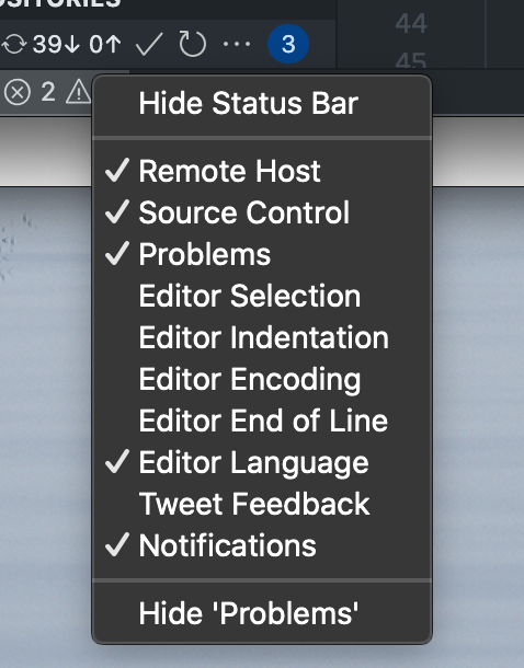
I think one of the things that really bother me is how the context menu starts from your cursor and downwards in the status bar, so you actually end up having to move your cursor all the way down:
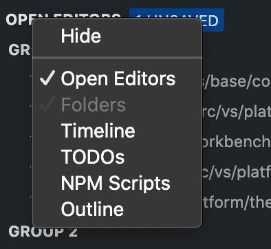
We should make all of these consistent, panels + views also behave the same as the activity bar:
|

|
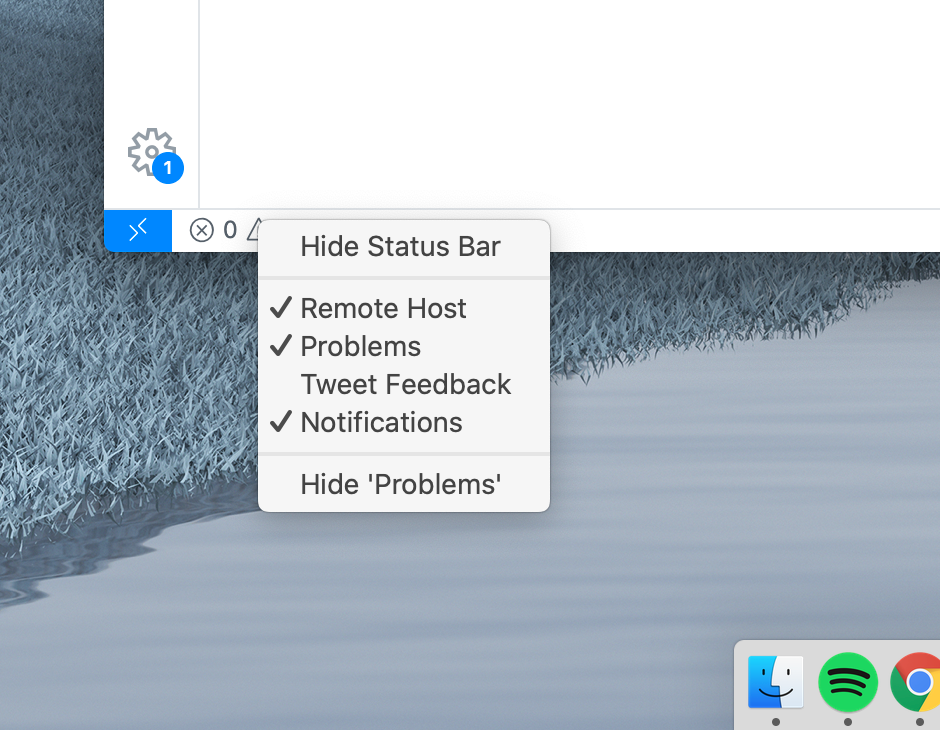
@misolori the status bar is typically to the bottom of the screen since the window is likely maximized and then the menu opens to the top:
The rationale was that in order to hide the entry you right click, you should not move the mouse all the way up. As such the "Hide" entry appears first. Should we change it? Doesn't this break muscle memory and people will start to hide the status bar always? |
|
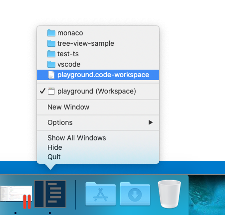
A very similar thing we do is to put most recent folders/workspaces to the bottom of the dock context menu:
|
|
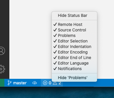
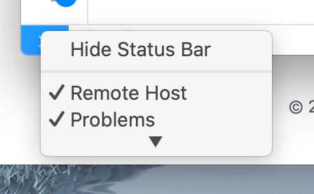
Ah, ok so I think what I've always seen is a bug on mac where the menu does not start at the bottom, so for me I've always had to scroll a lot:
If we're able to get the menu to work consistently then I think having the "hide this" menu option as the first thing makes sense. But I'm also fine making all menus the same. |
|
I will call my veto here on changing it as UX owner of the experience. Especially in codespaces for example, I see tons of entries and having a fast way to hide exactly the one you right click is crucial to me:
|
|
@misolori the fact that the menu scrolls is actually a bug we never figured out how to resolve in electron. See #40262 |
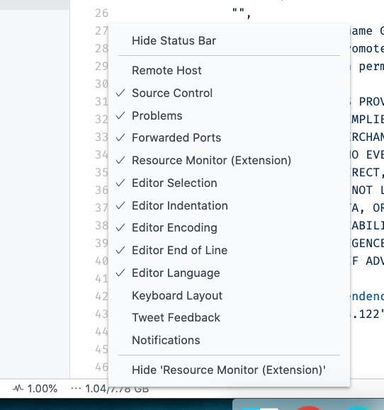
See attached screen capture, the groups is confusing and I often select the wrong item because the primary/top item is hide status bar, not hide for the entry. Context menus for the activity bar get this right
😕
😄
The text was updated successfully, but these errors were encountered: