A skin is a set of visual settings that gives your application a polished and consistent look. Aurora Theming module bundles a number of predefined skins that can be broadly categorized as light and dark.
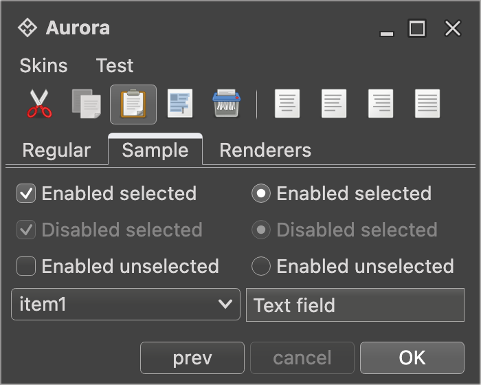
Light skins use predominantly light colors for painting the UI controls and containers. Business skin is an example of a light skin:

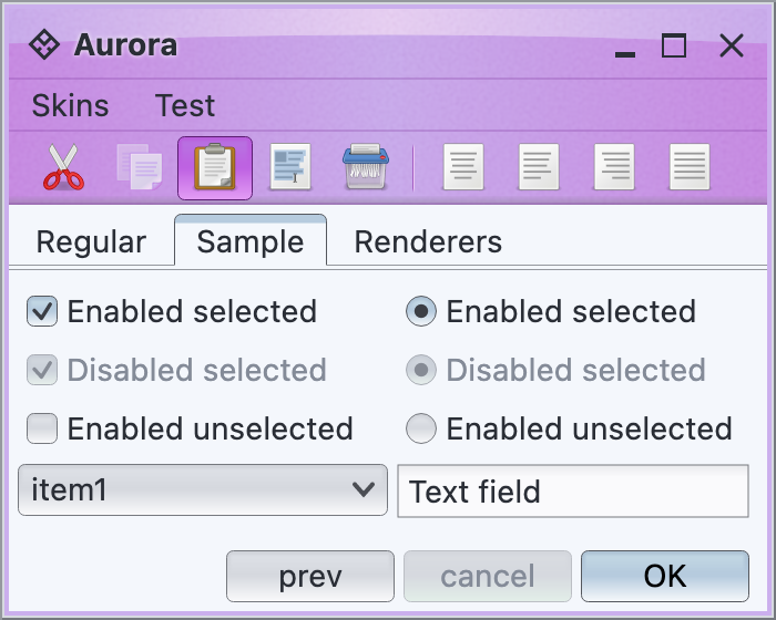
Dark skins use predominantly dark colors for painting the UI controls and containers. Graphite Chalk skin is an example of a dark skin:
The core Aurora skins are in the org.pushingpixels.aurora.theming package, and the AuroraSkinDefinition class contains all the APIs officially supported by Aurora skins. It is possible to use different Aurora skins on different AuroraWindows in the same application.
The skin definition consists of the following:
- Decoration areas and color scheme bundles:
- List of supported decoration areas.
- Color scheme bundles for the supported decoration areas.
- Optional background color schemes for the supported decoration areas.
- Painters:
- Miscellaneous:
- Button shaper.
- Optional overlay painters for some decoration areas.
In order to define a valid skin, you need to specify all its mandatory parameters. A valid skin must have a color scheme bundle for DecorationAreaType.None, a button shaper, a fill painter, a decoration painter, a highlight painter and a border painter. All other parts are optional.
The documentation on decoration painters explains the notion of a decoration area type. While a valid skin must define a color scheme bundle for DecorationAreaType.None, all other decoration area types are optional. Different skins have different sets of decoration areas that are painted. For example, the Moderate skin decorates DecorationAreaType.TitlePane and DecorationAreaType.Header, while the Nebula Amethyst skin also decorates DecorationAreaType.Toolbar:

In order to register a custom color scheme bundle and an optional background color scheme on the specific decoration area type(s), use the following APIs:
  /**
   * Registers the specified color scheme bundle to be used on controls in
   * decoration areas.
   *
   * @param bundle
   *     The color scheme bundle to use on controls in decoration areas.
   * @param areaTypes
   *     Enumerates the area types that are affected by the parameters.
   */
   fun registerDecorationAreaSchemeBundle(
         bundle: AuroraColorSchemeBundle,
         vararg areaTypes: DecorationAreaType
   )

  /**
   * Registers the specified color scheme bundle and background color scheme
   * to be used on controls in decoration areas.
   *
   * @param bundle
   *     The color scheme bundle to use on controls in decoration areas.
   * @param backgroundColorScheme
   *     The color scheme to use for background of controls in decoration
   *     areas.
   * @param areaTypes
   *     Enumerates the area types that are affected by the parameters.
   */
   fun registerDecorationAreaSchemeBundle(
         bundle: AuroraColorSchemeBundle,
         backgroundColorScheme: AuroraColorScheme,
         vararg areaTypes: DecorationAreaType
   )
Decoration areas registered with these APIs will have their background painted by the skin's decoration painter based on the default color scheme of the registered color scheme bundle. You can also use the following API to use a custom default color scheme on the specified decoration area types (in this case the controls in those decoration areas will use the default color scheme bundle):
  /**
   * Registers the specified background color scheme to be used on controls in
   * decoration areas.
   *
   * @param backgroundColorScheme
   *     The color scheme to use for background of controls in decoration
   *     areas.
   * @param areaTypes
   *     Enumerates the area types that are affected by the parameters. Each
   *     decoration area type will be painted by [AuroraDecorationPainter.paintDecorationArea].
   */
   fun registerAsDecorationArea(
         backgroundColorScheme: AuroraColorScheme,
         vararg areaTypes: DecorationAreaType
   )
Here is an example of specifying the default color scheme bundle for the Mariner skin:
val result = AuroraSkinColors()
val schemes = getColorSchemes(
    AuroraSkin::class.java.getResourceAsStream(
        "/org/pushingpixels/aurora/theming/mariner.colorschemes"
    )
)

val activeScheme = schemes["Mariner Active"]
val enabledScheme = schemes["Mariner Enabled"]
val disabledScheme = schemes["Mariner Disabled"]

val disabledSelectedScheme = schemes["Mariner Disabled Selected"]

val defaultSchemeBundle = AuroraColorSchemeBundle(
    activeScheme, enabledScheme, disabledScheme
)

defaultSchemeBundle.registerAlpha(0.8f, ComponentState.DisabledSelected)
defaultSchemeBundle.registerAlpha(0.8f, ComponentState.DisabledUnselected)
defaultSchemeBundle.registerColorScheme(
    disabledSelectedScheme, ColorSchemeAssociationKind.Fill,
    ComponentState.DisabledSelected
)
defaultSchemeBundle.registerColorScheme(
    disabledScheme, ColorSchemeAssociationKind.Fill,
    ComponentState.DisabledUnselected
)

...

result.registerDecorationAreaSchemeBundle(defaultSchemeBundle, DecorationAreaType.None)
and a custom color scheme bundle for the header-type decoration areas:
val headerColorScheme = schemes["Mariner Header"]
val headerBorderColorScheme = schemes["Mariner Header Border"]
val headerSchemeBundle = AuroraColorSchemeBundle(
    headerColorScheme, headerColorScheme, headerColorScheme
)
headerSchemeBundle.registerAlpha(0.4f, ComponentState.DisabledSelected, ComponentState.DisabledUnselected)
headerSchemeBundle.registerColorScheme(
    headerColorScheme, ColorSchemeAssociationKind.Fill,
    ComponentState.DisabledSelected, ComponentState.DisabledUnselected
)

...

result.registerDecorationAreaSchemeBundle(
        headerSchemeBundle, headerColorScheme,
        DecorationAreaType.TitlePane,
        DecorationAreaType.Header
)
And here is an example of specifying a number of decoration area types to have their background painted by the decoration painter and the specific color scheme, without registering a custom color scheme bundle for those areas:
result.registerAsDecorationArea(
        enabledScheme,
        DecorationAreaType.TitlePane,
        DecorationAreaType.Header,
        DecorationAreaType.Footer,
        DecorationAreaType.Toolbar
)To add polishing touches to the specific decoration areas, use overlay painters with the following API on AuroraPainters:
/**
 * Adds the specified overlay painter to the end of the list of overlay
 * painters associated with the specified decoration area types.
 *
 * @param overlayPainter
 *            Overlay painter to add to the end of the list of overlay
 *            painters associated with the specified decoration area types.
 * @param areaTypes
 *            Decoration area types.
 */
 fun addOverlayPainter(
       overlayPainter: AuroraOverlayPainter,
       vararg areaTypes: DecorationAreaType
 )
Here is how the Nebula skin is configured to paint drop shadows on the toolbars and separators on title panes and headers:
// add an overlay painter to paint a drop shadow along the top edge of toolbars
painters.addOverlayPainter(
    TopShadowOverlayPainter.getInstance(60),
    DecorationAreaType.Toolbar
)

// add an overlay painter to paint separator lines along the bottom
// edges of title panes and menu bars
painters.addOverlayPainter(
    BottomLineOverlayPainter(
        composite({ it.darkColor }, ColorTransforms.alpha(0.625f))
    ),
    DecorationAreaType.TitlePane, DecorationAreaType.Header
)
and here is how it looks like:
AuroraSkinDefinition groups its structure into three major categories: colors, painters and button shaper. Here is sample code from Mariner skin:
fun marinerSkin(): AuroraSkinDefinition {
    val painters = AuroraPainters(
        fillPainter = FractionBasedFillPainter(
            0.0f to { it.extraLightColor },
            0.5f to { it.lightColor },
            1.0f to { it.midColor },
            displayName = "Mariner"
        ),
        borderPainter = FractionBasedBorderPainter(
            0.0f to { it.ultraDarkColor },
            0.5f to { it.darkColor },
            1.0f to { it.midColor },
            displayName = "Mariner"
        ),
        decorationPainter = MatteDecorationPainter(),
        highlightFillPainter = ClassicFillPainter()
    )

    // add an overlay painter to paint a bezel line along the top
    // edge of footer
    painters.addOverlayPainter(
        TopBezelOverlayPainter(
            colorSchemeQueryTop = { it.ultraDarkColor },
            colorSchemeQueryBottom = { it.lightColor }
        ),
        DecorationAreaType.Footer
    )

    // add two overlay painters to create a bezel line between
    // menu bar and toolbars
    painters.addOverlayPainter(
        BottomLineOverlayPainter(
            composite({ it.ultraDarkColor }, ColorTransforms.brightness(0.5f))
        ),
        DecorationAreaType.Header
    )

    // add overlay painter to paint drop shadows along the bottom
    // edges of toolbars
    painters.addOverlayPainter(
        BottomShadowOverlayPainter.getInstance(100),
        DecorationAreaType.Toolbar
    )

    // add overlay painter to paint a dark line along the bottom
    // edge of toolbars
    painters.addOverlayPainter(
        BottomLineOverlayPainter(colorSchemeQuery = { it.ultraDarkColor }),
        DecorationAreaType.Toolbar
    )

    return AuroraSkinDefinition(
        displayName = "Mariner",
        colors = marinerSkinColors(),
        painters = painters,
        buttonShaper = ClassicButtonShaper()
    )
}Aurora provides a fine-grained mechanism for creating related skin variations by using accented skins. This can be done by using the AccentBuilder APIs.
Such skins "declare" themselves to support one particular, narrowly scoped kind of derivation - providing up to five color schemes as accents. It is up to a skin that declares itself as accented to "decide" how to apply those accent colors.
For example, here are two Creme skins that extend the core CremeAccentedSkin class:


The first passes a light blue color scheme as the accent for active controls and cell highlights, while the second passes a light brown scheme as the accent for the same parts of the UI. This particular accented skin family uses these two accent types for selected tabs, checkboxes, radio buttons, default buttons, scroll bars and active cells in tables, trees, and lists.
As another example, here are two Nebula skins that extend the core NebulaAccentedSkin class:

The first passes a light silver scheme as the window chrome accent, while the second passes an orange scheme as the window chrome accent. This particular accented skin family uses the window chrome accent on the root pane border, the title pane and the menu bar - while maintaining the overall consistency of its visual "language", such as decoration painter, fill painter, color scheme for active controls in the main UI area, etc.
The following class implements a custom combobox that lists all available Aurora skins and allows changing the current Aurora skin based on the user selection.
@Composable
fun AuroraSkinSwitcher(
    onSkinChange: (AuroraSkinDefinition) -> Unit,
    popupPlacementStrategy: PopupPlacementStrategy = PopupPlacementStrategy.Downward.HAlignStart
) {
    val currentSkinDisplayName = AuroraSkin.displayName
    val auroraSkins = getAuroraSkins()
    val selectedSkinItem =
        remember { mutableStateOf(auroraSkins.first { it.first == currentSkinDisplayName }) }

    ComboBoxProjection(
        contentModel = ComboBoxContentModel(
            items = auroraSkins,
            selectedItem = selectedSkinItem.value,
            onTriggerItemSelectedChange = {
                selectedSkinItem.value = it
                onSkinChange.invoke(it.second.invoke())
            }
        ),
        presentationModel = ComboBoxPresentationModel(
            displayConverter = { it.first },
            popupPlacementStrategy = popupPlacementStrategy
        )
    ).project()
}- First, it uses the
getAuroraSkins()API to populate the combobox with the list of all available Aurora skins. - Then, it uses the current
AuroraSkinDefinitionto select the combobox entry that matches the current Aurora skin. - Since the model entries behind the combobox are
Pair<String, () -> AuroraSkinDefinitionobjects, we pass adisplayConverterthat uses the display name of the skin. - Finally, our
onTriggerItemSelectedChangecalls the passed lambda. The purpose of the lambda is to allow the higher level configuration to update the current skin. This responsibility rests with the application code - to have a mutable state variable that tracks the currently set skin, and to update that mutable state in this lambda passed to the sampleAuroraSkinSwitcher.
The same approach can be used to create a menu selection of available Aurora skins.