A command is the most basic building block of Aurora components.
Commands are created by populating all required, as well as zero or more optional attributes on the Command data class. The following attributes are available:
| Attribute | Type | Required? | |
|---|---|---|---|
| Base | text | String | yes |
| extraText | String | no | |
| icon | Painter | no | |
| Action | action | () -> Unit | no |
| actionPreview | CommandActionPreview | no | |
| actionRichTooltip | RichTooltip | no | |
| isActionEnabled | Boolean | no | |
| Secondary | secondaryContentModel | CommandMenuContentModel | no |
| secondaryRichTooltip | RichTooltip | no | |
| isSecondaryEnabled | Boolean | no | |
| Toggle | isActionToggle | Boolean | no |
| isActionToggleSelected | Boolean | no | |
| onTriggerActionToggleSelectedChange | (Boolean) -> Unit | no |
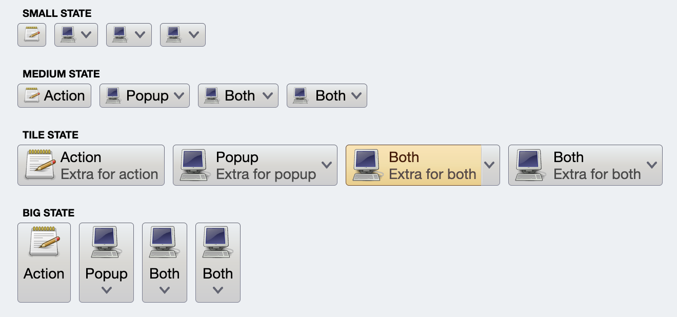
Let's take a look at the following screenshot that shows how four commands might be rendered on the screen (or projected, in Aurora terminology):
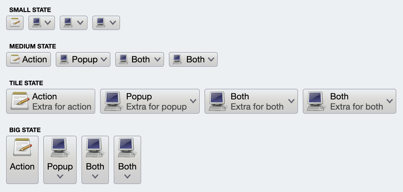
Each row has four buttons. All buttons at the same index in their row are projected from the same command. The only difference is the presentation model associated with each one of the projection:
- In the first row (small state), only the small icon is showing.
- In the second row (medium state), the icon is small, and only text is showing.
- In the third row (tile state), the big icon is on the left, and the vertical stack on the right displays the text and the extra text.
- In the fourth row (big state), the button is showing the text (that might go to two lines) and a big icon, stacked vertically.
For the "Action" buttons (first button in each row), the command that was used to project all four buttons looks like this:
val commandActionOnly =
    Command(
        text = resourceBundle.getString("Action.text"),
        extraText = resourceBundle.getString("Action.textExtra"),
        icon = accessories_text_editor(),
        action = { println("Action activated!") },
        ...
    )
As with all code samples in Aurora documentation, the classes for icons passed to icon attribute were transcoded by SVG Transcoder.
Action is a piece of code associated with a command that is executed when that command is activated (with mouse or keyboard):
// Increment progress by 10%
val incrementProgress = Command(
  text = "",
  icon = add_circle_outline_24px(),
  isActionEnabled = enabled and (progress < 1.0f),
  action = { progress += 0.1f }
)
The action attribute is a () -> Unit lambda.
In addition, you can pass the actionPreview object to configure the action preview. The CommandActionPreview interface looks like this:
interface CommandActionPreview {
    /**
     * Invoked when a command preview has been activated.
     *
     * @param command Command for which the preview has been activated.
     */
    fun onCommandPreviewActivated(command: Command)

    /**
     * Invoked when a command preview has been canceled.
     *
     * @param command Command for which the preview has been canceled.
     */
    fun onCommandPreviewCanceled(command: Command)
}
Command preview is activated when the command's projection goes into the preview mode - in most cases it would be when the user moves the mouse over the projected button. For example, an "add bold style" command might provide a preview of how that bold style looks like on the text without fully "committing" the user to take the corresponding action. Preview mode should provide a complete preview of the command's action, and fully rollback that preview once that mode is canceled. If implemented properly, preview mode is a powerful feature that would allow your user to explore the functionality of the application without the extra overhead of clicking around the controls and trying to undo the resulting operations explicitly.
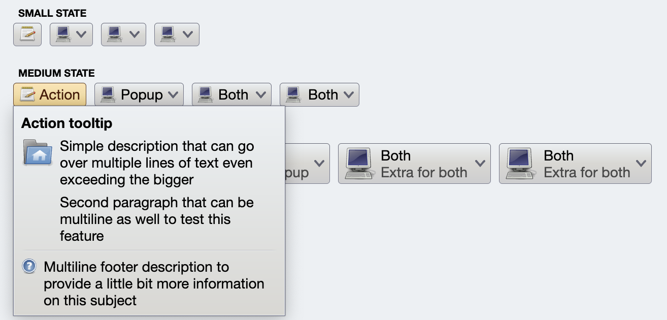
Rich tooltips are shown on hover, providing an opportunity to explain what the corresponding command does:
To configure the rich tooltip for the command's action, create a RichTooltip data object and set it as actionRichTooltip attribute on your command:
val commandActionOnly =
    Command(
        text = resourceBundle.getString("Action.text"),
        ...
        actionRichTooltip = RichTooltip(
            title = resourceBundle.getString("Tooltip.textActionTitle"),
            mainIcon = user_home(),
            descriptionSections = listOf(
                resourceBundle.getString("Tooltip.textParagraph1"),
                resourceBundle.getString("Tooltip.textParagraph2")
            ),
            footerIcon = help_browser(),
            footerSections = listOf(
                resourceBundle.getString("Tooltip.textFooterParagraph1")
            )
        )
)The command's action can be disabled and enabled dynamically based on application-specific logic. For example, commands that toggle styling of the selected content in a text field might have their action marked as disabled when there is no selection by setting isActionEnabled to false during the builder initialization:
// Bold style command
val commandBold =
    Command(
        text = resourceBundle.getString("FontStyle.bold.title"),
        icon = format_bold_black_24dp(),
        isActionEnabled = false,
        ...
    )
and then be dynamically enabled or disabled based on the current selection.
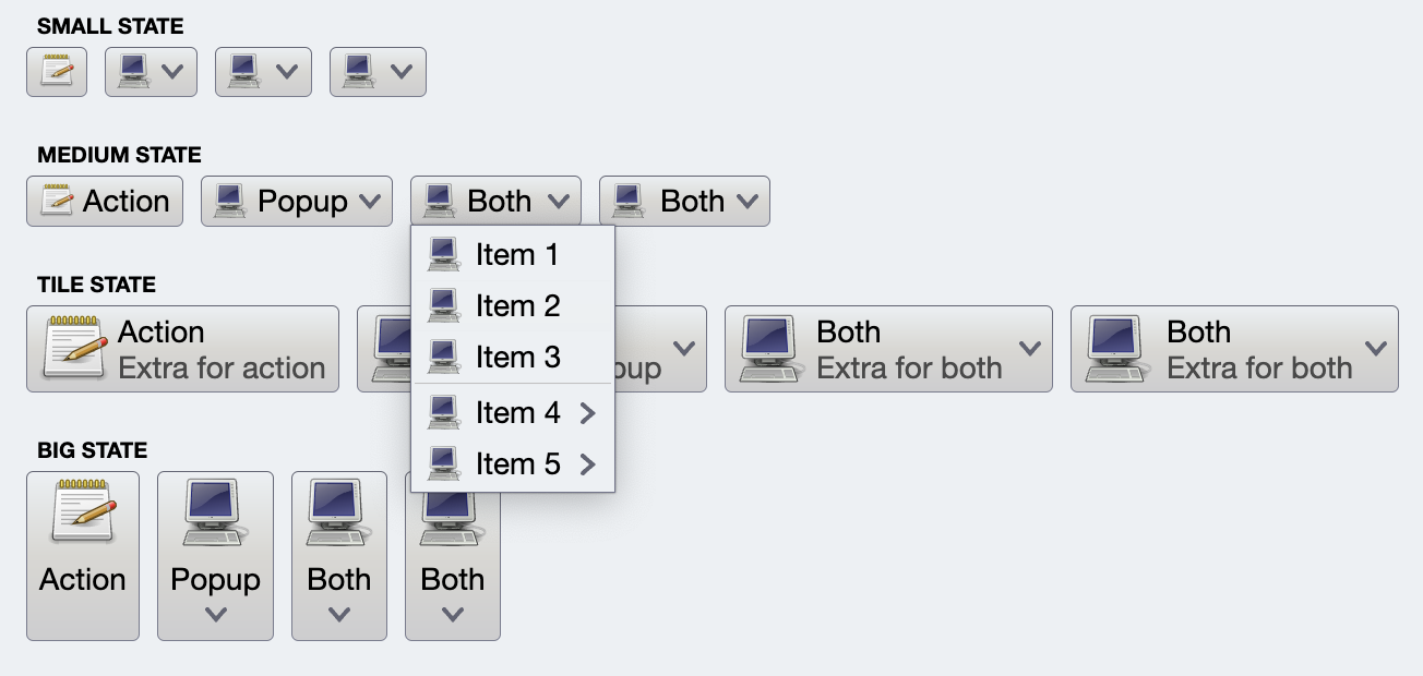
Secondary content allows logical grouping of multiple commands that are only shown when a specific, so-called "secondary" area of the projected button is activated.
The simplest case of secondary content is additional commands shown in a popup menu:
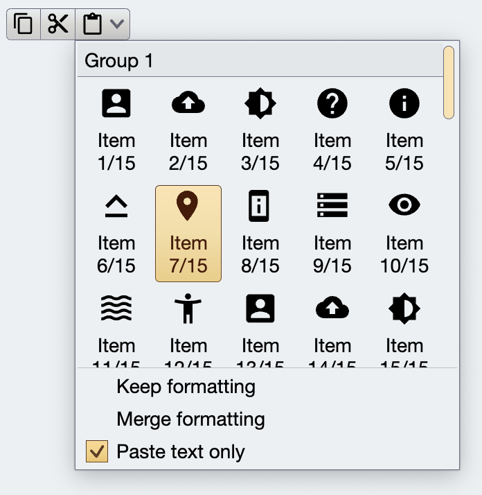
Secondary content can have a more complex structure, with an embedded, separately scrollable panel of commands:
All these three examples would be called "popup buttons" in similar component suites. The power of secondary content in Aurora commands can be seen in how easily it is to configure a projected button to be a "regular" action button - with just one action.
Or, by setting secondaryContentModel and CommandButtonPresentationModel.textClick = TextClick.Action make it a split button with a popup menu shown when the down arrow is clicked:
Or instead, setting CommandButtonPresentationModel.textClick = TextClick.Popup to make it a split button with a popup menu shown when either texts or down arrow are clicked:
An important note is in order here. Even though all the examples so far have shown secondary content displayed as a popup menu, that is not necessarily the case. Aurora's model of separating content from presentation (and combining the two in a projection) means that the same exact command projected as a split button can be projected into something that looks like this in the upcoming addition of the ribbon / command bar container:
Here, the ribbon application menu is a two-panel layout. The main commands are projected in the left column. The secondary content associated with a command is displayed in the panel on the right - not as a separate popup menu, but as part of the same application menu container.
Same as with action rich tooltips, you can configure a rich tooltip to be shown on hovering over the secondary activation area. To configure the rich tooltip for the command's secondary content, create a RichTooltip data object and set it as a secondaryRichTooltip attribute on your command.
Secondary content of a command can be enabled and disabled separately from the command's action enabled state. Set isSecondaryEnabled to false to disable secondary content during the initialization, or pass false / true later on to dynamically toggle the enabled state of the secondary content area of the projected button based on application-specific logic.
A command configured with one of the toggle attributes can be - programmatically or via user interaction with its button projection - in either selected (on) or unselected (off) state.
In the following example we use isActionToggle and isActionToggleSelected attributes to mark the four commands as toggleable:
// Align left command
val commandAlignLeft = Command(
    text = "Left",
    icon = format_justify_left(),
    isActionToggle = true,
    isActionToggleSelected = (textAlign == TextAlign.Left),
    onTriggerActionToggleSelectedChange = {
        if (it) textAlign = TextAlign.Left
    }
)

// Align center command
val commandAlignCenter = Command(
    text = "Center",
    icon = format_justify_center(),
    isActionToggle = true,
    isActionToggleSelected = (textAlign == TextAlign.Center),
    onTriggerActionToggleSelectedChange = {
        if (it) textAlign = TextAlign.Center
    }
)

// Align right command
val commandAlignRight = Command(
    text = "Right",
    icon = format_justify_right(),
    isActionToggle = true,
    isActionToggleSelected = (textAlign == TextAlign.Right),
    onTriggerActionToggleSelectedChange = {
        if (it) textAlign = TextAlign.Right
    }
)

// Align fill command
val commandAlignFill = Command(
    text = "Fill",
    icon = format_justify_fill(),
    isActionToggle = true,
    isActionToggleSelected = (textAlign == TextAlign.Justify),
    onTriggerActionToggleSelectedChange = {
        if (it) textAlign = TextAlign.Justify
    }
)
When these commands are used to project a button strip, only one of the four resulting buttons can ever be in the selected / on state. When one of the button transitions into such a state, previously selected button becomes unselected / off. This behavior controlled by the textAlign state variable.
In the following example we use isActionToggle and isActionToggleSelected attributes to mark the four commands as toggleable - separately from each other, as they are controlled by four separate state variables:
// Bold style command
val commandBold = Command(
    text = "Bold",
    icon = format_text_bold(),
    isActionToggle = true,
    isActionToggleSelected = bold,
    onTriggerActionToggleSelectedChange = { bold = it }
)

// Italic style command
val commandItalic = Command(
    text = "Italic",
    icon = format_text_italic(),
    isActionToggle = true,
    isActionToggleSelected = italic,
    onTriggerActionToggleSelectedChange = { italic = it }
)

// Underline style command
val commandUnderline = Command(
    text = "Underline",
    icon = format_text_underline(),
    isActionToggle = true,
    isActionToggleSelected = underline,
    onTriggerActionToggleSelectedChange = { underline = it }
)

// Strikethrough style command
val commandStrikethrough = Command(
    text = "Strikethrough",
    icon = format_text_strikethrough(),
    isActionToggle = true,
    isActionToggleSelected = strikethrough,
    onTriggerActionToggleSelectedChange = { strikethrough = it }
)
The state variables are used to create a derived span style which is applied on the AnnotatedString used to create the content of the TextFieldValue:
var bold by remember { mutableStateOf(false) }
var italic by remember { mutableStateOf(false) }
var underline by remember { mutableStateOf(false) }
var strikethrough by remember { mutableStateOf(false) }

val spanStyle by derivedStateOf {
    SpanStyle(
        fontWeight = if (bold) FontWeight.Bold else FontWeight.Normal,
        fontStyle = if (italic) FontStyle.Italic else FontStyle.Normal,
        textDecoration = when {
            underline && strikethrough -> TextDecoration.combine(
                listOf(TextDecoration.Underline, TextDecoration.LineThrough)
            )
            underline -> TextDecoration.Underline
            strikethrough -> TextDecoration.LineThrough
            else -> null
        }
    )
}

val textFieldValue by derivedStateOf {
    TextFieldValue(
        annotatedString = AnnotatedString(
            text = text,
            spanStyle = spanStyle
        )
    )
}
When any of the action buttons is toggled, it flips the corresponding state variable, which in turn recomposes the text field with the updated annotated string.
Continue to the command projections.