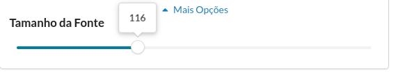
Label as a value indicator #6
Comments
|
You can do by wrapping it in a (The input props come form redux-form in this example.) |
|
Since the project looks abandoned for some time, I've made my own version with this support, it is available under "@kassellabs/react-semantic-ui-range" My company will use this fork project, so we will update it when we need it, so you can expect SemVer and a relative API stability if you plan to use this. The tooltip style customization is totally up to the project that uses it to decide, In our case, we're using it like this:
<Slider
  value={value}
  discrete={discrete}
  tooltip={(currentValue) => (
    <SliderTooltip position={tooltipPosition} value={currentValue} />
  )}
  style={{
    trackFill: {
      backgroundColor: '#007EA7',
    },
  }}
  settings={{
    tooltipPosition,
    start: value,
    max,
    min,
    step,
    onChange,
  }}
/> |
|
@nihey kudos for your work!
|
|
@SimonGolms Thanks for your feedback! About the notes:
The // SliderTooltip.js
// Uses semantic-ui's `popup` styles as a base
const SliderTooltip = ({ position, content }) => (
<div className={`ui ${position} center popup visible slider-tooltip`}>
{ content }
</div>
);/* SliderTooltip.styl */
.ui.popup.slider-tooltip {
position: relative;
}It serves us well on our needs.
Unfortunately, we have not implemented the tooltips for multiple thumbs, as all of our application sliders had just one thumb, we ended up only implementing what we needed. |
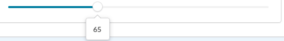
it would be nice to have a label floating around the slide to indicate its value.
The text was updated successfully, but these errors were encountered: