UI Components Library #41580
Comments
 ahmaxed
added
scope: UI
ahmaxed
added
scope: UI
|
Should this issue be consolidated back into #16445 |
|
For that we would use stylelint which would enforce a common css style. I would keep both issues separate, but link them since they are related. |
|
Can you please share some screenshots and elaborate more on this issue .I'm a newbie trying to contribute for the first time. Can you please help me?? |
Hey @prohackerzzz, |
|
@prohackerzzz, I think once we have replaced a couple of the components, it would be easer to contribute as a first timer then. |
|
|
|
@ahmadabdolsaheb I guess we could just build a set of new components first, then we could do incremental migrations when we deem they are ready. Do we plan to use the components on other platforms too (code radio, news,...) or they will be /learn components only? |
|
Hi, I am also a newbie who would love to help on this issue. @huyenltnguyen I think that's a good idea to do it incrementally. |
@huyenltnguyen, I think here is the plan moving forward if we are planning to do incremental migration.
This is a great read: https://dev.to/nejremeslnici/migrating-tachyons-to-tailwind-css-part-i-ich Please let me what you think.
Eventually we can reuse components across platforms; however, it is best to think about this component library built for learn at the moment to limit the scope of the migration. Coderadio has very specific UI needs and not sure how modularity would improve it. Going headless with news is in the works but the use of client technologies are not finalized yet. Ideally learn and news will have similar ui elements (walls of text, grid system, etc) and both could pull from storybook in the future. |
|
I have worked with Storybooks before. I have used tailwind with Storybooks and Svelte, but I'm sure it can be changed into tailwind and React easily. |
|
@ahmadabdolsaheb Thanks a lot! That sounds like a great plan. Now that it is up to us to be responsible for the components' HTML, what I would add as a criteria to our components is that they should be accessible and meet web accessibility requirements (https://www.w3.org/WAI/standards-guidelines/wcag/). Here is the list of components that we are pulling from
[edited by @ahmadabdolsaheb]: There was a list of actionable items here that was moved to the top to give contributors a better context of our progress. For the component to-do list, I noted them down in alphabetical order, but I'm sure you have a different order in mind with the components' priority, so please help me to adjust it. If the list misses anything please help add them in as well. |
Tailwind injection are typically very fast on production because as we know it, it will shake the tree and only inject what we need. While from my OWN experience and others, injecting tailwind into dev, will take longer because it doesn't treeshake on dev. One question I have is does FCC uses Bootstrap or TailwindCSS, because AFAIK it uses bootstrap right? If so, why are we using tailwindcss on storybook? |
You are correct. TailwindCSS uses PurgeCSS to get rid of unused CSS.
We are currently using bootsttrap; however, it comes with design decisions that we had to overwrite over time. |
|
@huyenltnguyen, thanks for the initial storybook setup. Looking forward to the tailwind, RTL, Package publication, and including the first component into learn. Generally speaking, performance is one of the main considerations for this migration. Optimizing our component library will help us reduce the size of that chunk and improve our SEO down the line.
|

|
@raisedadead, would you like to have the component library completely isolated as an npm package? |
|
Thanks for asking, I have tried and articulated the intent here: #41920 (review), a TL;DR version is yes to isolation and a probable no to an npm package (just for now at least) |
|
Since we are moving forward with Typescript, it might be beneficial to scaffold the entire storybook setup using a TS package developer CLI such as TSDX, that has Rollup, Jest, tsconfig, TSLint, storybook, etc out of the box. We would just need to add TailwindCSS config and RTL on the top. Thoughts? |
|
I'm not sure about TSDX. Firstly, it uses TSLint which was deprecated back in 2019 - TSLint's maintainers recommend people use typescript-eslint now. Also, if we wanted to move on from it, is there an easy way to bail out? |
|
As a general rule, we want to avoid tools that are opinionated. |
|
I see, just to clarify we want the followings:
|
|
Yes, we would probably prefer a bundler like webpack that we already have experience with but not necessarily married to. |
|
One of the component library documentation patterns include adding the styleguide as the storybook first page. This might be a good strategy for us to adopt where we could add our styleguide to our storybook, build and deploy it at https://design-style-guide.freecodecamp.org/ and have it be the single source of truth for design. |
|
@ahmadabdolsaheb Do you see https://design-style-guide.freecodecamp.org/ as a simple Storybook page, or will it be a documentation page like Material UI or Tailwind? I personally prefer documentation page as it is more structured and we can have more content about our design system rather than just component-specific. But I'm obviously painting a far future here. Could we for now deploy and host Storybook at |
|
You can also recommend sone component so that I can start the development. |
|
Hey @huyenltnguyen, I have gone through the codebases of other component libraries. They all use the React portal. I can do it. |
|
Hey @huyenltnguyen, Can I take on the ToggleButton/Row/Column/Image component? Also, Is there any document that carrying the specification of the components? |
|
I want to work on image and toggle button component, Its urgent to contribute for me. Please reply asap. @ahmadabdolsaheb |
|
@mansijain980, thank you for your interest. If you are in a hurry, I highly recommend adding the color tokens to the config (#42186) which is one of the setup steps needed before we could start working on the developing the components. Additionally, the image component seems straight forward and does not require the theme support which is not implemented yet. Feel free to proceed with creating the image element. Please make sure to review a11y best practices for the image element and document the process of component creation in your pr. @ashiskumar-1999, thank you for your research. Let me do a little bit of research and get back to you on the ways we could move forward on developing tailwind overlay components. |
|
@ashiskumar-1999, I was wondering if you could share the links to the component libraries you looked into for the modal component? |
|
@ahmadabdolsaheb, I looked into the Carbon design system (https://www.carbondesignsystem.com/components/modal/usage/), Chakra-UI (https://chakra-ui.com/docs/overlay/modal) as a reference. About the TailwindUI overlays part, yes, I have gone through the code samples on the website. |
|
@ahmadabdolsaheb @huyenltnguyen |
|
@ashiskumar-1999, thanks for sharing those references and for your patience. 🙏 Feel free to start by implementing the image component. Please make sure to review a11y best practices for the image element and share the process of your research and component creation in your pr so we could document it for other contributors. Once we get the the colors and night mode in we could start developing the modal. @hamzawaleed0102 thank you. Would you be interested in setting up Typescript for the component library and migrating our sample button component to TS? |
|
Yes @ahmadabdolsaheb that would be great 🎉. Please share a bit more details to help me get started easily. |
|
@hamzawaleed0102, we have a component library at https://github.com/freeCodeCamp/freeCodeCamp/tree/main/tools/ui-components that uses storybook for managing and documenting UI components. It uses tailwind to style those components and rollup to bundle them. A good starting point would be reading the TS related Storybook docs: https://storybook.js.org/docs/react/configure/typescript |
|
Thanks @ahmadabdolsaheb |
|
@ahmadabdolsaheb I enjoyed working on TS configuration for UI components library. I'm up for any other ticket. |
|
Hey! I would love to help. I enjoy working with TS and love working on frontend components. Where can I help? |
|
@hamzawaleed0102, @RJamesMaier thank you for your interest. Feel free to start working on a component that is listed in the issue description. You could gather the requirements by reviewing how each component is being used, what props are being passed, and how each DOM element is being rendered. Additionally make sure to review a11y best practices for each element and write tests accordingly. Please document the process of your research and component creation in your pr so we could add it to the issue for onboarding new contributors. |
|
Awesome thank you! |
|
Hey friends 👋 First of all, I'm sorry for being absent for a very long time and blocking the work. Covid hit and left me with mental bumps and bruises. I will need some time to get the balance back, but will try to be more responsive here as well as in the chat. As @ahmadabdolsaheb mentioned, we will need to gather the specs for each component before implementing them. The requirements will be slightly different depending on the complexity of the components, but I think the following questions need to be answered overall:
I think I have more to add, but I will need to sit down to have a more comprehensive guide (this is part of the documentation task that I keep failing to commit). I know this is quite overwhelming, especially the accessibility part, but I believe this is a right thing to do. Having a11y in mind now will enables us to have better implementation approaches in the beginning, rather than trying to shift the implementation later as a11y being an after-thought. We don't need to get it right the first time, but just try to take into consideration. Btw, even Material UI can't claim that their components are 100% accessible (see this PR). Also, I was thinking about opening an issue for each component, so that we can keep the discussion in one place, but it's up to you guys 🙂. Feel free to send PRs out if you think they are ready, and perhaps /cc me in there for visibility. I will try, but I don't think I can review them in a timely fashion, and I know it is Hacktoberfest, so I don't want to ruin it for you. I'll trust the core maintainers with the decision to merge the changes. I would rather see some movements in the component library rather than leaving it stale. Looking forwards to your contributions. Stay safe, stay healthy, and happy coding! There are a lot of component libraries out there for us to use as references, I'm linking some that I find helpful for me when I need to look for component guidelines and a11y best practices:
One interesting thing I recently found is that there are a lot of governments that have their own design system page, and they are open source ❤️ (and tax money well spent!): |
|
Hey everyone! 👋 I've been working a bit on alert component, and I've just opened a draft PR (#43835). I would really appreciate your feedback! |
|
Hi everyone! I got my local setup for FCC working. Just wanted to let you know that I will be looking at building out the toggle buttons. |
|
I have experience building UI component libraries and would like to contribute. Are there any mocks for these components? |
|
@JoeTurnerIO, Thanks for your interest. The components' design and functionality should resemble the components that are used in the learn codebase. Here is an example: freeCodeCamp/client/src/components/settings/Certification.js Lines 1 to 6 in d161998 |
|
I would like to contribute. |
|
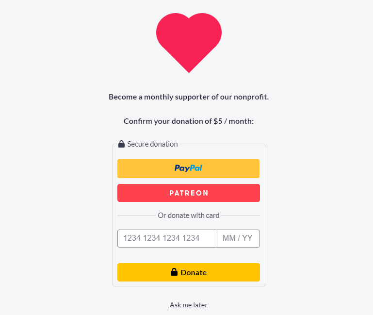
Hi guys |
|
Donations dialog box(attached below) UI need to redesign. Contribution: Yes |
 and others
Problem:
Currently our HTML and CSS consist of the followings:
As a result, we would need to remove a lot of the unused styles, overwrites, and find a better way to manage our components.
Solution:
We should create our own component library that uses Storybook (isolate the components and document them) and tailwindCSS (style each component) and make sure they meet the web accessibility requirements.
I would roughly break the project down into smaller tasks, and the list can be adjusted as we go:
/components/helpersand replace it with the one above (? - I'm not sure, I haven't looked at the code closely, but I guess maybe there is a reason to split them)npm-linkto link the ui folder with /clientreact-bootstrapcomponents with our own, one component at a time@freecodecamp/react-bootstrapas a dependencyLists were borrowed from @huyenltnguyen's comment below.
The text was updated successfully, but these errors were encountered: