Fluid typography: Custom font sizes are not responsive #49162
Comments
 beafialho
added
[Type] Bug
beafialho
added
[Type] Bug
|
Thanks for opening the issue! The current state of the fluid typography rules that get applied for custom font sizes, is that it uses the minimum font size factor of For much larger font-sizes like From testing in my local environment I can see the following output is happening:
Unfortunately, since the In the longer-term, to provide a proper fix for this, I wonder what the desired result would be? Would it be to still use the I'll add the Needs Design Feedback label, as it'd be good to get a little more feedback on what the desired output should be when folks want to use quite large custom font sizes. |
|
I've also added this one to the fluid typography tracking issue over in #44888. |
|
Thanks @andrewserong for providing help both for the short term and the long term. The code you provided to create another size preset will definitely be useful! In the case of this theme, I added We've been struggling with this issue for a while in some themes, and I had roughly mocked something up for the editor UI that could potentially help. A toggle inside Typography tools that would allow users to define the smallest and largest size of a text block, post title, etc. I don't know if something similar has been explored already.
Ideally though, there should just be different editing modes for editing your website: one for a small devices (Mobile) and for large devices (Desktop), maybe even one for Tablet or small Desktop. But I believe this needs broader thinking. I'd love to hear @iamtakashi @iamarinoh and @jasmussen 's thoughts. |


|
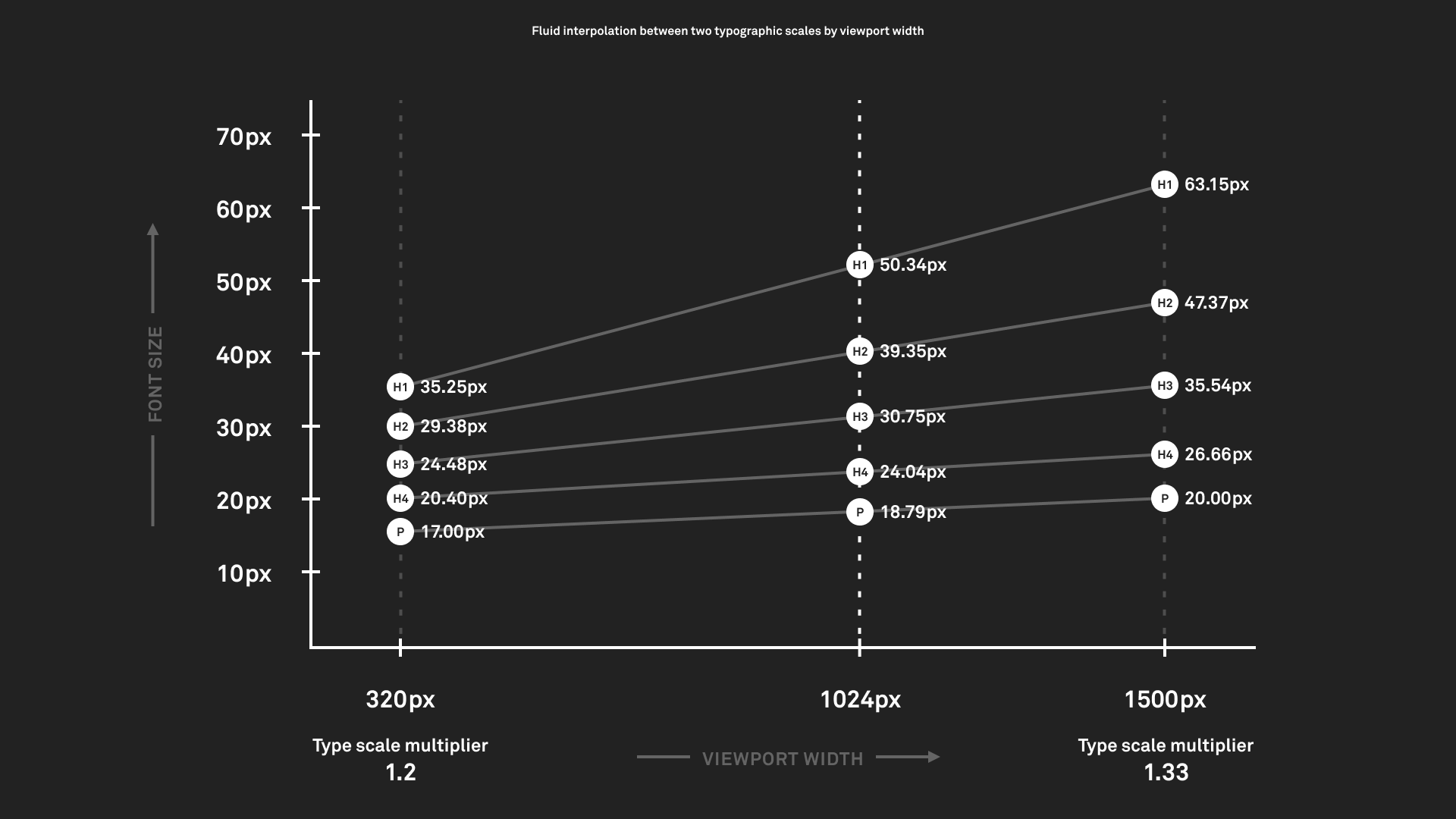
I like it, thanks for always being so visual in your feedback Bea! I think we might be able to be even simpler, having just a slider with min/max ranges, before you step into anything advanced. That said, I still think there's room to improve the basic formula for how those clamp values are made, it seems like we can make a smarter range of min and max values so outside of body text, there's always some basic scaling going on. Take the homepage of https://utopia.fyi/ for example, it scales really nicely. It also seems like https://utopia.fyi/blog/designing-with-fluid-type-scales goes into detail on the various scaling formulas, which could be worth taking some inspiration from. |
 annezazu
added
the
Global Styles
annezazu
added
the
Global Styles
|
Nice ideas! I really like the idea of being able to customise it at the individual control level.
Totally. There's currently a basic amount of scaling being applied to all font sizes, I think the tricky thing here is figuring out how that scale should (for want of a better term) scale as font sizes get larger 🤔 I'm happy to try out a PR to change the typography scale so that we can play with it, but I'm not really too sure where to begin. Currently, as far as I can tell, the algorithm uses the max font-size multiplied by |
|
@WordPress/gutenberg-design ^ for that latter question as without clarity there it's hard for development to proceed in fixing this until there's a sense of what we want the experience to be.
|
This is hard to answer definitively, as ultimately what "feels right" is going to be the solution. The Utopia example feels good, and looking at the type scale graph it seems like always multiplying the max-font size by 0.75 is going to produce a more linear scale than we might want. I.e. the bigger the max font size, perhaps, the faster it scales down. Diving further into some of those examples — not because they are to be copied verbatim, but because it feels very good — there's this example page, which feels nice and fluid across all widths. This one appears to still use vw units as the main scalar, but omits the usage of clamp in favor of calc. While just improving the existing clamping formula would be a great start, a separate issue has come to light which might benefit from moving beyond calc, if possible. Namely that since the clamp value provides a max font size, this makes it impossible to zoom in using the browser, i.e. the font size will not grow larger than the max value provided. At least in some browsers. So if a calc based approach works better, it might be good to consider. |
|
The baseline shouldn't be that hard to attain as we test with various sizes. Generally it's pretty obvious when something doesn't work as expected. Ultimately, a linear scale is not super useful to deal with really large type, so we need to coerce that further than 0.75 there. Smaller text size (body text) should be left alone most of the time. We'll add min/max control, but not before we have a good baseline. It seems we are still off from a good baseline. |
|
Thank you both, that's very helpful extra context! In the spirit of getting something to play with, I've opened up a PR over in #49247. In that PR, I've had a go at adding a ceiling to the minimum font size value so that it never goes over
That's a very nice looking example! To begin with, let's see if it's possible to tweak the existing logic in a subtle way as in #49247 — if it winds up not really getting us there, then we know it'll be worth revisiting the rules overall, and seeing if rewriting it with |
Thanks for diving into this @andrewserong 🙇 It might not be easy to satisfy all scenarios with one formula, while balancing flexibility and user expectations. Perhaps we could look at a curved growth function for calculating minimum widths on the fly for custom font size values (?) and/or play around with I think I'm happy to help out now that I'm back, and as soon as my 🧠 starts working 😄 |
I've taken a stab at this in: #49707 |
|
Update, I've closed out my earlier exploration as I think Ramon's work in #49707 looks like it's going to be the most viable path forward so far. |
|
Thanks so much for getting this done, everyone! |
Description
While creating a new theme, I noticed that even with
"fluid": true,in the theme.json, the homepage's large paragraph, which is set to a custom font size, is not responsive.Step-by-step reproduction instructions
Screenshots, screen recording, code snippet
paragraph.mp4
Environment info
Please confirm that you have searched existing issues in the repo.
Yes
Please confirm that you have tested with all plugins deactivated except Gutenberg.
Yes
The text was updated successfully, but these errors were encountered: