Improve the Global Styles Sidebar Design #27473
Comments
 jorgefilipecosta
added
the
Global Styles
jorgefilipecosta
added
the
Global Styles
Important emphasis, we probably will. I think we need a better subheading style. But this is a big improvement over what's there, so blaze a trail! |
|
I like that it cleans up and organizes things, but it reminds me a lot of the customizer 🤔 I agree we should find a way to organize things visually, but this time if possible I'd like us to take a11y into account from the beginning 😃 |
 aristath
added
[Focus] Accessibility (a11y)
aristath
added
[Focus] Accessibility (a11y)
|
The pattern was discussed fairly recently in #accessibility. Quoting @sarahricker:
https://wordpress.slack.com/archives/C02RP4X03/p1602258922112800 |
|
Thank you @jameskoster ❤️ |
|
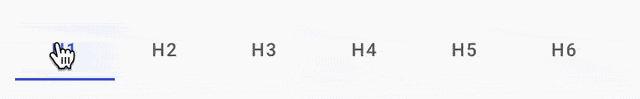
As far as I understand, this should switch between the different heading-styles?
In my opinion, this would definetely need a more Tab-like-Style or should be wrapped in accordions, too.
|

|
The contents of the panels (Colors, Typography, Spacing) are not that important for this issue, which focuses more on the grouping and presentation of global and per-block styles. For the components and rendering of the individual tools, see #27331. |
 mtias
changed the title
mtias
changed the title
|
@jorgefilipecosta or anyone else in this thread, I guess https://g2-components.xyz/iframe.html?id=examples-wip-globalstylessidebar--default&viewMode=story# is a prototyping tool of sorts. I can't make sense of it as I guess it's screenshots/mockups. Can you explain to me how this design differs from the sidebar that currently exists?
With a lack of vision, it is hard to participate this early but trying to wrap my head around what's going on in this design vs the last and what makes it better. Thanks. |
|
Can you tell me how I would find the global styles sidebar to make a comparison between the two? I'm not sure what this is, exactly. |
|
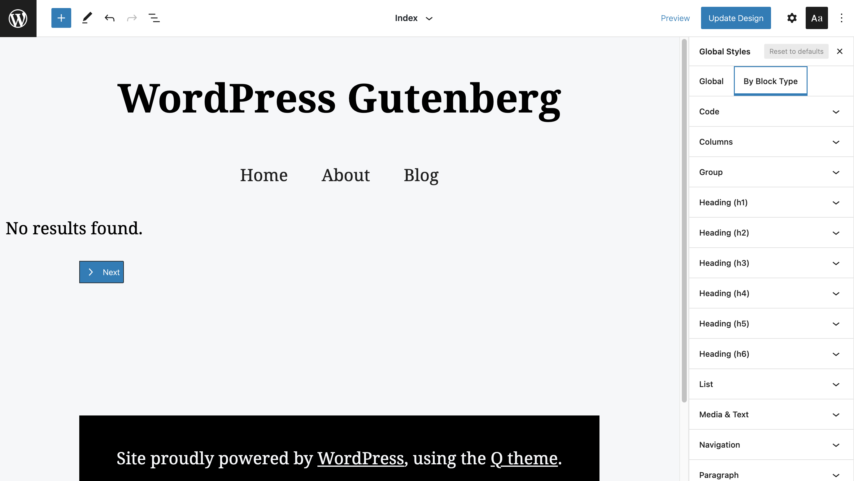
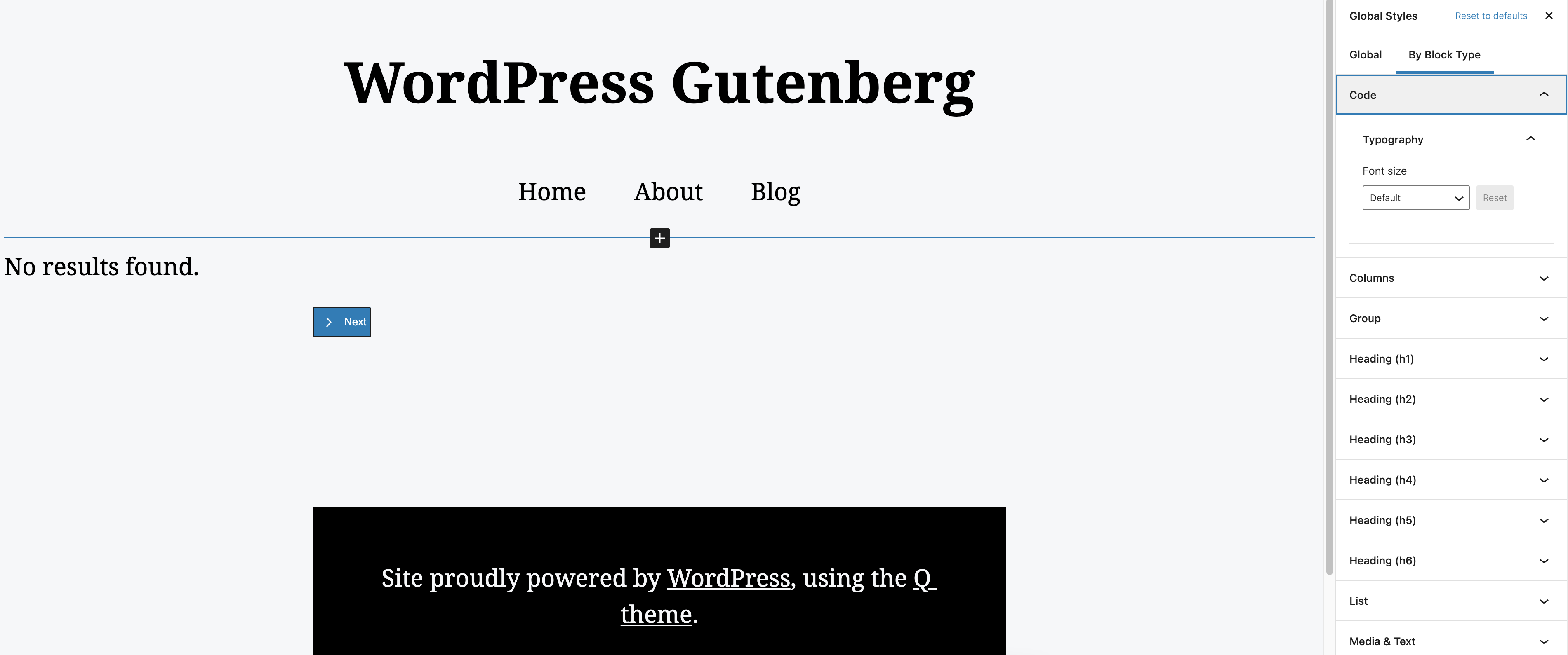
For context, the current Global Styles design looks like this:
Here's a quick video screencast showing the experience: (Loaded with the Q theme by @aristath ) Instructions for viewing Global Styles
|


|
Hi @alexstine, Regarding https://g2-components.xyz/iframe.html?id=examples-wip-globalstylessidebar--default&viewMode=story, the link is for a storybook using the components in code, and not for screenshots/mockups. I think Storybook using iframes may make this interactive demo inaccessible, but I'm not very knowledgeable about how the storybook works. @cc: @ItsJonQ in case you know some way to make the link more accessible.
There is not much difference, the biggest differences are visually at the component level things "look nicer" there are also more interactions offered in the components e.g: to decrement or increment a number input field one can drag the mouse up or down.
Well, the components offer more interaction options so they may be accessible to users that prefer a given interaction. There is also less "visual noise" as things are hidden before the user chooses to go to a specific section. |
|
@jorgefilipecosta It sounds like it uses a similar pattern to how the customizer works? You must select a section and then it opens options? Thanks. |
|
@alexstine it's pretty similar, yes. |
|
It has my support for now. Until I can really test the implementation and give specific feedback, my support shouldn't mean much. If I follow that it is a similar pattern to customizer, it should in theory work out pretty well. The real test will be once the code is implemented and then I may have more to add then. Hopefully other members of the accessibility team will comment throughout these first stages. Thanks. |
|
Thank you Alex, you rock ❤️ |
|
Based purely on visual, this looks like it is likely to be a better organization than the existing version, which certainly comes with some benefits. Does the new version change anything about how the user navigates between content and sidebar? The biggest challenge from an accessibility standpoint has to do with what the path is between "object I want to edit" and "method to edit that object". |
|
Haii! I just documented an overview of the mechanics of creating a sidebar navigation UI (like the one proposed), using parts from the new Component System. Link: Hope this helps! cc'ing @jorgefilipecosta @dubielzyk |
|
Hai all! Happy New Year 🎉. I started looking into this space again as part of the efforts to improving the Component System. Video WalkthroughDesign QuestionsA while back, I had 🍐 'ed with @noahshrader one afternoon to come up with some ideas for this Global Styles prototype. It hinted on some interesting solutions that we could explore to improve the experience. However, I felt like there were some unanswered designs questions. I started off with checking out the latest Site Editor + Global Styles UI and asked myself 3 fundamental product design questions.
(Note: I am not critiquing the current aesthetics of the sidebar. I understand that we have yet to do a more formal design update)
Questions 1 and 2 have to do with the editing flow. At the moment, we collect all supported blocks in a singular list:
CustomizerFor question 1 (How do I know what I'm adjusting?), the current WordPress/Theme/user workflow involves the Customizer, which is often accompanied by some kind of "kitchen sink" sample page.
This setup solves questions 1 + 2 as you're able to see the things you're editing and (roughly) see them next to each other. For example, if you wanted to adjust global Typography settings. And then fine-tune Heading vs Paragraph styles. Design UpdatesBelow are my design attempts to answering the 3 main design questions I mentioned above. Here's a link to a live prototype: (Note: Prototype is not feature complete)
It borrows the nested/drill-down navigation flow from my earlier prototype as well as the Customizer.
Sidebar HeaderOne important piece of this experience is the persistent Sidebar Header.
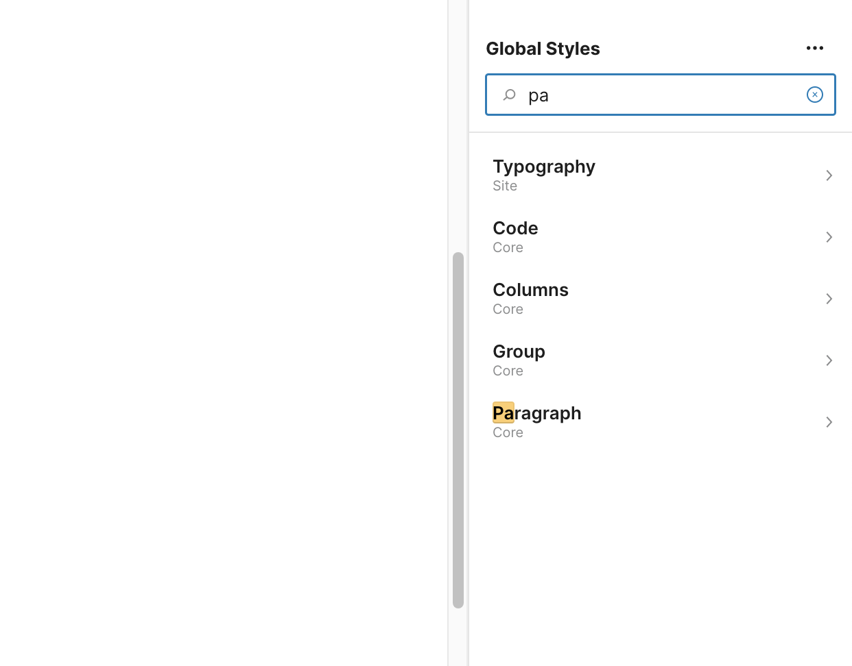
On the top level Global Styles section, in place of the title is a Search. When drilling down to a block, the search is replaced by the title of that block to provide context. On the right of the title is an action button for "Preview" (Will mention this later) Settings Collection
At the "root" level of the Sidebar, underneath the header there are 2 sections:
Items under "Site" control the global site settings (e.g. color). In the future, we may be able to group blocks in another way. Clicking into Block Search
At the "root" level of the Sidebar, we can see a search at the very top. Similar to the searchbar for settings you may find in your iOS/Android device, this search allows users to quickly filter/find blocks. This would be useful (and arguably necessary) as the Global Styles for blocks scales and more blocks get added. As an added detail, underneath the title of the block/setting is meta data indicating what "group" this item belongs to. Site/Block Controls
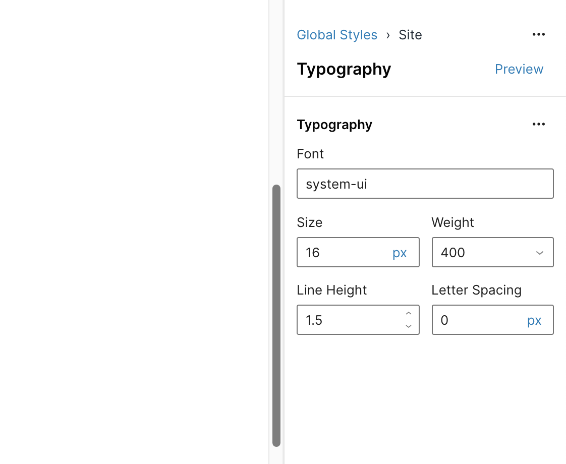
Drilling down to a block will showcase controls to adjust the global style settings. The example above showcases adjusting the site's global typography settings. For the most part, these control clusters should be consistent with what's available in the Page/Post editor (for blocks). Preview
In the Sidebar Header, there is a Preview button for each section. Clicking it would render a preview of that particular block/site setting. Any updates would reflect immediately in the preview. This is useful for seeing changes made on blocks that aren't available on the current (FSE) page. The Preview window is also draggable. This allows users to get a betters sense of the block next to certain content.
(Note: The Preview window should be resizable as well. This wasn't fully done in the prototype) Video DemoI recorded a short video demo showcasing these flows: Here's the link to the live prototype: This is just my take! I'm sure others who have been in this headspace have spent more time than I thinking through these issues. Would love to hear your thoughts! 🙏 |


I'm curious to hear more about the aversion to doing this. One benefit is that it would enable you to see the effect of your changes to one block in the context of others. I imagine this being quite helpful, especially when you're editing site styles. I can also imagine it being more interactive than a mere preview. IE clicking on a block in the preview navigates directly to its global styles settings. Kind of like a more visually driven storybook, where instead of selecting something in a list, you click the visual preview and view the knobs in the Inspector. Excuse the crudity of this mockup, but you probably get the idea:
|

@jameskoster To clarify, my aversion comes from the user having to (manually) create a "page with all the things" type pages to see their changes. If the editor provided (native) way to visualize blocks (like your rough mockups), I think that's okay :) I hope that makes sense 🙏 |
|
Some progress to share here:
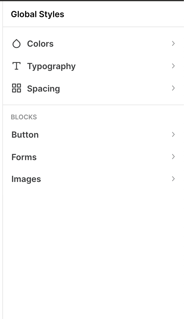
This reorganizes a few pieces that are already implemented but gives the greater organization and hierarchy. The initial state of the global styles sidebar has the following elements:
ColorsWithin the colors section the user can see and configure the color palettes:
And set the main exposed color elements:
The color elements are the set of default CSS variables that themes can support. The [+] is meant to allow the creation of new variables on demand that can be used anywhere a block has a "style" panel (connected with style variations, perhaps). This is mostly as reference as it's not in the scope of v1. Within the palettes section we'd clearly show the different color sets that are available. (See more on this topic in #29568).
If a theme registered a color palette, it shows right here. Colors from a theme have semantic value. The default color palette is also shown (unless a theme / site has explicitly disabled it). If There's a toggle to see solid colors or gradients. (Duotone gradients would be shown there as its own set.) TypographyThe typography panel follows the same logic with the exception that by default there's no choice of font-families / pairs. This is up to the theme or plugins to register. We need to account for their presence as we have the font stacks but they won't be exposed unless a theme registers those options. The main focus is on controlling typographic elements across blocks:
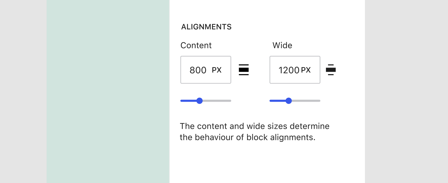
The set is initially limited but it can be expanded upon. Layout / SpacingThe third group would allow configuring some global aspects of the layout, including the default margins between blocks, padding of the site, and more importantly the different alignment widths offered:
Still Open QuestionsWith a structure that focuses on design aspects as the primary navigation there are some obvious tradeoffs when it comes to elements that have both typographic and coloring requirements as there are two places where they can be configured. It'd be reasonable to say elements should be visible in the first screen instead of the design categories, but it comes with its own fair share of problems, including lack of clarity and the mix of tools. There could also be ways to go from editing typography to editing color for a given element if required. This also doesn't preclude us from lifting certain elements to the root (for example, "Background", which is not merely a color but could also have an image set). |


|
This looks great! |
|
Moving over to #34574. |
As an improvement to the current global styles sidebar, @mtias suggested a good possibility would be implementing the following prototype, given that it is better than what we have now implemented in the repository:
https://g2-components.xyz/iframe.html?id=examples-wip-globalstylessidebar--default&viewMode=story#
So let us prioritize implementing this design.
This design can, of course, be iterated on.
The implementation of this design involves enhancing our components/bring some components/concepts from the G2 repository.
cc: @jasmussen,@jameskoster, @kellychoffman, @shaunandrews @youknowriad, @nosolosw, @ItsJonQ, @aristath, @mcsf
Related: #27331
The text was updated successfully, but these errors were encountered: