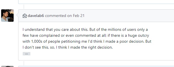
Weight change again? #60
Comments
|
This single handedly annihilated our entire set of Angular frontends. Can anyone provide a reference to the previous version, please? |
|
Please check the migration guide from https://github.com/JulietaUla/Montserrat/releases/tag/v7.200 |
|
@juandelperal is this going to be an ongoing thing with this project or are you finally done changing the weights? |
|
@danyj This change just killed many designs. I mean, I can't even breathe right now. @juandelperal Seriously guys, is this the way any software changes should be made anywhere? I guess not. The font should be versioned and by that I mean versioned on Google Fonts too not just @github. |
|
@brgrz I am looking for alternatives as we speak , since I have to change 200 designs than should just trash this font to never land. So unprofessional not even funny. And the thing is that we warned them in Feb about such changes and G fonts, but by the looks of it no one cares. |
|
Even after quickly upping the weights on one project things just don't look the same. And it also seems there's much less antialias present. This is just....such bullshit |
|
I manage the Google Fonts collection. We pushes updates from time to time to improve the quality of the fonts. If you want to self-host the fonts, so that you have total control over upgrades, the OFL license respects your freedom to do so. |
|
@davelab6 Then the service is useless to designers if changes to fonts are made in this way. I remember they did the same some time ago with Roboto (though it wasn't this drastic). |
|
@davelab6 I mean , why are you even saying what you do? You know you messed this up and there is nothing you can say that will fix it unless you version it properly. Host yourself, really we dont know that. You have any idea how many people are using the live Google version? And how many of them use the 400-600 , they all messed up now because you act and even talk like bunch of script kiddies. Now you are telling all of them to "host it yourself" bull , get your act together and even do it right or dont do it at all. |
|
@danyj the way he sits on his profile photo and the scripture "I work at Google on fonts." pretty much tells you he doesn't give a fuck |
|
I don't understand the conflicting messages here. In the developer guides, Google recommends that we use their embed code and not self host them. They even go as far as to say that Google fonts make the web faster. Now we have the manager of this collection telling us we better host our own or else who knows when or how the styles will change. I just don't get it :( |
|
So, after going through my CSS files for the last hour and comparing the looks the issue is that previously the 400 weight worked fine as |
|
@brgrz be careful , even the 700 changed but they did not document it , |

|
@danyj oic, thanks |
|
@JulietaUla can you please answer if this is going to be an ongoing thing with this project or are you finally done changing the default weights? |
|
This just broke a lot of our sites. |
|
Quit changing it please. This project is the new left-pad! |
|
3.65B times the font was served and no one cared to version it. |

|
@ everyone here , letter spacing ( or width, not sure , more apart now) is also changed drastically looks like we are forced to alternatives. |
|
Really, on FOSS land changes are common, it has been like that since decades ago. Keep up the good work @juandelperal |
If you expect something to look a certain way no matter if is open source you want it to stay like it is. If millions of people are using your product you should ask for input before any change and version it so that we have alternatives. This change is forced up on us for a second time in 9 months.
Talk like what? Cant you see we are all pissed, we all relied on the design which changed unexpectedly and now we all have to come up with alternatives. Did you follow discussion from February , we already talked about the same thing and it happened again. Should we expect to see Montserrat look like Comic Sans on the next update ? |
|
This makes me feel unsafe relying on Google Fonts I had no idea they let designers do things like this |
|
Funny that someone who appears to be proud of his work so summarily relegates it to the trash bin of the internet. Who's going to be using Montserrat going forward? No one influential, that's who. Live and learn. Too bad you have to take Montserrat on the journey with you, @juandeperal. |
|
This wouldn't have been an issue if the Google Web Fonts API had versioning but the omission of such a feature is deliberate (see google/fonts#707). So the only way to ensure that your designs are future-proof is to not rely on Google to serve your fonts (self-host). My suggestion to @davelab6 is to revise the copy on the Google Fonts site to indicate that fonts hosted on Google's servers may change in the future. Currently, users are encouraged not to self-host without any mention that font updates may inadvertently change their designs. Making sure your users are aware of this is the least you can do in lieu of proper versioning. |
|
Well I see that this is a f. in the wind , according to this post from @davelab6 we need min 1000 of us in order for anyone to make the change #39 (comment) and make him regret his decision like he did not in Feb.
Get Roboto or Raleway is the closest we can do now. To bad. |
|
The font is fine the way it is. Please stop changing it. This change added a considerable amount of work for my project and that's not accounting for when the font was changed back in February. |
|
So is it as simple as requesting the 500 weight instead of 400 (etc.), or is everyone finding other subtle differences? |
This is a good suggestion, thank you
If you want to really look closely, you'l find that there are 1,000s of subtle differences; the entire family was redrawn over the last 5 months. |
|
@davelab6 you should have done your job and by the looks of it you are 100% wrong person for it. Acting like you own the Google fonts project . Sure you can close the issues as much as you want and avoid us but in the end you know that you are not cut out for this project. This font changed 3 major weights , everyone designs look 100% different and you did not care to stop the designer or advise to release Montserrat v2 but instead have simply released it. It is on you as much as the designer. |
|
Ok, no point continuing this discussion. Self hosting it is. I don't get the point of this API if you are advising everyone to self host, but whatever.
It did not literally break the layout, but change any font on any page from 400 to 300 and legibility suffers.
Yes, it is clear to me now how reckless that was.
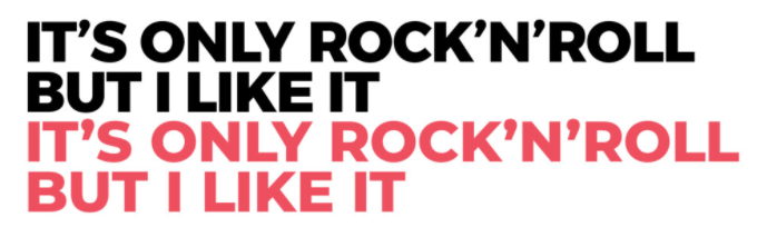
If your whole point is "nobody notices the changes", then why update this font at all? (by the way, you clearly did not read my post very carefully. the whole point of posting these images was to show they are not different, after updating the weights in CSS.) |
People do not notice the changes consciously; as you said earlier, the latest version is just better.
The point of the GF API is that it is for "everyone", making web fonts fast, easy and free. Which is to say, it is for those people who don't care about things to the extent that we do. I know this seems an odd position to take in a discussion among people who are dedicating their lives to typography, as you and I are... I am advising "everyone" to use the API, and specialists like yourself to self host.
I would be kinder to yourself, but yes, depending on 3rd party services trades off convenience for loss of control, and if you care about pixel-for-pixel changes then it may not be a good tradeoff. The purpose of libre licenses is to respect your freedom, so that you can control your own destiny.... Welcome to the software freedom movement :) You can buy a FSF membership at https://members.fsf.org |
I was referring to this image that you posted:
I would expect users to comment on the color change, and not comment on the line length change; I expect they would mistake that and say that they are different sizes. |
|
We made the choice of balancing out the weights. It took us several discussions and compromises. Finally we found the middle ground where both “old users” and new could enjoy the new design.
As you can see in the screenshot, the important middleweights Light, Regular and SemiBold have shifted one weight. This can easily be changed in API or CSS.
|
|
|

|
It's kind of funny though. The font designer decided to change millions of
websites without letting the owners know.
On Feb 27, 2018 6:23 PM, "Jacques Le Bailly" <notifications@github.com> wrote:
[image: schermafbeelding 2018-02-28 om 00 16 18]
<https://user-images.githubusercontent.com/20181530/36761041-926cc644-1c1d-11e8-8ed3-6668d7cbbf01.png>
—
You are receiving this because you were mentioned.
Reply to this email directly, view it on GitHub
<#60 (comment)>,
or mute the thread
<https://github.com/notifications/unsubscribe-auth/AFaOlhzl3_8BZslmecDB06QvfKfOrTDrks5tZI5vgaJpZM4QVLRl>
.
|
|
Does anyone else have the feeling we are talking to a wall here? It is also funny, they decided to give everyone in here, people who are actually using their API, the middle finger, because they want to keep it "simple" for "everyone". They sure didn't make it simple for us. Above, I also read that posts about this over on the Google Github/forum were ignored and quickly shut down. Maybe you should spend a little more time listening to your actual users, instead of this imaginary "mass market" that you keep talking about?
@Fonthausen THIS IS THE WHOLE F*ING POINT. You know, at first I just took this for an oversight of the impact of this change. Negligent but no more. But it seems you and your team were well aware this was a breaking change (requiring action to fix), and still chose this path. This, frankly, is insulting. Now, I don't mean this as a personal attack, I respect you, you are obviously a very talented typographer. But judging from your comments, I dare to guess you are not a developer with client websites or applications in production — nor is anyone in the Google team. There is a serious disconnect from reality here. |
|
The whole process has been documented step by step. Everyone had access to this thread: |
|
@Fonthausen I don't see any discussion or consideration in that thread about 'should we release this under a new name or just force update the current font'. The only one who brings it up is actually the original font creator @JulietaUla herself:
But unfortunately this comment was totally ignored. |
|
And by the way, just to show you how "un-easy" this change can be, here is an example of one of my own Squarespace sites, after the Montserrat update:
Note the legibility issues in the body text, caused by the 400 suddenly becoming one weight lighter, in combination with a
Luckily, I am skilled enough to overwrite the Squarespace styles and thus get some of the legibility back (by disabling the font-smoothing — increasing the weight has no effect as the 500 weight is not loaded from Google fonts), but this is an option that a novice ('mass market') user will NOT have. This means this will only get fixed if/when Squarespace updates their font listings, and/or their (default) styles containing the font-smoothing rule, which is not likely to happen quickly trust me. By the way, this also shows you that Squarespace, a leading website service platform, is among the "reckless" using the font straight from Google. This is just one example. I hope this illustrates the impact of this change goes far beyond your initial estimation. Of course, these are all not your problems you have to deal with. But we do. |


|
I can't believe the self-absorbed entitlement on this thread by people who just realized that Google Fonts are dynamic and often change, and that one must self-host (or convert to outlines, or render to PNGs, or whatever) if their designs are so brittle that they can't tolerate refinement. Want to be a web designer? Your design should still work if Google Fonts goes down, if the user has turned off custom fonts, if the client doesn't support custom fonts, or whatever. The web is not print. @JulietaUla, @davelab6, @Fonthausen, and anyone else I might be forgetting: Thank you for making such an amazing creation and giving it to the world. Don't let the trolls get you down. |
|
@CharlesWiltgen you are the only one trolling here, my friend. |
|
@rijk I would suggest you to keep an eye on https://groups.google.com/forum/#!forum/googlefonts-discuss. This will allow you to know what the Google team is working on and enable you to continue to design websites at a high typographic level. You are welcome to join in the discussions and give us your opinion. Although I would use another tone of voice. All people involved in all projects are honest and gentle, trying to do their best. |
|
Still this discussion... ufff... |
|
@andrestelex it's entered its ripe mature state of trolls trolling trolls. I'm quite enjoying it now. |
|
Rijk, I'm not sure what your goal is with this discussion; I hope you can
clarify so I can better respond to you. Clearly you have some unmet need
that you are hoping we can help you with, but at this point I don't know
what that is.
Are we talking about a hypothetical "what would have been better when
Montserrat was updated" to inform my future update decisions?
Are you proposing that I roll back the update and then publish a Montserrat
2?
Perhaps you are suggesting Google senior managers sign off on changes to
the product values policies? Or they should allocate more engineers to the
project or reprioritize existing team members to add sophisticated version
pinning to the API?
Kyle, as for the inception level trolling, I'll let you interpret this how
you like ;) https://youtu.be/Ay9BWM8lwOA
|
|
We just don't want the Montserrat font updated again. Like especially if
the author decides to embed porno in the font.
It's like if jQuery changed their symbol from $ to _ on their CDN.
…On Mar 1, 2018 1:04 AM, "Dave Crossland" ***@***.***> wrote:
Rijk, I'm not sure what your goal is with this discussion; I hope you can
clarify so I can better respond to you. Clearly you have some unmet need
that you are hoping we can help you with, but at this point I don't know
what that is.
Are we talking about a hypothetical "what would have been better when
Montserrat was updated" to inform my future update decisions?
Are you proposing that I roll back the update and then publish a Montserrat
2?
Perhaps you are suggesting Google senior managers sign off on changes to
the product values policies? Or they should allocate more engineers to the
project or reprioritize existing team members to add sophisticated version
pinning to the API?
Kyle, as for the inception level trolling, I'll let you interpret this how
you like ;) https://youtu.be/Ay9BWM8lwOA
—
You are receiving this because you were mentioned.
Reply to this email directly, view it on GitHub
<#60 (comment)>,
or mute the thread
<https://github.com/notifications/unsubscribe-auth/AFaOloeqcJiJtUEhHAyrupYCcM09pnskks5tZ492gaJpZM4QVLRl>
.
|
|
Fair enough. Montserrat could have more languages added but I don't expect the Latin to change soon. Other families will be updated in the same way, and I'll attempt to give more of a heads up on the GoogleFonts Twitter and GitHub.com/Google/Fonts/pulls system and the mailing list Jaques mentioned. I don't understand the porn reference. I don't agree this was a drastic change. |
|
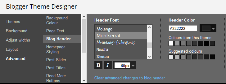
Whilst changing to 500 may be viable on most systems, it's quite ironic that this is not possible on www.blogger.com, Google's own blogging platform. What would you suggest for users who wish to retain the old 400 weight on Blogger? There is only a single option for weight: bold or not bold.
|
|
Use custom CSS to import the Fonts API 500 weight
…On Mar 3, 2018 11:19 PM, "pipdig" ***@***.***> wrote:
Whilst changing to 500 may be viable on most systems, it's quite ironic
that this is not possible on www.blogger.com, Google's own blogging
platform. What would you suggest for users who wish to retain the old 400
weight on Blogger?
There is only a single option for weight: bold or not bold.
[image: image]
<https://user-images.githubusercontent.com/15048120/36937421-fb94129a-1f0a-11e8-895a-d7f75a118a6c.png>
—
You are receiving this because you were mentioned.
Reply to this email directly, view it on GitHub
<#60 (comment)>,
or mute the thread
<https://github.com/notifications/unsubscribe-auth/AAP9yy-gcgCjtvRn5UwCbOOAt8wNAMGxks5tatekgaJpZM4QVLRl>
.
|
|
@davelab6 That won't be possible on Blogger.com, unfortunately. The system enqueues font weights automatically. So even if the HTML is edited directly, it would still use the new 400 weight rather than 500. The solution to this would be to self-host and rename the font, but this is also not an option since only Google Fonts are available in the theme designer UI. |
|
Yeah, the solution would be to not use Blogger in that case. @JulietaUla I suggest closing this issue |
|
But what about the weight change? |
|
The weight change won't be reverted. Move to Medium (500) if you can.
|
|
It's so bad this issue is currently closed, but I forked the Montserrat v5 and published as separate family. The family has even some modifications. Come see out - https://www.1001fonts.com/argentum-sans-font.html That project was born in January 2018 based on this issue. |
Great! :) |
@juandelperal What is the matter with you ? Few months ago you change weight #39 (comment)
, now you doing it again.
Are you aware that designers are using your font and we do rely on font weight. Switching weights as you see it fit messes up all our designs. This is the most irresponsible project I have seen and it is so one sided. If you would care about any of the users you would ask for input and version this thing properly than let us decide what version to use.
menus before desired design
menus after unexpected
Dont even get me started on headings.
When you did this last time I asked you to version it , now again.
Not to mention a project we worked on for 2 years relied on weights from 300 to 600 ,
200 themes in one.
Now we need to change everything. I just do not believe you did this.
The text was updated successfully, but these errors were encountered: